- Joined
- Dec 11, 2006
- Messages
- 18,743
- Reaction score
- 8,048
- Location
- Mid-Atlantic US
- Can others edit my Photos
- Photos NOT OK to edit
- Banned
- #1
I must admit that I hadn't realized the amount of discomfort, I would feel being the sole judge.
That being said, I want to point out that I 'know' nothing about the academic points about art, art history or even too much about photographers.
My response is only my reactions to the pictures and where I see weaknesses that make the photos less impactful to me, specifically.
In the order they were posted:
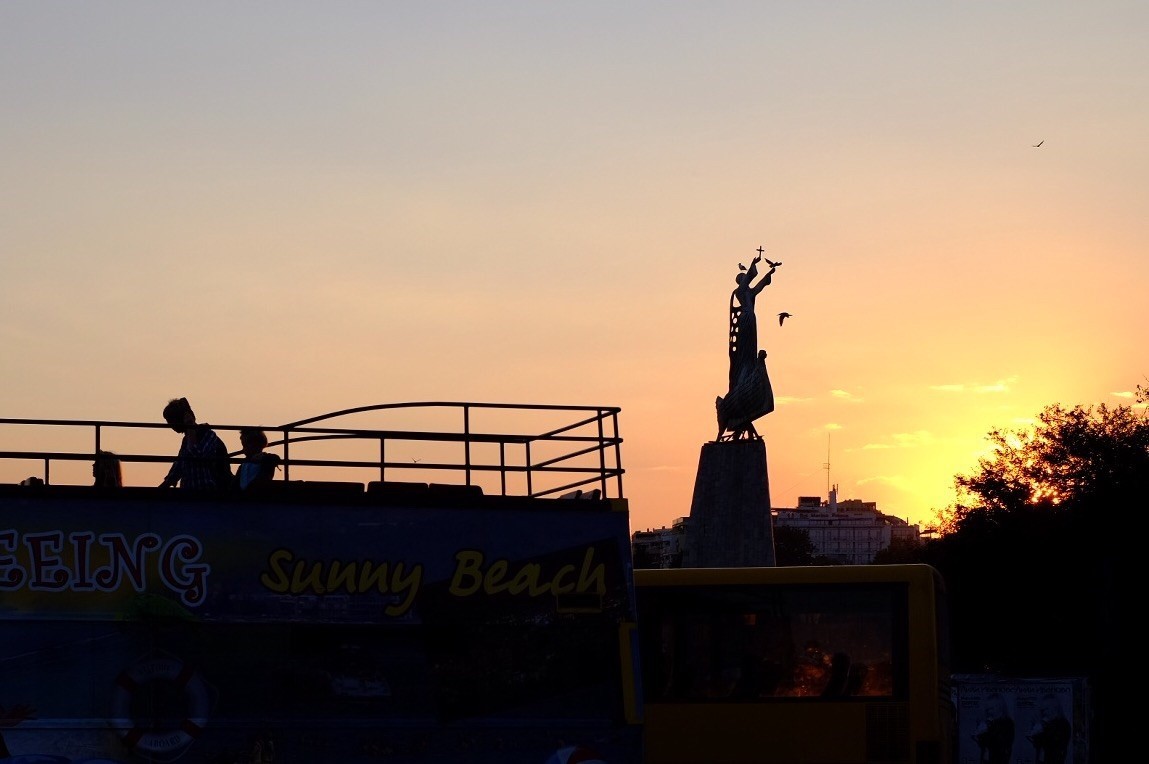
Sashbar knows what he's doing and so the picture is the way he wanted it. So there is no 'technical' criticism, things are done right.
I see the statue on one side and people, perhaps on the top of a pavillion or sight-seeing bus, on the other side.
But, I don't get the point - even with the title.
I don't know what is being shown and why.
I am perfectly willing to admit that I may be at fault or unsubtle - but that's the way it is.
_______________________________________________________________
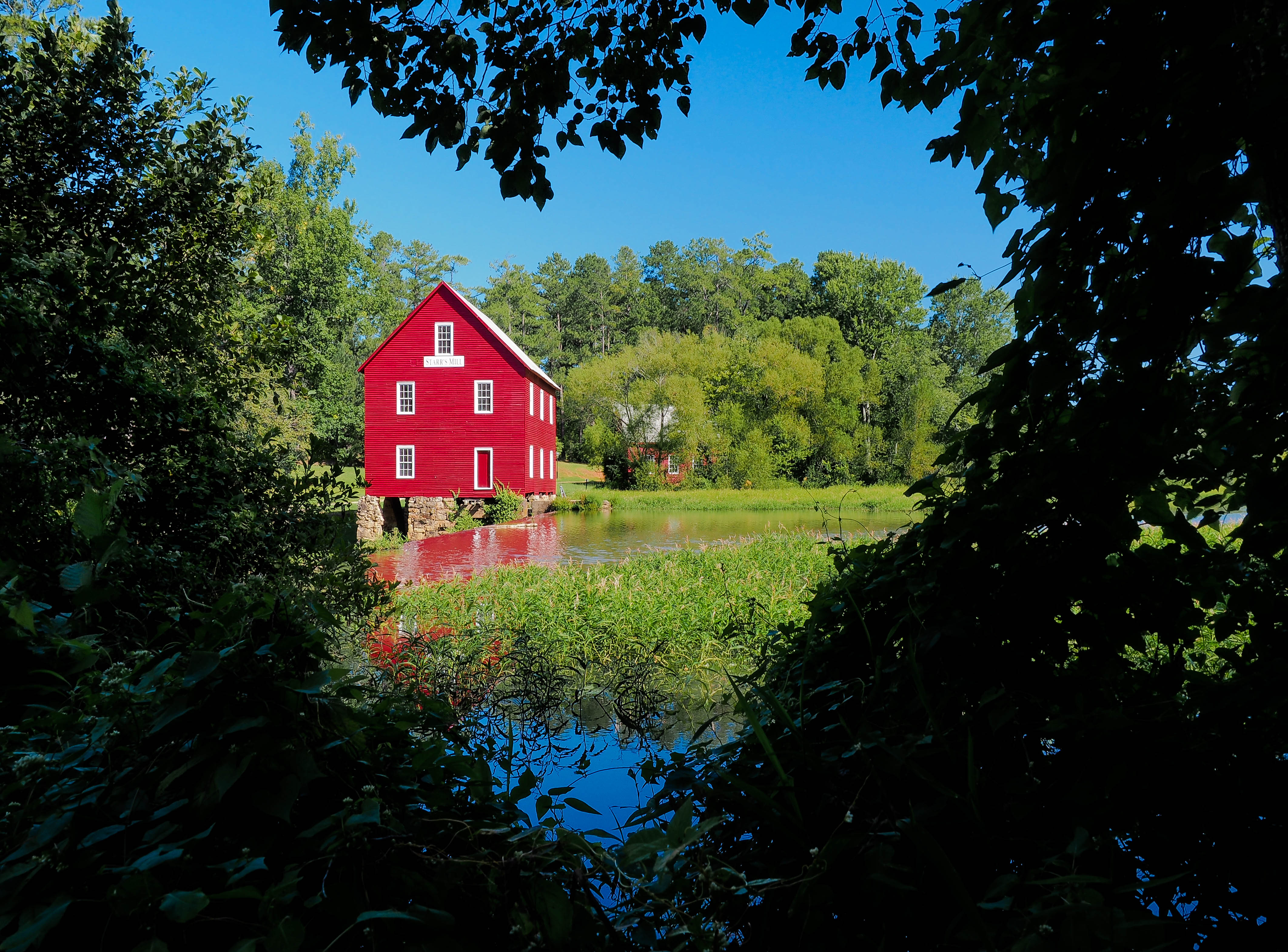
A semi-landscape by PropilotBW taken at Starr's Mill in Georgia.
This is an ingenious shot and propilot did a good job of finding something interesting and unique about a topic that has been shot multiple thousands of times.
I think a little less bright and saturation on the trees in the background would benefit and especially toning down the barn so the texture of the boards is more obvious. That would soften the entire impact and ket the viewers' eyes go to the heart. (Even a purposeful softening might work well)
_________________________________________________

This is a technical shot By that I mean that the photographer is trying to show the unusual symmetry of the chamber and the impact (to me) depends on the actual image being captured in a way as much as possible reflecting what the photographer saw.
The exposure, depth of field and sharpness is all good. (I am a bit ambivalent about the color.)
Unfortunately there is a lapse in the framing that hurts this picture. The midline is off, the sides are asymmetric and the chair back is off center on the window and runs into the lower edge of the window frame.
I think the idea is good and surely deserves another try.
________________________________________________________________

This photo by scooter is about someone with mental illness. The problem with this photo - for me - is that most of the information about the photo is contained in the text - and the photo itself doesn't give me much or any clues.
Sharpness is good; framing, being purposefully off center, actually gives a hint that this is not a traditional portrait.
So much of the meaning of any photo is carried, not just by the actual content, but by the treatment. This image is much too heavy in the grey tones and the contrast is so low that I can actually not see important detail. Most important I can't separate the message from what may be not-the-best processing.
If the contrast is enhanced and the image sharpened a bit, particularly adding a bit of the micro-contrast (called clarity in LR or PS) a lot changes.
The sharpness is more obvious, the hooded eyes looking down contrast with the skin, I can see multiple piercings and what might be tears.
I can see more and now could conjure up a story about this young woman. The processing does not hide things from me and the text is useful but not necessary to the strength of the shot.

____________________________________________________________________
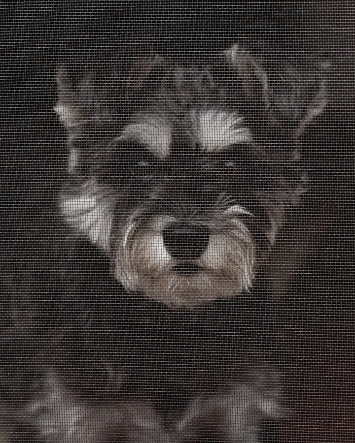
A damn cute picture of a dog - and because there is text I know the dog was inside a door and looking through the screen.
What this picture is missing is a little bit of the wooden (or metal) frame so that would set the scene - 'A little doggie stuck inside'. and all the pathos and sweetness that suggests.
As it is, without the text it could be an added -on texture and there may not be any story at all.
Yes, it might have been nice if the focus was on the dog and not the screen so much but....
If you have a frame, I'd put it in.
_________________________________________________________________
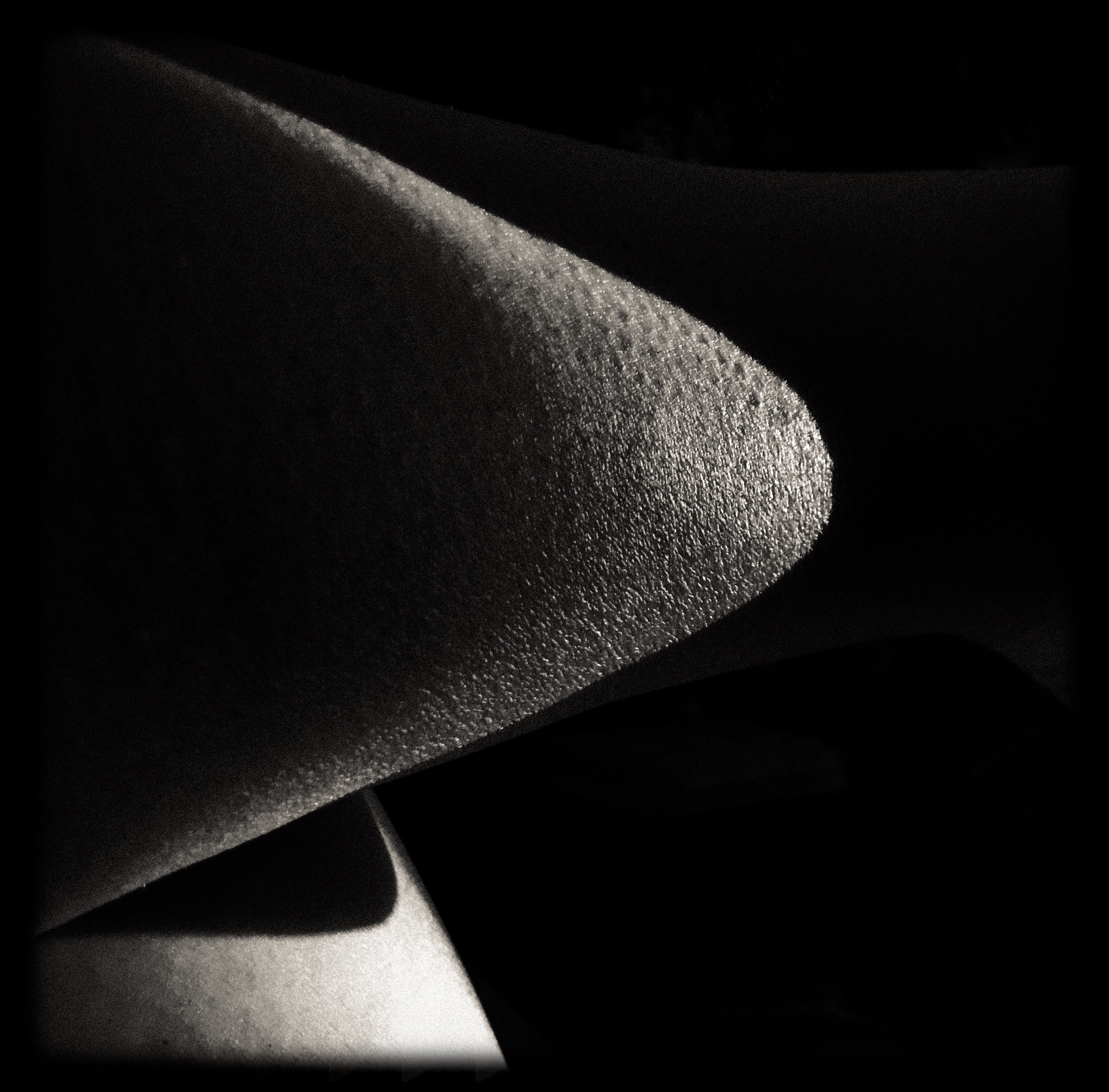
I left this shot (by Wyogirl) purposefully for the end because I was so struck by it.
The technical issues are irrelevant (except that f 22 made this possible) but the composition and framing are just wonderful.
I'm not certain what it is - and I really don't care. The balance is wonderful, it has mood and mystery and, I can make guesses about what I am seeing, but can't confirm the guesses and really don't want to know.
This is just terrific and my choice as winner.
That being said, I want to point out that I 'know' nothing about the academic points about art, art history or even too much about photographers.
My response is only my reactions to the pictures and where I see weaknesses that make the photos less impactful to me, specifically.
In the order they were posted:
Sashbar knows what he's doing and so the picture is the way he wanted it. So there is no 'technical' criticism, things are done right.
I see the statue on one side and people, perhaps on the top of a pavillion or sight-seeing bus, on the other side.
But, I don't get the point - even with the title.
I don't know what is being shown and why.
I am perfectly willing to admit that I may be at fault or unsubtle - but that's the way it is.
_______________________________________________________________
A semi-landscape by PropilotBW taken at Starr's Mill in Georgia.
This is an ingenious shot and propilot did a good job of finding something interesting and unique about a topic that has been shot multiple thousands of times.
I think a little less bright and saturation on the trees in the background would benefit and especially toning down the barn so the texture of the boards is more obvious. That would soften the entire impact and ket the viewers' eyes go to the heart. (Even a purposeful softening might work well)
_________________________________________________
This is a technical shot By that I mean that the photographer is trying to show the unusual symmetry of the chamber and the impact (to me) depends on the actual image being captured in a way as much as possible reflecting what the photographer saw.
The exposure, depth of field and sharpness is all good. (I am a bit ambivalent about the color.)
Unfortunately there is a lapse in the framing that hurts this picture. The midline is off, the sides are asymmetric and the chair back is off center on the window and runs into the lower edge of the window frame.
I think the idea is good and surely deserves another try.
________________________________________________________________
This photo by scooter is about someone with mental illness. The problem with this photo - for me - is that most of the information about the photo is contained in the text - and the photo itself doesn't give me much or any clues.
Sharpness is good; framing, being purposefully off center, actually gives a hint that this is not a traditional portrait.
So much of the meaning of any photo is carried, not just by the actual content, but by the treatment. This image is much too heavy in the grey tones and the contrast is so low that I can actually not see important detail. Most important I can't separate the message from what may be not-the-best processing.
If the contrast is enhanced and the image sharpened a bit, particularly adding a bit of the micro-contrast (called clarity in LR or PS) a lot changes.
The sharpness is more obvious, the hooded eyes looking down contrast with the skin, I can see multiple piercings and what might be tears.
I can see more and now could conjure up a story about this young woman. The processing does not hide things from me and the text is useful but not necessary to the strength of the shot.
____________________________________________________________________
A damn cute picture of a dog - and because there is text I know the dog was inside a door and looking through the screen.
What this picture is missing is a little bit of the wooden (or metal) frame so that would set the scene - 'A little doggie stuck inside'. and all the pathos and sweetness that suggests.
As it is, without the text it could be an added -on texture and there may not be any story at all.
Yes, it might have been nice if the focus was on the dog and not the screen so much but....
If you have a frame, I'd put it in.
_________________________________________________________________
I left this shot (by Wyogirl) purposefully for the end because I was so struck by it.
The technical issues are irrelevant (except that f 22 made this possible) but the composition and framing are just wonderful.
I'm not certain what it is - and I really don't care. The balance is wonderful, it has mood and mystery and, I can make guesses about what I am seeing, but can't confirm the guesses and really don't want to know.
This is just terrific and my choice as winner.
Last edited:
") So awesome!
So awesome!


![[No title]](/data/xfmg/thumbnail/42/42281-7e2c2677bdc791ca1918fb67b6b760c5.jpg?1734176697)

![[No title]](/data/xfmg/thumbnail/35/35212-039632ef3763350189fc49390cb7eadf.jpg?1734166871)

![[No title]](/data/xfmg/thumbnail/35/35880-9a6926237907ab72b42781d9a09698a6.jpg?1734167640)


