Restaurant/product pics

Tashyd

TPF Noob!
Joined
Mar 15, 2011
Messages
72
Reaction score
3
Location
British Columbia
Can others edit my Photos
Photos NOT OK to edit
Hi everyone,
Here are some pictures that I took for my friend for his restaurants website. Let me just say that I by no means think these shots are really up to a professional standard and I did not charge for them. I do not have any lighting set up and had about half an hour to do them before they opened :er: I also realize that i could have done a better job even without those things (composition and such) Anyways Im rambling...I just wanted to see if anyone had any critiques of them that would be different than mine as I know other people usually see your work differently than you do. Thanks for looking :)

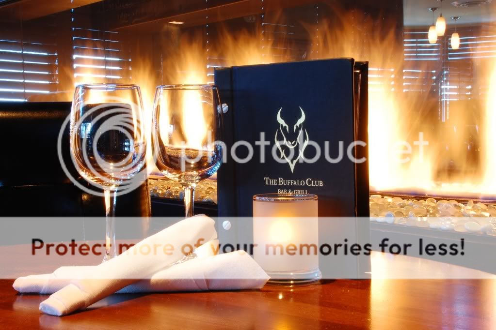
This shot was supposed to entice a customer to come dine by the fireplace. I think it is too blown out in certain areas. I also think the lighting isn't great, but I did not have a set up to work with.
CopyoftheBuffaloClub106.jpg


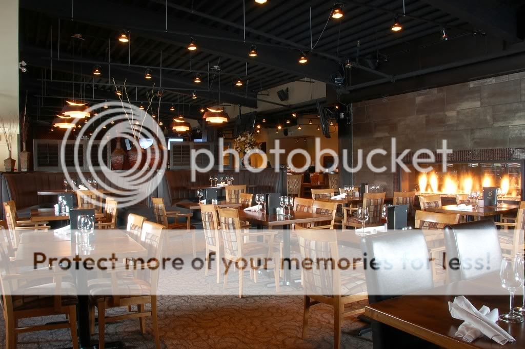
This one was just to give the customer an overall view of the restaurant. I am not really happy with it as I think its quite boring but had a hard time coming up with a good composition.
CopyoftheBuffaloClub027.jpg


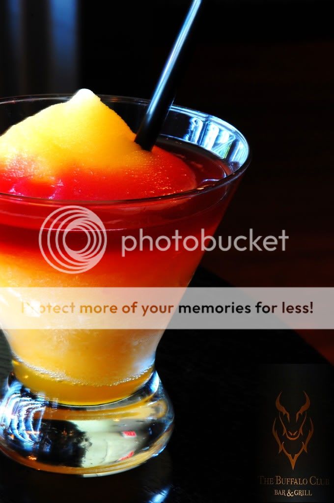
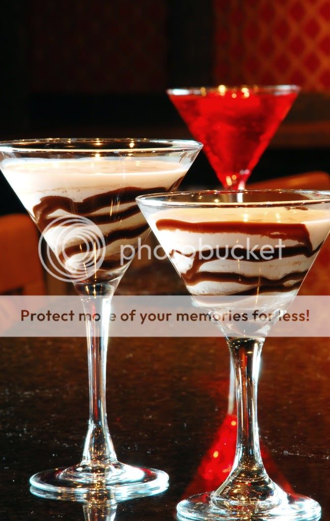
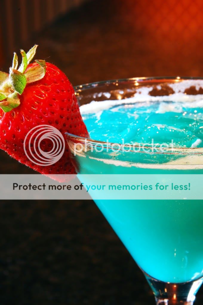
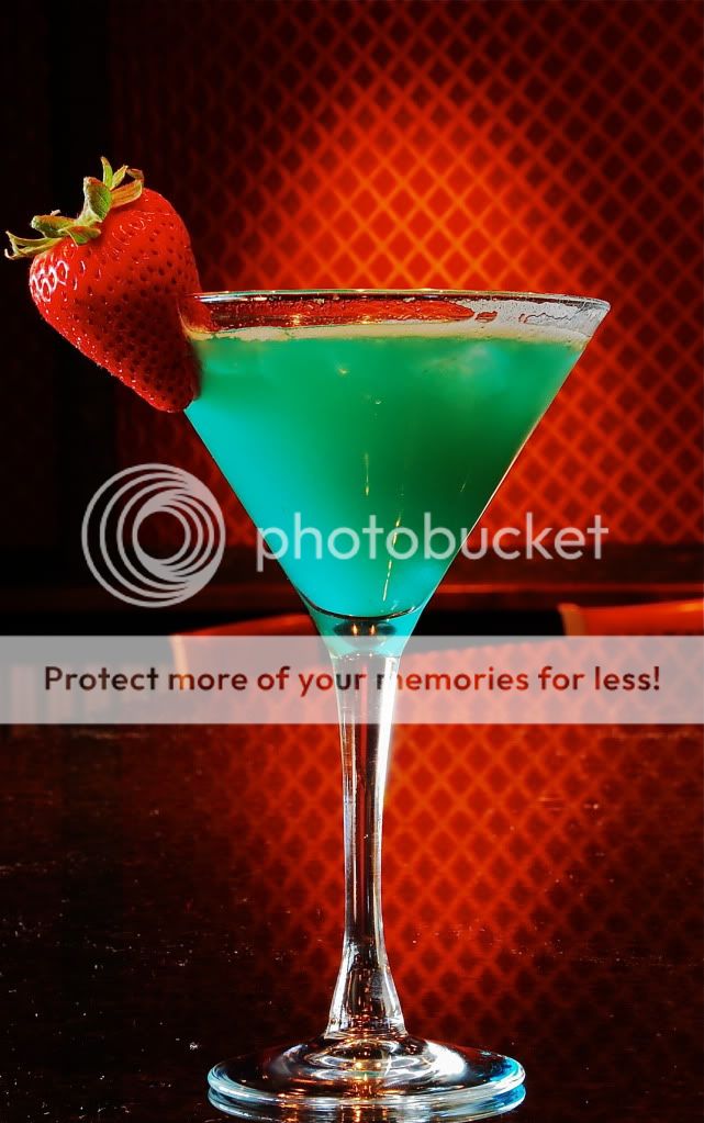
My friend wanted drink pictures as it is a bar and grill so thats what the next few are. I think the backgrounds are too distracting and the stone bar top didn't serve any benefit. There is also maybe too much shadow? As well as I think I could have found a nicer looking strawberry. Also lighting..but again..I just had window and bar light to work with.
CopyoftheBufaloClub095.jpg


CopyoftheBuffaloClub100.jpg


CopyoftheBuffaloClub086.jpg


CopyoftheBuffaloClub085.jpg
 
Hi everyone,
had about half an hour to do them before they opened :er:

I did a restaurant once 'for free' using 1600 film. Nightmare. I left my camera bag on one of the leather sofas in the better shots.
 
Please number your shots next time. It makes it easier to C&C.

They are not bad at all for a first, rushed time. The main problem I see here is the same I see with a lot of photogs, experienced or not, and that is a lack of attention to details. But if this is a friend's place, you can go back and reshoot and do a better job next time.

Details: in the first one, the name of the place is partially hidden by the candle and is a bit hard to read to boot. Slightly higher camera and moving the menu around to find the angle that makes it easy to read was needed. The window reflections in the left glass are annoying. Blankets over the windows would have taken care of that.

#2 is lifeless and a lifeless restaurant is not appealing. I would have set the tables with plates and maybe some flowers with a table in the foreground bearing a meal. I would also have had some of the wait staff either standing there or walking through in a blur or a bit of both.

#3 the reflections on the glass are a bit annoying and I would have put either a flower or some bar food next to the glass; The photo is not about a drink, it's about a place and you need to make us want to go there.

#4 There is a wonderful design thing going on here that you could have played with better but I have a feeling you didn't see it. Look at it while thinking details and keep in mind that composition is nothing more than the arranging of details together so I'm also talking composition. If you're interested I'll talk to you about it some more later.

#5 The composition is wrong for this shot. I love the close up but a horizontal framing would have wonders for the graphic aspect.

And the last one is just a blah shot of a drink.

Take advantage of this being a friend's place to do a reshoot. Tell him those are not going to help him bring in customers if you have to. ;)
 
Thank you imLOSTirl!

c.cloudwalker: thank you sooo much for your critique! I did notice a lot of what you mentioned before hand but you definitely mentioned some things I did not. I really like the idea of having a couple of employees in the picture, I would love to try out the motion blur you mentioned. I also completely agree that #5 would look much better if it was composed horizontally...wish I would have done it. Im trying to think of what you might be seeing when you look at shot #4 - I think maybe if I had arranged the glasses along the curve of the bar and used that as a leading line in the photo it could have turned out better, Im very interested in what you are envisioning though, and would be very appreciative if you wanted to expand on your comment. I wish I had had more time to spend on them! Unfortunately my friend does not manage that place anymore (although they are still using my pictures) so I wont be going back for redos. But I really enjoyed the experience and would hop right on another opportunity to do more. I think when I get some lights Im going to try a bunch at the restaurant I work at. Again thank you so much for the comments!

Tashyd
 
Nice shots. #1 looks like it needs to be straightened (its leaning left) and a couple of inches higher would show the "bar and grill" better on the menu. I agree that #2 is too lifeless. #3-6 need the reflections to be knocked down. #4 and 6 need the counter to be digitally cleaned off. These edits are not too major and the shots are really good.

Edit: looks like most of these comments have been made already, I second them then.
 
Fire place ?
What fire place ?
You can hardly see the fir place.
Remember that less is more. You don't have to shoot all restaurant, small section would be fine, low light.
Product ? I would use a close-up lens 1.4 maybe if you have one.
But this is just me..;)
 
Well done especially the first and the last one.

Minga, it's just you.
 
Great job friend, I like your idea especially first picture awesome!!
Thanks for sharing
 
The first shot is fine, full of warmth and inviting.
The others are clinical.
To make a statement about how warm and welcoming the place is use good looking models being happy, eating and drinking and being a welcomed.
 
Tashyd:

Really pretty good for your first effort..nice job!

I shoot a lot of restaurants and food and concur with most of the comments. Not many seemed to like your last shot and I think that is your strongest image by far. It is a very graphic image with the existing lighting, a natural vignette and the mirror image of the light on the table is nice and also repeats the shape of the martini glass. The color is off however, you probably shot on AWB and the tungsten lighting in the restaurant mixed with the blue drink and muddied the color. You can see the "blue" in the base of the stem from what is probably daylight coming in through the windows.You can clean up the color in PS or you could have lit the scene yourself and set your color temp yourself. You should also use post work to clean up the spots and distracting reflections. Bringing some small lights would give you the ability to put light where you want it. Existing light and digital cameras can do wonders but it is all about lighting. You have a good eye though.
The 4th shot has nice possibilities, I don't care for the red drink coming out of the front drink's head like a hat. The 5th shot could be shot horizontally but vertical is fine as well. The 3rd shot doesn't look in focus and needs accent lighting help. Composed pretty well but needs help. The 2nd shot of the room is okay. Again, needs supplemental lighting, too much ceiling and some sort of color...pretty monochromatic. The first shot is pretty well designed. Glasses need wine, can't block the name of the restaurant...all about signage. Lighting the scene yourself would enable you to control the fireplace flames better.
Keep it up and good luck!
 
PhotoMatt12345 said:
Tashyd:

Really pretty good for your first effort..nice job!

I shoot a lot of restaurants and food and concur with most of the comments. Not many seemed to like your last shot and I think that is your strongest image by far. It is a very graphic image with the existing lighting, a natural vignette and the mirror image of the light on the table is nice and also repeats the shape of the martini glass. The color is off however, you probably shot on AWB and the tungsten lighting in the restaurant mixed with the blue drink and muddied the color. You can see the "blue" in the base of the stem from what is probably daylight coming in through the windows.You can clean up the color in PS or you could have lit the scene yourself and set your color temp yourself. You should also use post work to clean up the spots and distracting reflections. Bringing some small lights would give you the ability to put light where you want it. Existing light and digital cameras can do wonders but it is all about lighting. You have a good eye though.
The 4th shot has nice possibilities, I don't care for the red drink coming out of the front drink's head like a hat. The 5th shot could be shot horizontally but vertical is fine as well. The 3rd shot doesn't look in focus and needs accent lighting help. Composed pretty well but needs help. The 2nd shot of the room is okay. Again, needs supplemental lighting, too much ceiling and some sort of color...pretty monochromatic. The first shot is pretty well designed. Glasses need wine, can't block the name of the restaurant...all about signage. Lighting the scene yourself would enable you to control the fireplace flames better.
Keep it up and good luck!

I agree with photoMatt :) He said everything I was thinking!
 

Most reactions

Back
Top