"re-TIRED"
*chuckle*
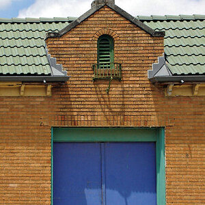
As far as the picture is concerned... there's not a lot there. I think you could have played a bit with the repetition of the arch, but the way you did it doesn't seem to work. You also cut off a lot of the sign, which I don't think was done in a way that works. The fence is distracting (not that you could have avoided it), the tree isn't placed well, etc. It's also a dead-on shot that lacks any real interest, and the perspective issues add some additional challenges.
Basically I would say bin this one.





![[No title]](/data/xfmg/thumbnail/37/37656-96c70ee246b815f10e703ff6cd8acdc0.jpg?1734170811)
![[No title]](/data/xfmg/thumbnail/37/37523-291af5748bb3a98408cc748fb81bb365.jpg?1734170683)


![[No title]](/data/xfmg/thumbnail/36/36665-7c494bf98537fba5ac87ac5ad6bda658.jpg?1734169172)