unpopular Been spending a lot of time on here! Joined May 17, 2011 Messages 9,504 Reaction score 2,004 Location Montana Nov 14, 2012 #1 CC welcome
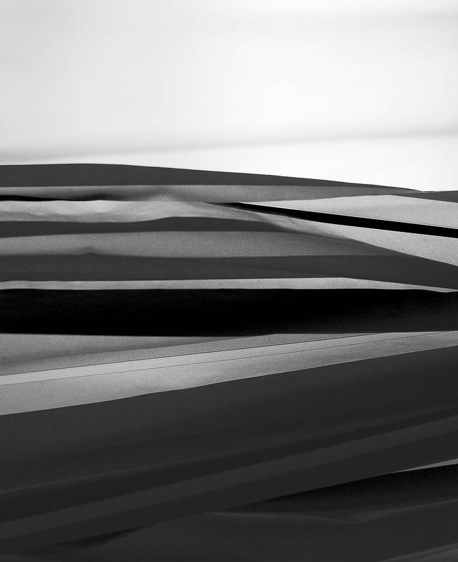
invisible Been spending a lot of time on here! Joined Mar 10, 2007 Messages 5,213 Reaction score 983 Location Canada Can others edit my Photos Photos NOT OK to edit Nov 14, 2012 #2 I like this but feel that some of the white area at the top needs to go the rest of the image looks too dark in comparison.
I like this but feel that some of the white area at the top needs to go the rest of the image looks too dark in comparison.
Derrel Mr. Rain Cloud Joined Jul 23, 2009 Messages 48,211 Reaction score 18,936 Location USA Can others edit my Photos Photos OK to edit Nov 14, 2012 #3 invisible said: I like this but feel that some of the white area at the top needs to go – the rest of the image looks too dark in comparison. Click to expand... Yeah...I get that same sense too. THis seems kind of "abstracty"...I really do not get any sense of what the heck it is that I am being shown...
invisible said: I like this but feel that some of the white area at the top needs to go – the rest of the image looks too dark in comparison. Click to expand... Yeah...I get that same sense too. THis seems kind of "abstracty"...I really do not get any sense of what the heck it is that I am being shown...
unpopular Been spending a lot of time on here! Joined May 17, 2011 Messages 9,504 Reaction score 2,004 Location Montana Nov 14, 2012 Thread Starter 🔹 #4 I think if I cropped out the "horizon" it'd just be a bunch of horizontalish lines.
Bitter Jeweler Been spending a lot of time on here! Joined Apr 27, 2009 Messages 12,983 Reaction score 5,003 Location Cleveland, Ohio Can others edit my Photos Photos OK to edit Nov 14, 2012 #5 Oddly, given my penchant for portrait orientation, I really like this in landscape, turned 90° counter clockwise.
Oddly, given my penchant for portrait orientation, I really like this in landscape, turned 90° counter clockwise.
unpopular Been spending a lot of time on here! Joined May 17, 2011 Messages 9,504 Reaction score 2,004 Location Montana Nov 14, 2012 Thread Starter 🔹 #6 pffft. why don't I just convert it back to color while I'm at it!
invisible Been spending a lot of time on here! Joined Mar 10, 2007 Messages 5,213 Reaction score 983 Location Canada Can others edit my Photos Photos NOT OK to edit Nov 14, 2012 #7 unpopular said: I think if I cropped out the "horizon" it'd just be a bunch of horizontalish lines. Click to expand... My suggestion was not to crop out the "horizon" but just part of the white section. If you did, you might also need to crop out some of the bottom for balance. It's a cool shot. I wish you hadn't told us what we were looking at.
unpopular said: I think if I cropped out the "horizon" it'd just be a bunch of horizontalish lines. Click to expand... My suggestion was not to crop out the "horizon" but just part of the white section. If you did, you might also need to crop out some of the bottom for balance. It's a cool shot. I wish you hadn't told us what we were looking at.
unpopular Been spending a lot of time on here! Joined May 17, 2011 Messages 9,504 Reaction score 2,004 Location Montana Nov 14, 2012 Thread Starter 🔹 #8 I didn't. Not even close.
Frequency Been spending a lot of time on here! Joined Oct 17, 2010 Messages 8,864 Reaction score 683 Location Calicut, Kerala,India Can others edit my Photos Photos OK to edit Nov 15, 2012 #9 i think the dark ribbon in the near middle must be faded so that eyes are not locked there; as a whole, i liked it
i think the dark ribbon in the near middle must be faded so that eyes are not locked there; as a whole, i liked it




 Not even close.