This kinda falls under design or editing or whatever but it's photography at the same time. Just want to know what you think. I'm thinking about using it to make business cards.
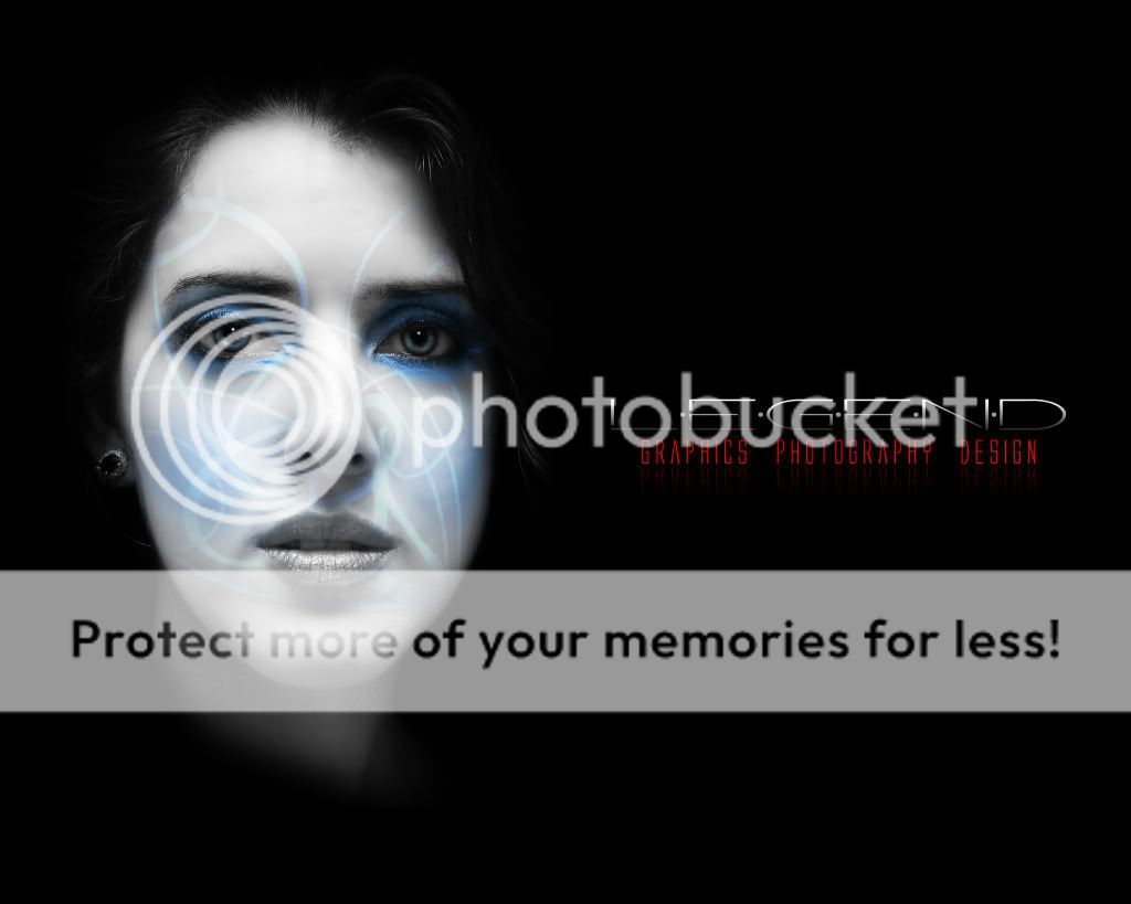
I can see what you're trying to do (sort of) but I think the squigly blue lines detract from the entire composition. All I keep doing is trying to figure out what they are and where they go...makes me feel like a rat in a maze. Maybe no blue lines, or LESS blue lines. Sorry - I don't despise it. But I can repost and say I do if you really need someone to
I don't despise it either, but I do find the lines distracting too. I see what you were going for but I think if the "design" element of the lines were over the entire card (very faint) it "may" be less distracting? Also what does it look like with blue text? (or maybe go for silver ) I do like it!
I'm kind of following along. So you guys think it will look better if the design was all over the card instead of just only the face?
i think the black is tooo black. I suggest emulating that squigly line pattern in the black to give it some depth. the font for LEGEND looks weak too-thicken it up.
but thanks for the post. Yeah, the font seems to be a little thin. Let me see how the I can do that design on the black.
burns??? limecat FTW well, unless you actually projected that light on her face, i'd take the lines [assuming it's a vector file] enlarge them over the black area, masking out the parts that hit her head and blur them a bit to allude to depth. Perhaps add a gradient to the black, a subtle one like 90% - 100%. Just play with it some more man...the girl and text are disassociated and need to be unified. That red font underneath might work better in electric blue so everything correlates. :burnout: