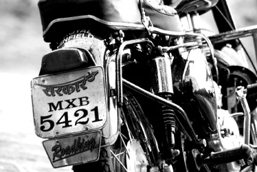
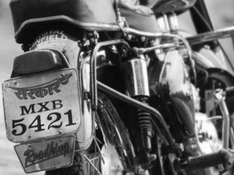
Well done. The crop is pretty unorthodox, but it works, I think. You've made the license plate the "subject" which works graphically just fine, but isn't that great content-wise, unfortunately. Not in love with the "kill the greys" high contrast look.
This is still a good image, very graphically strong and evocative of gritty/powerful/loud motorcycle goodness.
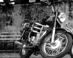
I see that you really like that space on the LHS (left hand side). I like the cropped version of the original, but you dropped the contrast and tone range!!! Also, it's a different image? The DOF is totally different...I like the first DOF better.
That's cool....but keep an eye on the balance of the image. You never want to feel like one side is heavier than the other...like the image itself will somehow flop over on its side.







![[No title]](/data/xfmg/thumbnail/31/31088-b509581dfd5e8b6b36c83266751654fc.jpg?1734159214)
![[No title]](/data/xfmg/thumbnail/41/41928-733459df56e3fa2fe957f910305d4e37.jpg?1734176286)
![[No title]](/data/xfmg/thumbnail/42/42276-99df5da06c3e5dc83ae4bab11e935910.jpg?1734176684)

![[No title]](/data/xfmg/thumbnail/42/42024-bf0604d67b26c7acb5e4d59254692618.jpg?1734176407)