What's new

Rule of thirds fail?

Heitz

No longer a newbie, moving up!
Joined
Sep 10, 2011
Messages
941
Reaction score
145
Location
Chicago, IL
Can others edit my Photos
Photos OK to edit
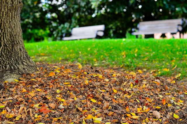
I kind of like this, but I kind of don't like it. Not sure why. Its got regions conforming to rule of thirds and several regions of vivid (and contrasting) colors. Opinions?
6212879775_a7f12fcb1b_z.jpg
 
I don't see a subject. There's a foreground and a background, but no subject.

Usually, violations of the Rule of Thirds works best by centering the subject, not moving it to the extreme edge. Now, all rules are meant to violated, so in some cases, pushing the subject off to the extreme works, but it needs to be clear what the subject is.
 
Agree it's hard to make out a subject. The leaves are in focus, but don't make an interesting subject. The tree and leaves could have made an interesting framing element - but it still needs a main subject to finish it off.
 
I agree with the previous two posts about the lack of subject. If you try and retake the photo with one, I'm sure it would turn out a lot better.
 
Hmm.. i dont want to live in Tennessee.. The grass is crazy!
 
I think the subject is supposed to be the tree trunk, but it's not really working.
 
I agree with Schwetty. The grass is SOOOOOOO green. It looks like you really cranked up the Vivid saturation a bit much.
 
What is the subject , you have left us quessing.
Centering the dominant image and being successful relies of visual weight being present surrounding that object.

The Rule of thirds, is a guideline to assist people in creating a better balanced image. Some take that principle to an extreme.

This is not just a guide line for photography, it is found in the art world, and usually refered to as the Golden Ratio. That ratio changed a bit with the use of 35mm film it's ratio, which is not the Golden ratio, but with a bit of creative exercise has been used for a very long time.
 
If the green was toned down from Nuclear plasma to fresh cut grass, the colors would be pleasing. But it does feel empty. It reminds me of using a long lens on a landscape to create an abstract image, but this isn't abstract enough to be in that class.... maybe that's what you were going for? Simply to display the color and texture in abstract?
 
The ROT is just one of many compositional guidelines, and I'm afraid you still have some gaps in your understanding of how the ROT and other visual image compositional guidelines are used to make pleasing visual images.

A good visual image also has an unambiguous primary image element that has sufficent visual weight to draw and retain the viewers attention.

The ROT works when an important portion of that unambiguous primary image element is placed on one a ROT power point.

Other than the nuclear blast saturation of the grass, your photo has no unambiguous primary image element, and nothing of interest at any of the 4 ROT power points.
 
its just leaves and grass.
 

Create an account or login to comment

You must be a member in order to leave a comment

Create account

Create an account on our community. It's easy!

Log in

Already have an account? Log in here.

Back
Top Bottom