thereyougo!
Been spending a lot of time on here!
- Joined
- Jun 1, 2010
- Messages
- 2,360
- Reaction score
- 2,180
- Location
- UK
- Can others edit my Photos
- Photos OK to edit
Two slightly different edits of the same shot
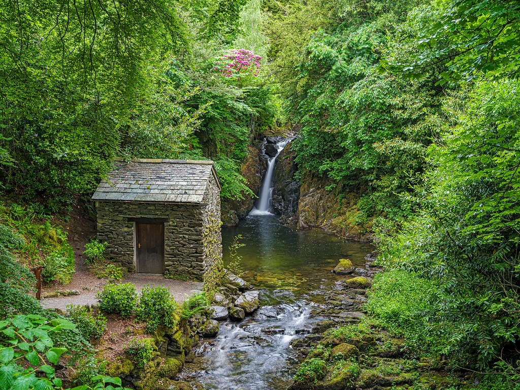
GFX100s GF 32 - 64 at 47.3mm ISO 250 0.5s Handheld
 Rydal Grot and falls by singingsnapper, on Flickr
 Rydal Grot and Falls 1 by singingsnapper, on Flickr
GFX100s GF 32 - 64 at 47.3mm ISO 250 0.5s Handheld
Rydal Grot and falls by singingsnapper, on FlickrRydal Grot and Falls 1 by singingsnapper, on Flickr


![[No title]](/data/xfmg/thumbnail/36/36302-6ee4929dfdf80290ffd73704693e860f.jpg?1734168631)


