jmandell
TPF Noob!
- Joined
- Jan 7, 2012
- Messages
- 133
- Reaction score
- 18
- Can others edit my Photos
- Photos OK to edit
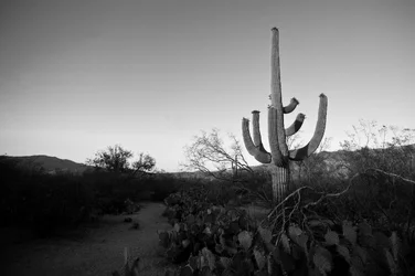
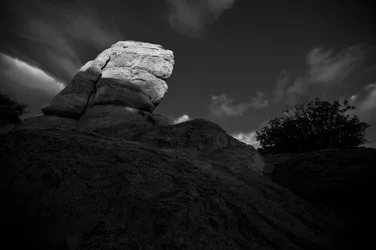
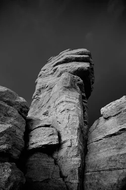
Here are a few shots from my trip to Arizona. The first 3 were from Saguaro Natl. Park and the last two were at Windy Point on Mt. Lemmon. All shot with a Nikon D700 and processed in Lightroom 3
1.
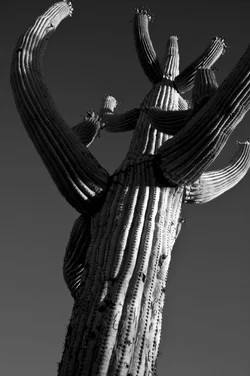
2.
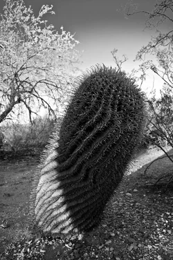
3.
4.
5.
My favorites are probably 1 and 4
C&C Welcome and Appreciated
1.
2.
3.
4.
5.
My favorites are probably 1 and 4
C&C Welcome and Appreciated
Last edited:






![[No title]](/data/xfmg/thumbnail/32/32981-27e3d29bfa5b1638f18299ec111c7b87.jpg?1734162931)