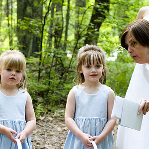
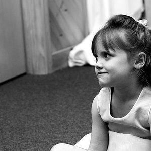
All the color and the direction of the eyes are all to the left of the image and just to close to the edge, feels like everything is bunched up there. I am fine with just B&W for the child, the child's look here is good, but the background is distracting with the line coming in just below the eye. Tuck in the tag of the shirt as it is white and draws attention away from the face. Instead of the vignette, I think some dodging and burning would add some depth to the face and rest of the image. I would go to a 4x5 crop in portrait, taking all off the back (right side of the image).






![[No title]](/data/xfmg/thumbnail/40/40309-c759bfd4ae7c079632e7402d21d332f1.jpg?1734174717)

![[No title]](/data/xfmg/thumbnail/39/39657-59afb9b38e439b33906e81e4952470ac.jpg?1734173973)