
Deon Reynolds
TPF Noob!
- Joined
- Oct 31, 2020
- Messages
- 26
- Reaction score
- 43
- Location
- New Mexico
- Website
- www.deonreynolds.com
- Can others edit my Photos
- Photos NOT OK to edit
I recently started scanning colour negatives. I’m not new to scanning film, but most of my experience is with B+W negatives then colour transparencies. When scanning transparencies, I become very aware of the colour palette from the brand/type of film I’m scanning. Mostly I’m scanning Fuji Velvia, if you are not familiar with Velvia, it has very saturated primary colours and skies that frequently shift magenta. With these scans I’ve been mostly successful neutralizing the “Velvia” look into a look that I feel is more natural. This makes me happy!
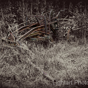
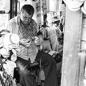
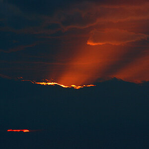
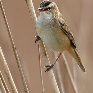
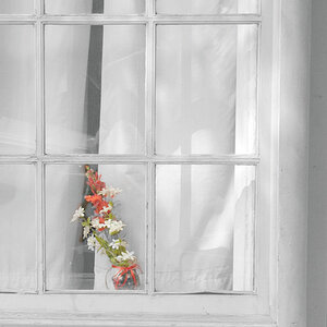
Now, I’m scanning colour negatives and again one becomes aware of the colour palette from that film. But, Here lies my rub. I don’t seem to be able to escape the palette. This image is about the best I’ve been able to accomplish, so far. I don’t think it looks bad, I just think it looks like colour negative film. I was hoping to get a more natural “what I saw” colour, like what I was able to accomplish with the transparency film.
Any thoughts of getting away from these colours? Or, do you think I’m I barking up the wrong tree? I don’t really mind the colour palette, I just though photoshop could escape them without it looking disastrously unnatural.
Thanks, Deon
My process: Kodak Ektar 100 film / Hasselblad 501 C/M 60mm CF lens. To scan, I’m on Mac OS 12.6 / Mac calibrated monitor, Epson V-700 scanner / scan bed. Silverfast 9 Ai Studio scan software, using Silverfast’s “Kodak Ektar” profile, I tried other profiles just for the heck of it, the correct one seemed the best (not always true with some films). I scan every image as big as quality allows using ProPhoto RGB colour space. I edit in Photoshop CC (24.0), after I straiten, and crop the image to the rebate edge and spot away dust and flaws I add in layers, Levels, then in Curves I open each colour channel and adjust each colour to get an overall colour cast I like. Then Hue/Saturation, going through each colour I “WAY” over saturate each colour so I can see what effect each colour has on the image. I adjust the hue (baby steps) if need, then desaturate back to normal, repeat for every colour. Last, I open Selective Colour going through only the colours I feel need help and adjust. Save with layers. The 40x40 scan with four correction layers = a 1.75 GB file. Oh, I almost forgot, when tasked with a daunting number of scans, working in photoshop becomes mind numbingly boring. So, I recommend loud music with a good base line. This is my audio speed to keep me on task. It also keeps people out of the studio, fewer distractions as no one likes my music…

![[No title]](/data/xfmg/thumbnail/39/39446-903cfeac143cee6330a51546ecfdda92.jpg?1619739035)

![[No title]](/data/xfmg/thumbnail/39/39442-c7791194bfea1b4d6bd382b004fb8488.jpg?1619739033)
![[No title]](/data/xfmg/thumbnail/35/35877-b537a0bce18fcb18b610d787610f3d3d.jpg?1619737203)
![[No title]](/data/xfmg/thumbnail/32/32433-abebb6cea0cf29d5f27d9054c7b0664e.jpg?1619735443)