What's new

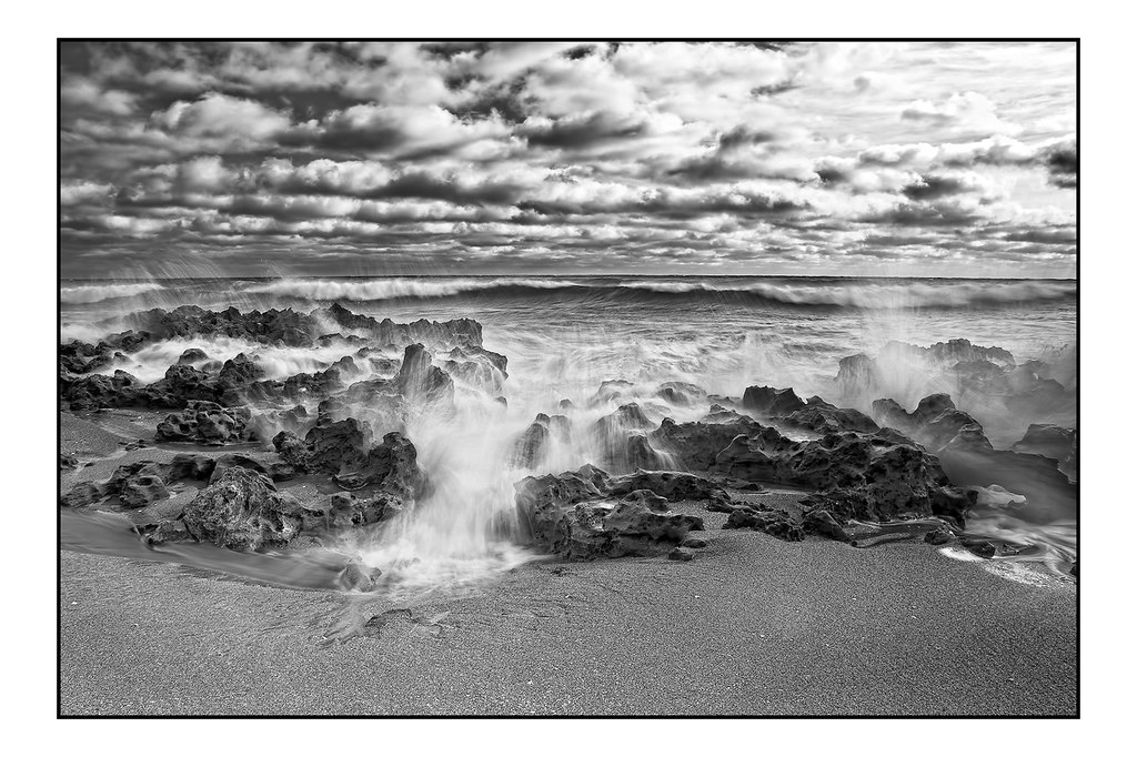
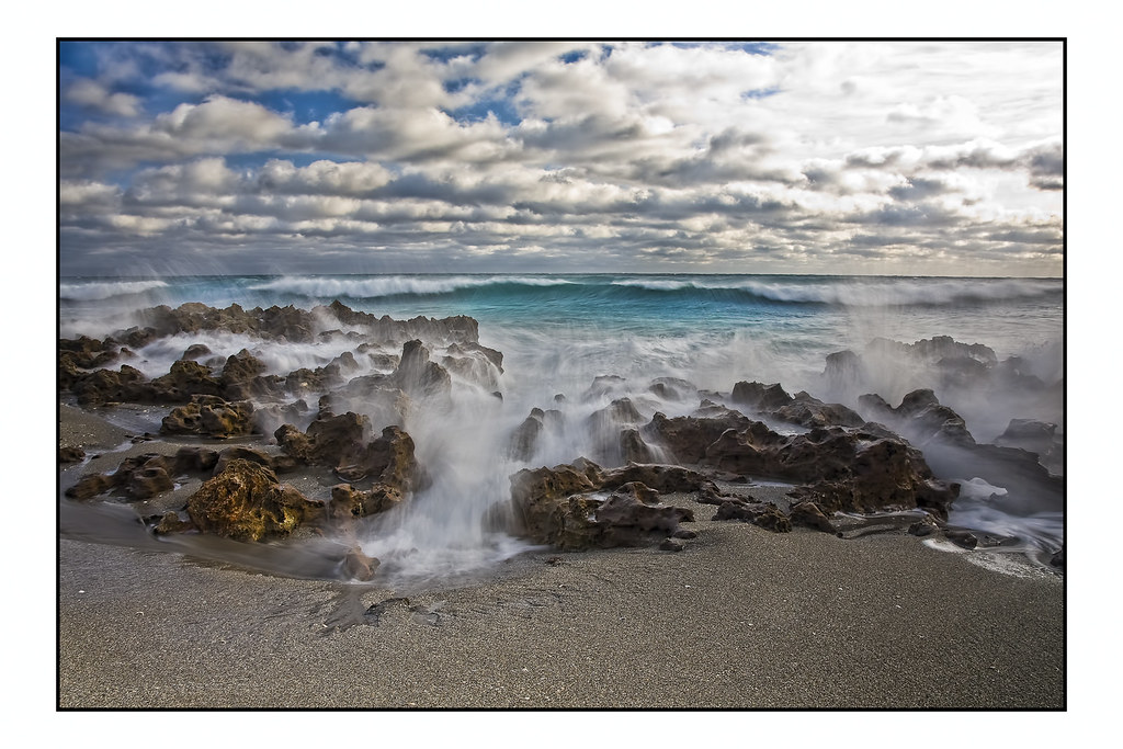
Seaside Drama

Very cool shot. Something about the PP looks off to me though. Is clarity bumped up a lot?
 
Love this work, love your creativity, wonderfully done!
 
Thanks for the comments everyone,,
Josh, the clarity is bumped a bit but not alot ;) :D
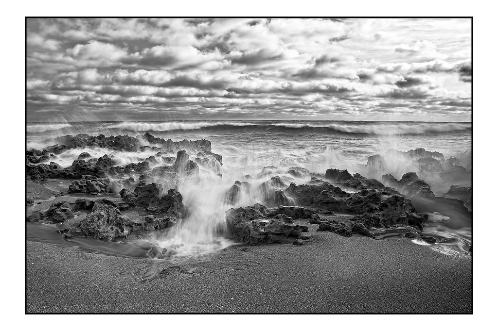
I redid the sky a bit on this one as I thought the sky was overdone in the first image :wink:


8b by jaharris1001, on Flickr
 
I like the rework a bit more than the first interpretation of the scene. This is one of my more favored of your photographs.
 
Your second edit is softer to the eye, being less contrasted in the sky. But if you are looking for dramatic sky, #1 is the way to go! Depends what was your goal. Personally, I like the epic sky best!:D
 
Thank you Derrel and Marc,
Derrel, I recognize your avatar, I think I know you from another site maybe ?? :D
 
This is the first time i felt your image very artificial; as if overworked, overnight :lol: On the left side i see another vanishing image ...some rocks or some thing.... i think its color version would be less contrasty and more impressive; but can't say until i see that ;sorry, i said that :blush2:
Regards :D
 
This is the first time i felt your image very artificial; as if overworked, overnight :lol: On the left side i see another vanishing image ...some rocks or some thing.... i think its color version would be less contrasty and more impressive; but can't say until i see that ;sorry, i said that :blush2:

Regards :D

Right now i saw this image from Richard and then i am almost sure the colour image of this would be wonderful; may i request you to show that ;)


Regards :D
Thank you for commenting :D :thumbup: :D and I always appreciate honest comments and critiques :D :thumbup: here is the color version of that shot


9a by jaharris1001, on Flickr
 
liked all three, but the first one I would put on my wall.
 
Ahh see I like the new edit better :) Good job.
Although now that I see the color version, thats probably me favorite. Great shot!
 
See i am busy voting for the colored original; please don't disturb me ;) ;) ;)

Regards :D
 
The first one is deffinately epic, but the color one made me notice the wave coming towards you. I didnt ever see it in the B&W. Just got lost in the water waves for me at least. Still i vote for the 1
 
Thanks gang :D :thumbup: there's aspects in all three that I like personally, hard for me to chose, I DO like the turquoise water colors but also like the drama of B&W,, Im a huge fan of B&W's ;) :D Thanks again for looking and commenting
 

Create an account or login to comment

You must be a member in order to leave a comment

Create account

Create an account on our community. It's easy!

Log in

Already have an account? Log in here.

Back
Top Bottom