What's new

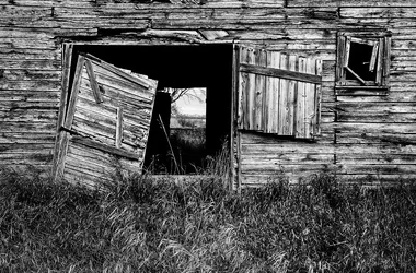
See-through

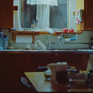
I definitely prefer the color image. The sepia toned one kind of bores me to be honest.
LOL, I wouldn't say it bores me but I definitely prefer the original colour version myself as well :)

Fantastic image. I like both but I think with a little more tweaking the B&W or sepia would be the stronger image.
Thanks much. If you feel so inclined, please do go ahead and edit the monochrome version to show what you have in mind.

Cheers, guys.
 
Thanks much. If you feel so inclined, please do go ahead and edit the monochrome version to show what you have in mind.

Cheers, guys.

Here is what I have in mind. Granted working with the low res jpg. Just an idea. Such a great capture so much to work with here. I can give details of what I did if you would like. Don't worry you won't hurt my feelings if you don't like it.

$p1243560602-4-2.webp
 
Don't worry you won't hurt my feelings if you don't like it.
I do like it, and I appreciate the time you spent working on it. My issue – which is why I went with a soft, low-contrast sepia – is that a high-contrast B&W brings out all the textures, to the point of almost being too much. It's OK to differ though :)
 
No Problem. I do tend to like mine a little contrasty....I just looked and pulling the contrast back a little does look a better and not as harsh on the wood.
 
Have you tried a high-structure option in Silver Effcts Pro 2? It would REALLY make the texture of the wood pop...
 
I like it dark - after all, dark and sepia are almost always good things. It makes me wonder if I would have liked the color image more if it were darker in the mid-tones like the bw. That could have been more of an issue for me than the color.
 
Regardless of what treatment you finally decide to use (it IS art, after all, so the important thing is that YOU like it!), I defenetly think you have a winner here. And as stated above, you have a great file to work with, so there are many paths you can take with it.
 
Have you tried a high-structure option in Silver Effcts Pro 2? It would REALLY make the texture of the wood pop...
I didn't. A high-structure edit would produce similar results to a high-contrast edit, in that the photo would have too many textures to focus on, to the point of being too much. So what I did was to apply structure to certain areas of the image locally in the colour version. That was partially lost in the sepia version, which I wanted to be softer overall.

I like it dark - after all, dark and sepia are almost always good things.
Ha!

It makes me wonder if I would have liked the color image more if it were darker in the mid-tones like the bw. That could have been more of an issue for me than the color.
I think I'm done playing with this image, but do go ahead (if you feel so inclined) and edit it to reflect what you have in mind, then post the results here.

Regardless of what treatment you finally decide to use (it IS art, after all, so the important thing is that YOU like it!), I defenetly think you have a winner here. And as stated above, you have a great file to work with, so there are many paths you can take with it.
Agreed, this scene can be edited in different ways. I'm happy with the original edit though :)

Thanks, guys!
 

Create an account or login to comment

You must be a member in order to leave a comment

Create account

Create an account on our community. It's easy!

Log in

Already have an account? Log in here.

New Topics

Back
Top Bottom