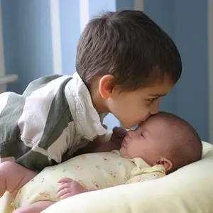
I'm not a big fan of selective coloring either...but I like it when it's used to draw attention to where you want the viewer's eye to go.
In this shot, you would probably want the viewers eyes to go to the subject's face/eyes...that is usually what you want in a portrait.
So in this shot, the selective color is drawing the viewer away from the face...to the flowers. IMO, this hurts the image.
For the same reasons, I think that her face is too dark and that she could use some catch lights in her eyes. When I look at this image, I'm drawn to the flowers and to the bright parts of her dress. That is maybe not a bad thing, but a really strong image would have more emphasis on her face.





![[No title]](/data/xfmg/thumbnail/39/39446-903cfeac143cee6330a51546ecfdda92.jpg?1734173536)