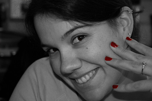
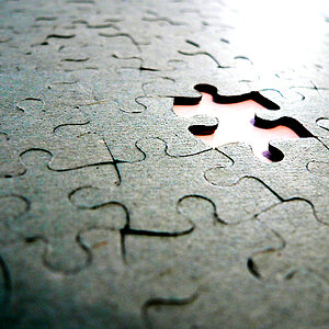
I think that with selective colouring most people concentrate on the colour bits and don't mind so much about the B&W part of the picture. I think that's the case here: to me the picture lacks contrast, it looks too gray. Maybe that's just personal taste but I think the picture would be better with more contrast.







![[No title]](/data/xfmg/thumbnail/32/32719-7d42e7d7077540fabb3fa0275a99899a.jpg?1734162364)
![[No title]](/data/xfmg/thumbnail/32/32929-22e23acc63d6ecb25e5ee941be87121f.jpg?1734162700)

![[No title]](/data/xfmg/thumbnail/32/32926-ec27ecead8c80d803404500d8f888dbf.jpg?1734162683)