Selective Coloring

FineWhine

TPF Noob!
Joined
Feb 25, 2011
Messages
18
Reaction score
6
Location
Texarkana, TX
Can others edit my Photos
Photos NOT OK to edit
Hi!

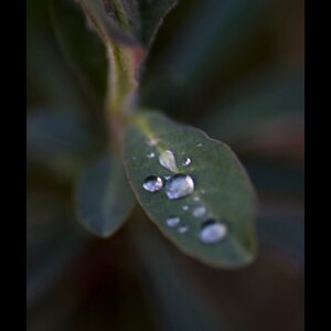
I had a quick question. I have a couple of "clients" (I like to call them that..but it's more of a "Can you take these for me?" "Yeah! I need portfolio shots!" kind of deal. So no money, but still what I like to do.) who are asking for selective color pictures.

I'm not one for doing these kinds of pictures. Mine are always either full color or fully monochrome. I'm not sure how to go about picking what parts to keep as color.

I know there are some of you who probably do this a lot or at least have some experience in doing it.

Do you have any tips on how to go about picking which parts to leave and what to do to make it more visually appealing?
Thanks in advance! :hug::
 
The problem I have with 99% of selective colouring is that the colouring takes away from the subject. Your eye is drawn to colour, so if you take two cute kids, turn the image black and white and then colour in just the hats, you have now made the hats the main subject of the image, when it's supposed to be the kids. Just because something is a bright colour doesn't mean it needs to pop even more.

People need to learn to take better images and use that colour in their shot to compliment the main subject, not take away from it.

That being said, I have a very hard time finding a use for selective colouring in pretty much any image. However, I do selectively desaturate some colours if I find they draw my eye too much. Take a nice city picture with a bright orange construction sign. That sign will draw my eye. While I could turn the whole thing to black and white, I can also chose to desaturate the oranges to dull down the sign and keep it on equal level of the rest of the scene.

On a last note, if you don't do selective colouring, don't do it. If you do punchy colours and contrasty black and whites, say to the client that you will do the shot, but not the processing as it's not your thing. You mentionned you wanted portfolio shots, so are doing this for free, so how can you justify putting in a selective coloured image in a portfolio when this is not something you normally do? Or would you just put the non-selectively coloured shot in the portfolio?

Gah, just avoid it all together IMO
 
Never do it because it is NAFF
Naff = A British colloquial form with the meaning 'inferior, tacky', originally from the Polari subculture.

While I do not like selective coloring, I think the original question can be interesting. Posed in this form: since it is technically possible to do it, is there a way to use selective coloring in an un-naff way?

Anyway, the reason for posting here for me was another: I never heard of Polari, thank you for having taught me something new (and related to my language, by the way).
 
That's what I'm wondering.. If there is, in your opinion, a way to do it that IS NOT tacky?
 
It's something that I feel like I need to master the art of making it not tacky. I'm stubborn..I admit it :p I want to make clients happy..and if that's what they really want, I don't mind taking a little extra time to do it. If that is what they want hanging on their wall..if I can do it in a way that I, myself, am happy with..then I want to do it for them.

But I just don't know how to get there :/
 
That's what I'm wondering.. If there is, in your opinion, a way to do it that IS NOT tacky?
IMO - the color part should be muted, or subdued. Desaturated. Just a hint of color. (Well, maybe (slightly) more than 'a hint' - but it should not be overpowering.)

I see a lot of really tacky selective color photos - and they all have one thing in common. Usually, the color part is just too vivid - over-saturated, and just over the top.

I believe that it is possible to have a well done selective color photo, and the way to do that it by not having too much color. The color part has to blend with the B&W part.


edit
Of course, there are times when you would want to do the opposite of what I just said, but I think those times would be in the minority. Use good judgement, and don't overdo it. If it looks bad, try desaturated the color part a little more. The 'vivid' selective color does have it's place, but you have to know when you use it. Most people go straight to that without even considering the subdued selective coloring. Trust me, the color will stand out - you don't have to make it stand out more by pushing the sliders all the way to the end.
 
Last edited:
That's what I'm wondering.. If there is, in your opinion, a way to do it that IS NOT tacky?

That's a really tough question. I've seen some selective colors that were tasteful, but EVERY one of them was fine art, not portrait. As has been mentioned, if everything is BW except one object that is colored, whatever that colored object is becomes the subject. The problem is, a lot of people seem to like the effect (the reason why the mall 1 hour portrait studios push SC so much). If someone were paying me, I'd likely do it, since it's a paycheck, and it's what the client wanted. But if it's for me, or for free, I won't do any effect that I don't think enhances the shot. With a portrait, SC is almost always going to make a shot worse than it was before.

If it were me, I'd just tell them that I have a particular way of processing, and it won't involve selective coloring. Also explain that since you're working pro bono for portfolio shots that are SC are not the type of shots you want associated with your work, and will be unusable for a portfolio. However, I'd tell them that I'd be willing to do BW, color, or even desaturated if they'd like.

I have yet to see a SC portrait that wasn't tacky. Mrpink's shot is close, and better than most I see, but my eyes are drawn immediately to the flowers. The child's eyes and face are more of an afterthought, instead of what should be the focus.
 
is there a way to use selective coloring in an un-naff way?
.

Anonymously

ohsnap1.gif
:lol:
 
That's what I'm wondering.. If there is, in your opinion, a way to do it that IS NOT tacky?

The only SC shot I have ever produced (after a lot of whining from my wife about wanting one)


A. 124W by Matt Francosky, on Flickr

I think it works.

Well, the flowers do pull the eye away from the bar through the child's head; if that's the effect you were going for, you got it.
 
I personally hate selective color, but will do it when a client asks (after telling them why I dislike it and don't offer it unless it is specifically requested).

I think the least tacky way to do it is with muted colors like PP said, and to never, ever do it on eyes. I have so many people ask for their baby's blue eyes in color and I do refuse that one. They always look like little vampire zombies.
 
I have seen selective coloring only work in one photo, which i don't have or know where to look for it. But it was 2 children standing over a goldfish in a bowl and the only thing that was colored was the tiny goldfish. You could almost not even see the color and it didn't take away from the children. It was only maybe 1 or 2 % of the photo and that is the only time i feel it has not been tacky. If you have to do it I would just really be carful with how much of the photo you are actually coloring.

I'd stay away from it if you can though.
 

Most reactions

New Topics

Back
Top