
Nikmal
TPF Noob!
- Joined
- Dec 6, 2012
- Messages
- 121
- Reaction score
- 21
- Location
- Minnesota
- Can others edit my Photos
- Photos OK to edit
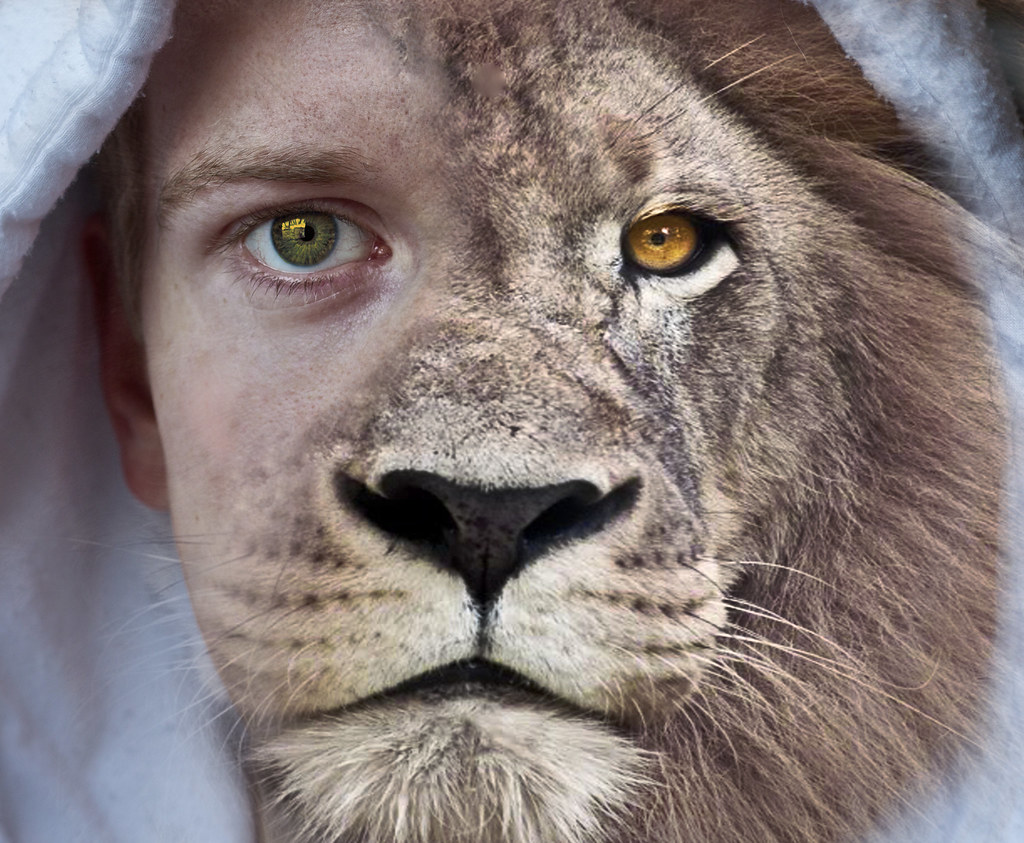
I agree it is very interesting and one I am interested in seeing further of. Is it kitsch as mentioned.. sure it is but none the less still kind of fun to see when well done. I agree that the selective coloring could go away and I think make the picture overall better in the long run. a Little more face (human I think would add a little more interest as well... not necessarily the nose of the face.. but maybe a little more cheek and such? Like across the bridge of the nose, a little more cheek and a lot more forehead. Bring a little of the human to the lion side and a little lion to the human side.
Maybe make the hood black/darker too?? I think that the white is a little distracting.
This is just my opinion for what it is worth
Cool effect
Editing to make one more comment. The lions forehead is a little out of shape from the human forehead. Maybe if you had more of the human facial forehead above the lions and therefor equalizing the overall shape of the entire face would make the entire face a little more cohesive?
Maybe make the hood black/darker too?? I think that the white is a little distracting.
This is just my opinion for what it is worth
Cool effect
Editing to make one more comment. The lions forehead is a little out of shape from the human forehead. Maybe if you had more of the human facial forehead above the lions and therefor equalizing the overall shape of the entire face would make the entire face a little more cohesive?


 ....
....




![[No title]](/data/xfmg/thumbnail/39/39447-6e7679723d775935851f055bae9712ba.jpg?1734173538)