Senior Pictures.. (Warning:Lots of Pictures)

Sinister_kid

TPF Noob!
Joined
Oct 12, 2008
Messages
215
Reaction score
0
Location
In The City
Can others edit my Photos
Photos NOT OK to edit
These are the couple of shots i took for some friends. The first girl was my first time ever shooting protrait style pictures. Hope you guys like them C&C welcome. And i do not have any special equipment, using a D80 with 18-135mm 3.5 Lens and onboard flash for fill light.


Mandy
1. Flash On
DSC_0478Resize.jpg

2. No Flash, Natural pose. She didn't even know i took this picture.
DSC_0487Resize.jpg

3. Flash on, yes i know the lighting isn't the best.
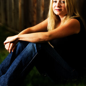
DSC_0490Resize.jpg


Paige
1. Flash On
DSC_0514Resize.jpg

2. Flash Off
DSC_0520Resize.jpg

3. Flash Off, He's a golfer hence the reason for the hole.
DSC_0533Resize.jpg


Cory
1. Flash On
_MG_0685Resize.jpg

2. Flash On
_MG_0659Resize.jpg

3. Flash Off
_MG_0631Resize.jpg

4. Flash Off, natural laugh.
_MG_0629Resize.jpg


Fabian
1. Flash On, Natural laugh
_MG_0664.jpg

2.
FabianArguero.jpg


Ian
1. Flash On
DSC_0041.jpg


The next two were purely for artistically pictures. Not for senior pictures.
2.
DSC_0035.jpg

3.
DSC_0036.jpg


Thanks for looking!
 
Are you charging for these?
I am guessing yes because of where you have posted.

This is a C&C and is not meant to hurt feelings, but is meant to help you improve.

I think almost all of them lack the very foundations of a portrait. The composition is all over the place or not there at all, Too much space above people and the faces are centered (Look Up the “Rule of 3rds”)
The white balance is all over the map, from Warm (Mandy 3)to cool(Corey 2) to green(Paige 2)

In almost all the images you have cut people off at the waist, wrist, elbows and knees. As a rule don’t cut through a joint that bends
 
Last edited:
Are you charging for these?

Ah you make it sound like i shouldn't have, lol.

But yes i did. I charged only 100$ per person and shot a good 60 per person. Which came out with about 15 shots that each person chose they liked.
 
Mandy:
1) Love the lines in the picture. Little too centered. Someones going on with here eyes and whole head from about mouth to eyes. They seem out of focus?
2) Could have used some fill flash. Actually, need some fill flash. Don't like the look on her face. Sometime a "candid" shot works, sometimes it doesn't. This one it doesn't. Sorry. Cars in background are distracting.
3) Harsh sunlight. Would have moved her camera left some. The sun peeking onto her top is just too much and takes away from her face. I don't like the backgroud either. Doesn't seem "clean."

Paige:
1) Good...actually really good use of fill flash. Background could have been more interesting but works nonetheless. He is way too centered.
2) Even with the flash off, I like this picture. Natural light worked. I'm a little iffy about the cut off hands. I would have moved back and zoomed in, popped some flash to get those hand in.
3) Lighting is harsh and WB is off. It's too warm. You have some purple going on in the white of his shoes also. Way too wide of a shot. This NEEDS more subject/background isolation. Move out, zoom in. You could have got enough shutter speed from the sun to not have to use fill light. The wide angle makes his feet look oddly large and very disproportional. The composition is good, but the isolation would have made all the difference.

Cory:
1) With shots like this, you need an external flash and either a flash bracket to the the flash above the lens or a SC-29 sync cord to get the flash OFF the camera. That flash behind him look bad. I don't like the conrete pillar either
2) Nice shot. Nice composition. I wouldn't have had him cross his arms though. He looks un natural like that. Having a wider shot with him on the right 1/3 of the frame and his arms on the back of the lift chair would have been better.
3) Good composition but the jacket/coat is almost washed out.
4) Too....WAY too centered and there's a tree growing from his shoulder. Watch out for that in future shoots of things growing out of people

Fabian:
1) Good. A "non-natural" laugh or just a smile would have been better.
2) Not working for me at all. Looks like he said "Huh?" and you took the picture


Ian:
1) Once again, subject is too centered both vertically and horizontally. Way too overexposed, unless this was what you were going for.
2 & 3) Wonderful shots. What lighting were you using for these or were the effects all in post processing. It's funny you said these are just for artistic purposes but these are probably the best out of them all. Great lighting and composition. Definitely something different that the senior and their parents would like. With all this said, I don't think the serious look of him works for these shots. I think a slight head down and looking up tot he camera would be good or just a face and eyes straight at the camera.

All in all I think you could use work on using more rule of thirds. Most of your shots are really centered. Some good use of fill flash is seen but I think investing in an exteral flash would be better. (It's always fun to spend someone elses money!) Seriously though, something like an SB-600 which can be really inexpensive would great improve all of your shots, especially since you seem to like shooting outdoors and are using alot of fill flash.

Take my advice with a grain of salt, or seriously but it's just my 2 cents.

I hope you like it though

~Michael~
 
Thanks for the input guys. yes most of the shots could use work. But the clients and their parents both liked them, which is mostly what i was going for. I plan on doing this next year for next years seniors so i will definitely be trying to improve by then, and definitely buying an external flash ;)

Also,as a side note. these were just what came out of the RAW, not what i gave to all the seniors. I cropped them down some before sending them off to the yearbook.
 
Wow...I started off looking at the Mandy photo, of her underneath the pier, and thought "not too bad, maybe click in + .5 exposure or so, but not too bad," and then by the third photo with the wonky white balance, things started to go south. I hate to pile on, but your framing choices, with all the dead space at the top of verticals is too much for me to take. Ian #1, cropped off at the wrists is a good example of how not to shoot a half-body portrait. Ian #3, portrait of a brick wall, leaves me without words. The shot of the kid on the golf course, with the flag--that shot has an actual "reason" for having so much space at the top, and along with the Mandy under the pier shot to open up the post is probably the strongest senior portrait you have.

Some serious work reading some books on portraiture would truly help you. This is the professional gallery...
 
But the clients and their parents both liked them, which is mostly what i was going for. I plan on doing this next year for next years seniors so i will definitely be trying to improve by then, and definitely buying an external flash ;)

Also,as a side note. these were just what came out of the RAW, not what i gave to all the seniors. I cropped them down some before sending them off to the yearbook.

OK as long as you are happy with they turned out "OK". I am sure you will find soon your customers will not be.

The fact thst you do not even have an external flash tells me you are not ready to be charging people, you do dont have the right equipment to do the job.

And if this is not the final produt why post them, show us the finished images.

I am sorry if this sounds harsh, but I like to think when posting in the pro section you need to have a stronger C&C.
 
Well, you seem to have a natural sense of what is a good setting for portraits, but yeah.... you need to learn about lighting for portraits and posing basics. It's not rocket science, and I believe you'll pick it up quickly. But you do need some instruction.

Good luck, and have fun!

-Pete
 
Are you charging for these?

Ah you make it sound like i shouldn't have, lol.

But yes i did. I charged only 100$ per person and shot a good 60 per person. Which came out with about 15 shots that each person chose they liked.

:shock: I really wish I could find something to say, but I think I'm speechless.

(If you're wondering why I'm posting, it's because very few things leave me speechless so it's worth noting). I'm still in awe.
 
Also,as a side note. these were just what came out of the RAW, not what i gave to all the seniors. I cropped them down some before sending them off to the yearbook.


Then why did you post these for C&C in the pro section. If you want help or direction with a finished image then I think you should post the finished image. Otherwise the question becomes '.. hey guys, what would you suggest I do for cropping and processing?'

Just me being grumpy but still a fair question don't you think?

Pat
 

Most reactions

New Topics

Back
Top