^^^What he said. Exposure is no different.
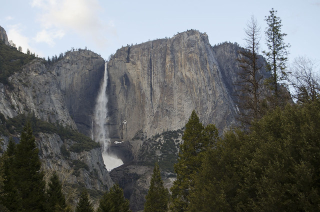
If you're shooting digital and converting to monochrome, there's more to it than just turning the saturation down, though. Here's a shot of Yosemite Falls I took back in March 2013. It being Yosemite, I wanted to go all Ansel Adams with it. (As if I
could...)
This is with the saturation zeroed out, no color. Yes, it's now black and white, but dang, it's dull!
Photoshop lets you adjust the levels of primary and secondary colors while you convert to black and white, with Image --> Adjust --> Black and White. You get sliders for red, yellow, green, blue, cyan, and magenta. Experimented a bit, ended up dropping cyan and blue rather sharply, red a good bit, and bumped yellow up quite hard, ended up with this. Cyan and blue dropping gave me the sky. Turning red down gave me the rock face, and turning yellow up gave me the trees. Yes, yellow, not green! There is NO brightness/contrast or levels adjustment between the two monochromes, although I did have to brush out some pixellation that happened in the sky when the blue and cyan came down. The tool also lets you tone the image, with a full range of saturation and tint adjustment for the applied tone, if you want something like sepia. I'm not showing that here, though.
And some subjects are so close to monochrome, you just go with it. This is a full-color image: