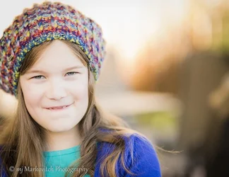
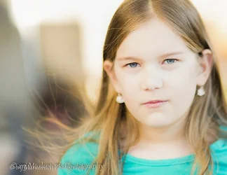
I would bring down the exposure on the second one just slightly. Some of the texture in the skin and the defining lines in the face (around the nose and eyes) are beginning to get a little faint. The first one would be good for copy, because of the space on the right. I'm not sure if that's what you're going to use it for, though. If it's not going to be used for copy, I wonder if it might feel a little more balanced by using a 2:3 crop.
I like them both, though, taking these two points into consideration.




![[No title]](/data/xfmg/thumbnail/42/42257-4c4b35d60337b1b4ec661332486a33be.jpg?1734176633)


![[No title]](/data/xfmg/thumbnail/36/36393-86ce601930c671b92b6df002b7fcbd0b.jpg?1734168775)