What's new

Sie9el?

er111a

TPF Noob!
Joined
Jan 30, 2008
Messages
1,896
Reaction score
6
Location
Virginia
Can others edit my Photos
Photos OK to edit
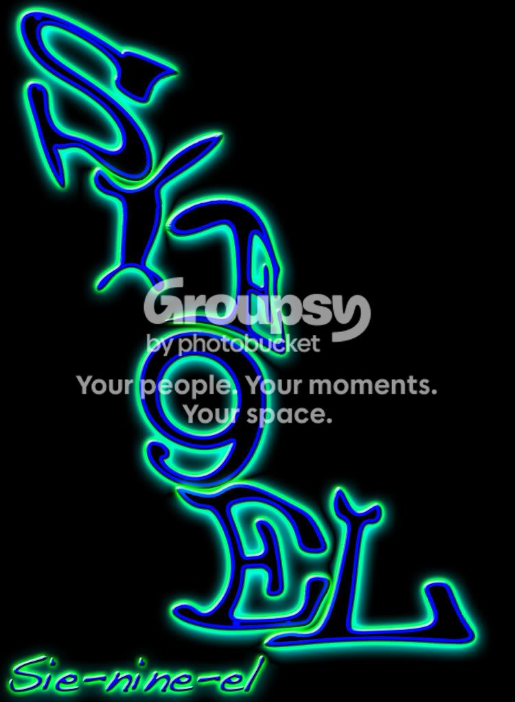
what do you think of that as a company name, such as Sie9el(pronounced Sie-nine-el) photos?
Sie9el.jpg
 
Last edited:
:confused::shock::raisedbrow::crazy::scratch:
 
A company name that no one knows how to say generally isn't a good idea :P
 
Oh, he's finally gone pro and started a business.

Cool beans!
 
A company name that no one knows how to say generally isn't a good idea :P

Nikon seem to get away with it :lol:


However in all seriousness how many companies do you know that use a random number to replace proper wording? Not many most select a name that is either a family name or something that is easily spelt and spoken - thus far easier for people to remember and to search on.
 
Oh, he's finally gone pro and started a business.

Cool beans!
haha bitter you just made my day I have a good friend that always say cool beans.
And I was just seeing what yall thought, I thought it looked cool because my last name is Siegel haha
 
added an example photo
 
Your example image of a logo really works against itself in every aspect of it's creation. For one, the name. The name is not good, not good at all. In fact it's bad. No one would think to pronounce it that way. This is what is going to represent you in the photography world, not your Xbox Live Gamertag. Secondly, the design you made is not only in a hard to read font, it also looks like a captcha which are DESIGNED TO BE HARD TO READ.

For example, if you wanted See-Nine-El, why not go with C9L? Same thing, right? Still not a good name to represent your photography body of work. Don't just throw in numbers because "you think it looks cool". If it doesn't have a purpose or meaning, it's useless.

 
I thought the name was pronounced "Senile" before I saw your pronounciation guide. (You wouldn't want the pronounciation on your logo, either.)

However, if we're only talking about the logo, I think you'll want to simplify it. 3-d text is generally not a good idea for logos. Neither is a black background. Think logically. You want a logo that will look good on a business card, letterhead, as a watermark, and various other uses like posters, etc. The logo must function the same resized small (business cards) and also be readable as well as bigger (billboards). Your logo only works if placed on black backgrounds or as a distracting contrast on a white background. Think of something that's not so full of movement. Remember, you'll want it to accompany your work, not be the center focus.

Also, think about the message your font sends. Font really tells a lot about the project. The font you chose sends a message about graffiti. As a photographer, would you say your photos are "street art"?

Just a few things to think about! :)
 
Thajal o oso ldsmfk ldlll slf'd kdhdleu lsjdfh lsj lsjshsk lk. Dldlsl aksdjfh? Adldj jdj jsjksjk akkdjkkf kdjklkdnfbgk! Dldkdk? :lol
 

Create an account or login to comment

You must be a member in order to leave a comment

Create account

Create an account on our community. It's easy!

Log in

Already have an account? Log in here.

New Topics

Back
Top Bottom