

DanCanon
TPF Noob!
- Joined
- Nov 19, 2008
- Messages
- 145
- Reaction score
- 4
- Location
- Mpls, MN
- Can others edit my Photos
- Photos OK to edit
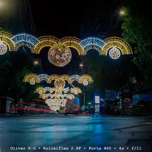
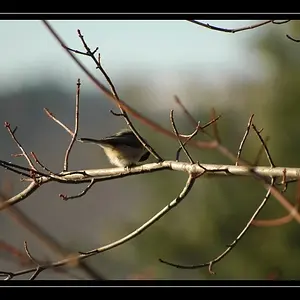
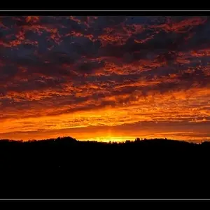
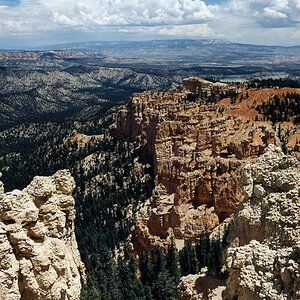
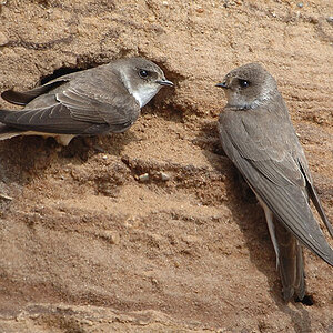
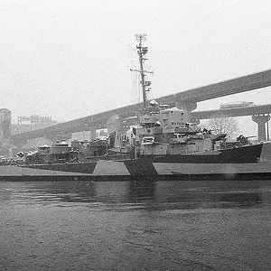
This is the same image just processed differently each time. I'm looking to get feedback about which, if any, you like best. Also which orientation is most pleasing to the eye. Let me know what you do/don't like or don't be afraid to tell me it's nothing special.
#1
#2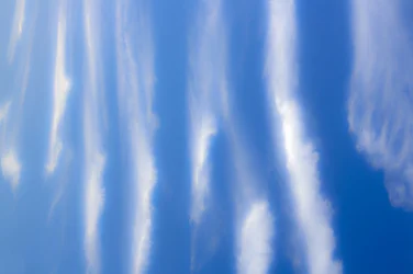
#3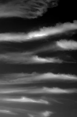
#4
#1
#2
#3
#4
Last edited:




![[No title]](/data/xfmg/thumbnail/31/31978-02cde49248ebdf1b82fba5c899e08378.jpg?1734160755)
![[No title]](/data/xfmg/thumbnail/31/31979-ea92aca54ae865842d998c9cec534991.jpg?1734160756)