echoyjeff222
No longer a newbie, moving up!
- Joined
- Jun 27, 2010
- Messages
- 643
- Reaction score
- 140
- Location
- WA
- Can others edit my Photos
- Photos OK to edit
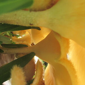
Hi all,
Been working on creating a soft flower look for awhile now. Was inspired by Jarmila Vymazalov 500px
Spent a few hours today trying to get the shot I wanted. I have no clue how this fern decided to wrap itself around that flower like that, but it definitely helped me out!
I have a few different crops that I'm trying out on this. I'm not sure which one I like more. I'm leaning toward the original because of the top left water drop. Thoughts?
I also spent awhile trying to figure out what colors would go with one another. I think these shades of yellow and green work?
Also any comments on the overall pic are welcome, thanks!
original:
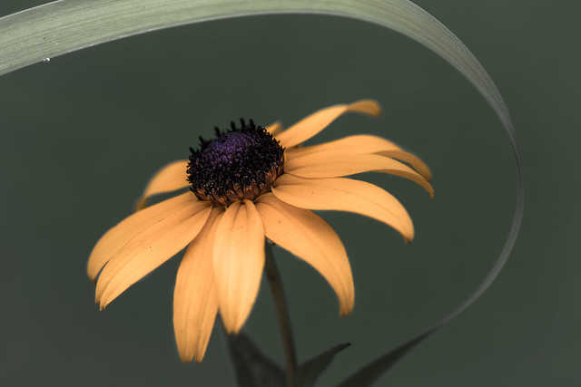 IMG_4791 by Jeffrey Lee, on Flickr
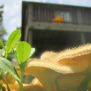
crop1:
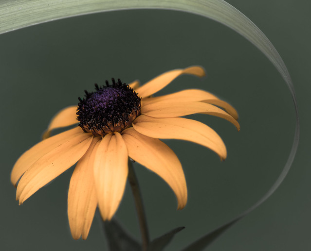 IMG_4791-4 by Jeffrey Lee, on Flickr
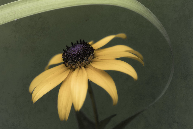
crop2:
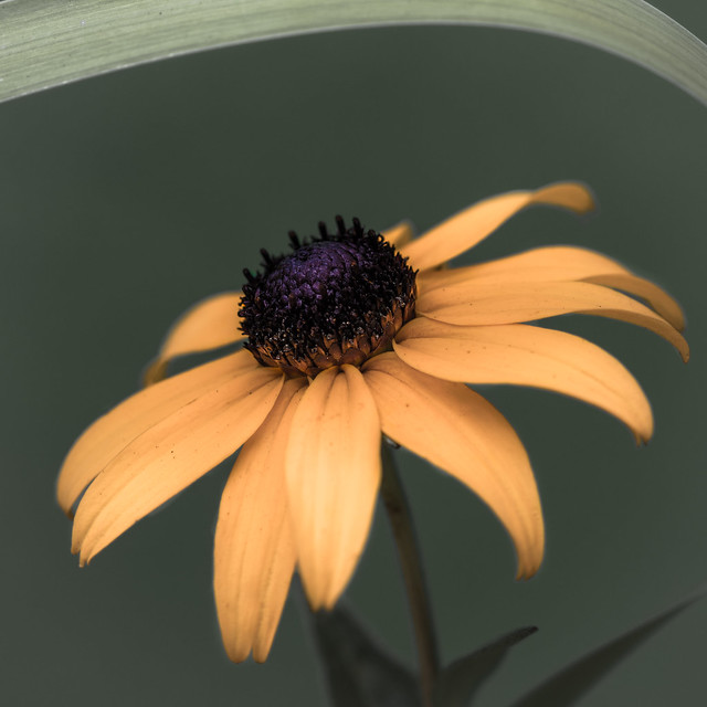 IMG_4791-3 by Jeffrey Lee, on Flickr
Been working on creating a soft flower look for awhile now. Was inspired by Jarmila Vymazalov 500px
Spent a few hours today trying to get the shot I wanted. I have no clue how this fern decided to wrap itself around that flower like that, but it definitely helped me out!
I have a few different crops that I'm trying out on this. I'm not sure which one I like more. I'm leaning toward the original because of the top left water drop. Thoughts?
I also spent awhile trying to figure out what colors would go with one another. I think these shades of yellow and green work?
Also any comments on the overall pic are welcome, thanks!
original:
IMG_4791 by Jeffrey Lee, on Flickrcrop1:
IMG_4791-4 by Jeffrey Lee, on Flickrcrop2:
IMG_4791-3 by Jeffrey Lee, on Flickr")
 .
. white gradientfinal
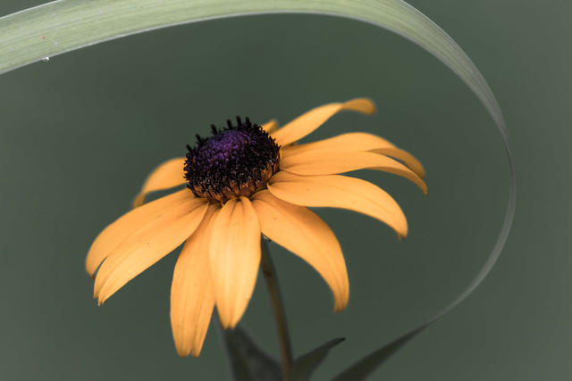 vignettefinal
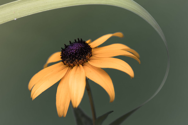 warmthfinal

 with texture 2
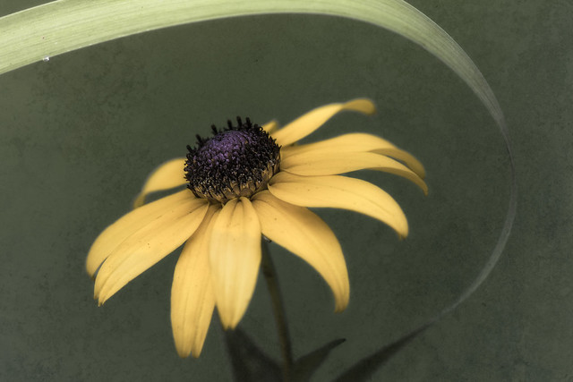 with texture and brightness
![[No title]](/data/xfmg/thumbnail/42/42040-7a66cabbeffd44783ea44a91ef4d0e70.jpg?1619739987)