What's new

Softness

mooseluver24

TPF Noob!
Joined
Nov 5, 2009
Messages
45
Reaction score
1
Location
Maryland
Can others edit my Photos
Photos OK to edit
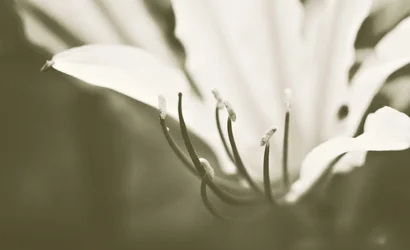
I don't work with black and white very often as it just doesn't appeal to my senses, but occasionally I will play with it. What are your thoughts?


$Lily copy.webp
 
I don't really think this works. There is very little contrast, no blacks and no whites...just grey.
 
You're going or a soft look, hence the predominance of greys rather than lots of contrast. Unfortunately it looks more like we're peering through a veil than it does a soft image. I would push the contrast up a little, and push the brightness down. Better to lose the whites than the blacks in this image, I think. I will accept that the flower is dimly lit, but not that the shadows are this super pale grey tone. Try for a more natural look overall, somehow? Leaving most of the action in the greys, and leaving things relatively low contrast is a good idea, I think it just needs a little refinement before it really sings here.

 
Thank you. That is why I came to this site. The critique helps me learn. Thank you for your honesty.
 
You're going or a soft look, hence the predominance of greys rather than lots of contrast. Unfortunately it looks more like we're peering through a veil than it does a soft image. I would push the contrast up a little, and push the brightness down. Better to lose the whites than the blacks in this image, I think. I will accept that the flower is dimly lit, but not that the shadows are this super pale grey tone. Try for a more natural look overall, somehow? Leaving most of the action in the greys, and leaving things relatively low contrast is a good idea, I think it just needs a little refinement before it really sings here.

Amolitor, would you mind checking back in a little while? I would like to re-vamp and get your opinion on a redo.
 
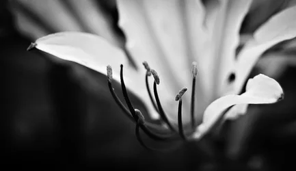
Ok, do we like this more or even less? Newbie to B&W so any critique is more than welcome!

LilyCopy2.jpg
 
I don't work with black and white very often as it just doesn't appeal to my senses, but occasionally I will play with it. What are your thoughts?

Not everyone likes monochrome right out of the box. May I suggest that you check out a few books from the masters of monochrome, such as Ansel Adams, for instance. Notice how there is a wide range of tone. Digital won't simply give that range to you without some work, but it can be a goal to work toward.

Furthermore, not every scene is best portrayed in B&W. After some practice, you can learn to recognize what will look good in B&W. I used to have a glass that helped me to visualize a scene in B&W, but I don't know where it is now.

As to this photo: The focus is very narrowly on the staymens, but is way off on the petals, and the framing cuts off the flower petals. Consequently, it has very little interest for me.
 
this is better but I wish I could see more details in the petals.
 
Thanks for you response Designer. While I have viewed some of Ansel Adams work, I must admit that I have not delved to deeply into his art. I will give his photography a closer look.
I greatly appreciate your critique.
 
Paigew, my intention was to focus on the staymens as Designer pointed out. Due to the fact that multiple people have now stated that they don't much care for it, I will take care to work on bringing more focus to the petals as well. I was going for a soft background of petals hence why they are greatly unfocused.
 
To me, it isn't the fact that the petals are out of focus, it is that they lack any detail. You can sort of make out the ridge in the middle of the petals and I think bumping contrast might help. Can you post the original for me to edit?
 
Why don't you try some sort of soft filter, diffuser. Maybe you would like it better. If you don't have one on hand try some piece of nylon stocking stretched over the lens front element. Also use softer light. Just experiment a little, this type of photography is bit different from regular let say street shooting, is more about creating a conditions in order to get, what you want.
 
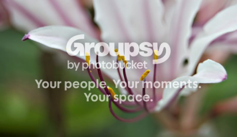
Gladly Paigew. Here is the Original (Kinda. The orig is too big so I had to upload to from photobucket - Hence the slight dinginess)

lileorig.jpg
 
okay here is my try at it. I increased contrast. did some curves adjustments, darkened shadows brightened highlights. and added more magenta to help bring out the petals.
 

Attachments

  • $lileorig.webp
    $lileorig.webp
    25.4 KB · Views: 101
I still like your color version better though ;) I think it is really pretty in color!
 

Create an account or login to comment

You must be a member in order to leave a comment

Create account

Create an account on our community. It's easy!

Log in

Already have an account? Log in here.

New Topics

Back
Top Bottom