ajones7279
TPF Noob!
- Joined
- Feb 26, 2011
- Messages
- 10
- Reaction score
- 0
- Location
- NC
- Website
- www.flickr.com
- Can others edit my Photos
- Photos OK to edit
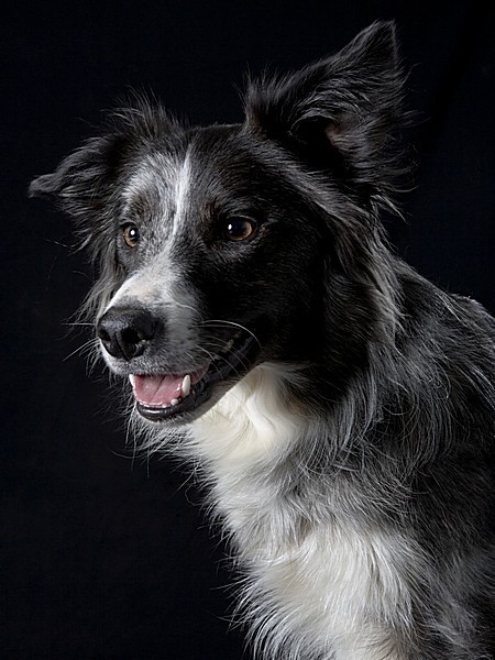
I like the third one. You can see more detail in the hair.
Follow along with the video below to see how to install our site as a web app on your home screen.

Note: This feature currently requires accessing the site using the built-in Safari browser.
")
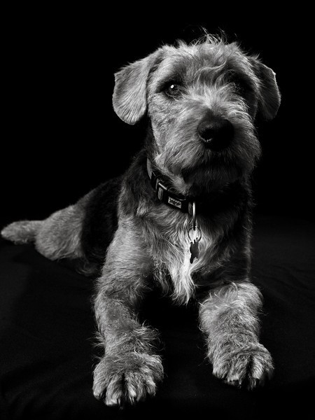
Rafal said:As far as composition goes I like #1 the most but it does look a little over exposed. I'm a begginner so don't take it to seriously, but maybe if you have a little darker background you exposure would come out better.
You are correct...you are a beginner. And you're giving out false information! Having a dark background isn't going to do anything with her exposure. You shouldn't go around giving info out, if you don't know what you're talking about.
That being said...the exposure look fine lol.
Kmh...look at the color picture...it's not BLOWN out. It's white hair lol...you're not going to see fine details in white hair when converted to B&W.
Plus, had she exposed for the white chest hair to be darker, the face (predominantly black) would be way underexposed. And since the face is the focal point, she exposed as good as she could.
Rafal said:As far as composition goes I like #1 the most but it does look a little over exposed. I'm a begginner so don't take it to seriously, but maybe if you have a little darker background you exposure would come out better.
You are correct...you are a beginner. And you're giving out false information! Having a dark background isn't going to do anything with her exposure. You shouldn't go around giving info out, if you don't know what you're talking about.
That being said...the exposure look fine lol.
thanks, I was thinking the same thing, plus with a darker background I was thinking I would lose detail on his darker fur (he would blend in). As you can see, the white fur is blown in the bottom left corner. I was trying to get as close to perfect exposure as I could for his face and had to sacrifce his chest area.
here is a colour version of #1
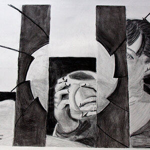
![[No title]](/data/xfmg/thumbnail/31/31753-281132967af6a422c89bcc0d6f16499a.jpg?1619734991)
![[No title]](/data/xfmg/thumbnail/31/31979-ea92aca54ae865842d998c9cec534991.jpg?1619735137)
![[No title]](/data/xfmg/thumbnail/39/39446-903cfeac143cee6330a51546ecfdda92.jpg?1619739035)
![[No title]](/data/xfmg/thumbnail/31/31978-02cde49248ebdf1b82fba5c899e08378.jpg?1619735136)