Some of my better ones for C&C

aprhockey

TPF Noob!
Joined
Jul 19, 2010
Messages
83
Reaction score
0
Location
Montreal
Can others edit my Photos
Photos OK to edit
So far I think these are some of my better pictures, but I'd like to know what I can do better. These are all straight from the camera. Any critique is appreciated. Be harsh.

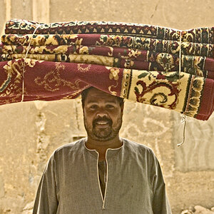
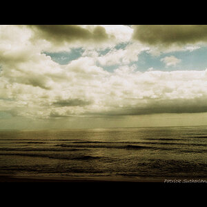
1. Simply converted to B&W in camera. I know most would say that is a bad way of doing it.
f/8, 1/2 sec, ISO Hi1 (3200?)
5072606705_a5e5599329_z.jpg


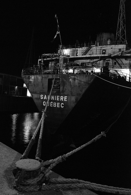
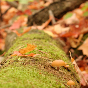
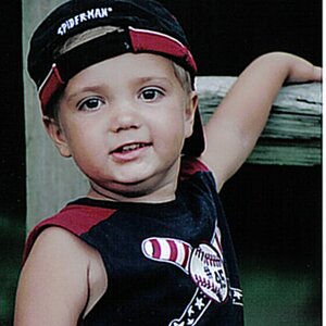
2. f/3.5, 1/50 sec, ISO 200
5072604185_fc9e33f035_z.jpg


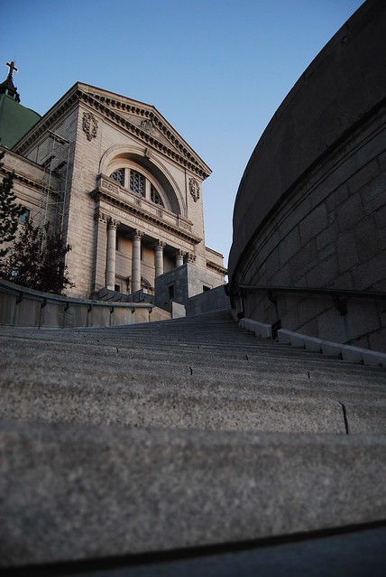
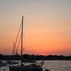
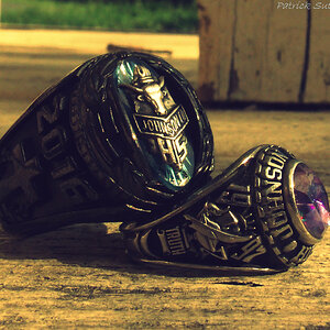
3. f/8, 1/400 sec, ISO 200
5072602889_453de8b457_z.jpg


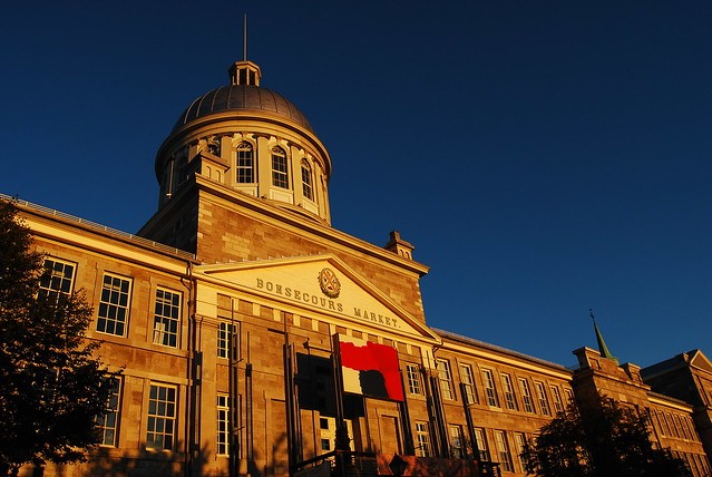
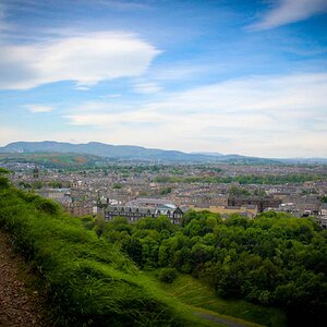
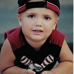
4. f/3.5, 1/3200 sec, ISO 200
5016173713_62fabab371_z.jpg
 
I really like them all. On #1 the light on the left side of the boat is a bit distracting but the reflection in the water works. With #4 I might crop the bottom just a tad, while still leaving a portion of the line. All in all, very nice. I haven't been to Montreal since I was a kid.
 
I also like them all, especially the compositions. No. 3 has a yellowish caste (IMHO) which I tried to fix in PS-> Levels-> Color Balance...

aprhockey03.jpg


FWIW, the "improvements" to the other three were minimal with #4 being the next in line...

aprhockey04.jpg


No. 2 might have benefited from a Graduated Neutral Density Filter. I'm guessing cause I have only heard about them. I tried that effect in LR but couldn't get it right.

What camera/lens did you use?
 
Last edited:
camera obscura: I agree with the yellow caste on 3, though it was pretty much how it looked in reality. I should cool it down a bit. Does the sky's color in your edit look a bit fake though? Also, do you mind telling me what you thought was wrong with 4 to warrant the edit. White balance?

Does anybody think #2's composition is too tight? I wasn't liking it at first but it has started to grow on me.

Lazy Photographer: Thanks. I agree about that distracting light. Maybe I can darken it a little in post just so it's not so bright.

Anybody else have critique?
 
Now that you mention it, it does look a bit fake. I would tone that down a bit. Nice contrast to the dome though.

Yes, correction for white balance was the only thing I did to #4. Nice shot.
 
I love em all especially the perspectives and how it created leading lines....i don't have anything new to say though other than what is already been said
 

Most reactions

New Topics

Back
Top