Just a beginner but I've noticed some things on this forum, people tend to number their pictures so that when they critique they can refer to a particular image.
I'm no professional but I can certainly tell you what I do and don't like.
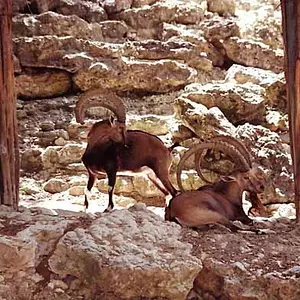
Photo 1: Really like it, what aperture were you using though as I think I'd have liked it if more of him was in focus. I like the way he kind of blends into the background, but at the same time I feel that he ought to 'pop out' a little more.
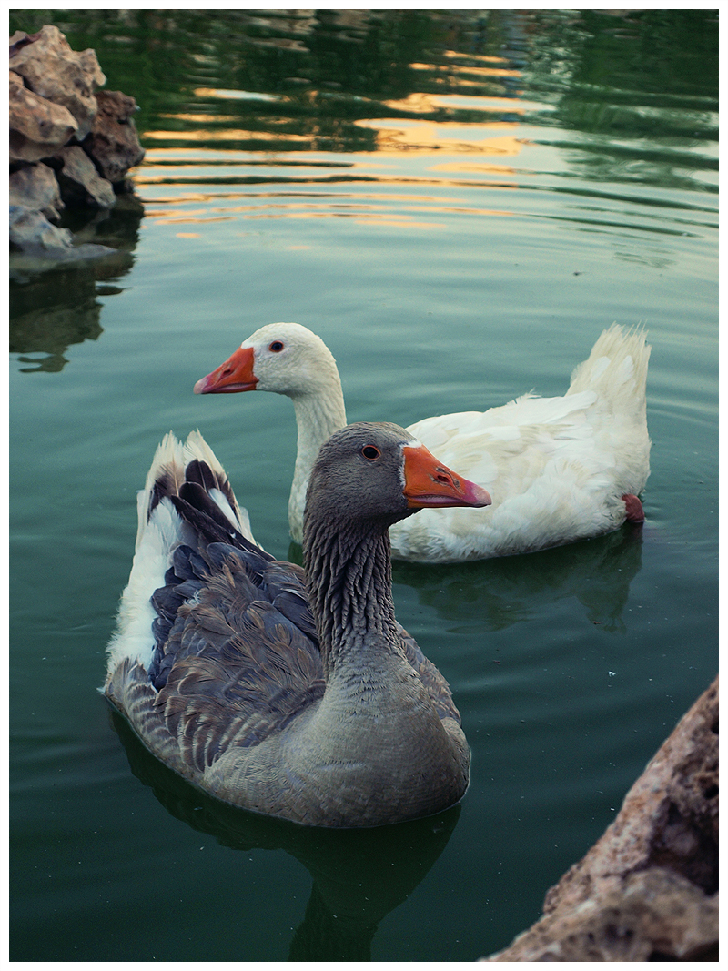
Photo 2: Simple but awesome, I like the way that they're facing different directions. One thing I'd have wanted different though is that the grey ducks reflection is cut off, and the rocks in the foreground just seem to be there, they don't add anything. I think if you'd have taken it at an angle where you'd got the entire reflection and a different angle on the foreground it would have been nicer.
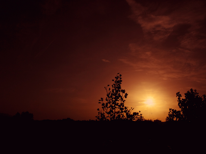
Photo 3: Once again very nice, liking the clouds and the colours. If those are building I see on the horizon then I don't like them and they need to be chopped out

And I feel that the silhouettes need to be darker, at the front you can see a bit of detail which throws it off. I think it would have been better with almost no foreground, or just the silhouette of a single tree. I feel that it's the weaker shot out of the 5 you've posted.
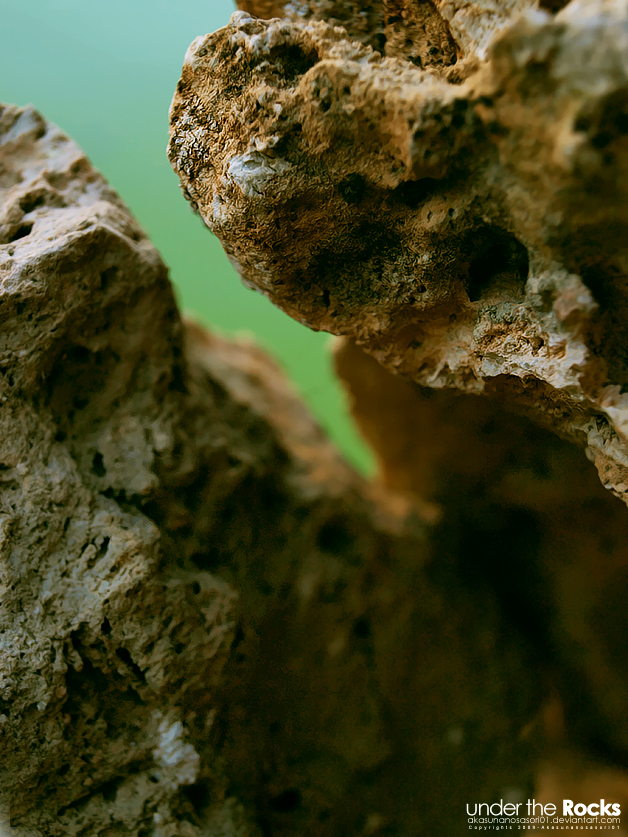
Photo 4: I like the texture of the rock that's in focus, but I don't understand the photo. Just personal taste I presume.
Photo 5: I really like, what is it? What's the green thing?
I don't want to sound harsh, these are just my opinions. I'd be proud if I'd taken any of those photographs.





![[No title]](/data/xfmg/thumbnail/35/35953-1a8b92df0115ff7026f31b78855ac815.jpg?1734167764)
![[No title]](/data/xfmg/thumbnail/34/34082-cb4fe628070c391a1a71b4fdcc58f400.jpg?1734164516)