Navigation
Install the app
How to install the app on iOS
Follow along with the video below to see how to install our site as a web app on your home screen.

Note: This feature currently requires accessing the site using the built-in Safari browser.
More options
You are using an out of date browser. It may not display this or other websites correctly.
You should upgrade or use an alternative browser.
You should upgrade or use an alternative browser.
Some recent photos, :| all comments are welcome
- Thread starter rangerman
- Start date
flyingember
TPF Noob!
- Joined
- Mar 31, 2010
- Messages
- 318
- Reaction score
- 0
- Location
- Kansas City, MO
- Can others edit my Photos
- Photos NOT OK to edit
too much editing
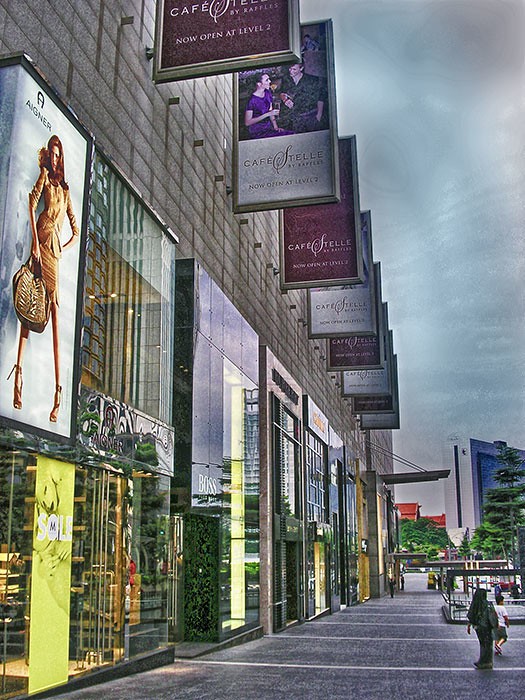
#1- it needs to be straightened slightly, the buildings lean too much, you can see it at the end of the row and in the person how there's a subtle V-shape with the edge. otherwise, you have a person to anchor the scale and foreground, there's something in the distance and good leading lines
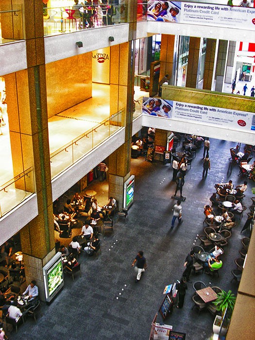
#2- I would do one thing on it. either pull up to get the top level more or pan down and make your top the white stone and get more of what's below. you're cutting off people at the top of the shot. I'm not sure about the blurry people but it's not specifically bad.
Carson38
TPF Noob!
- Joined
- Jul 8, 2010
- Messages
- 95
- Reaction score
- 0
- Location
- Idaho
- Can others edit my Photos
- Photos OK to edit
I agree a little to much editing, but honestly I have no room to talk. I just know I can get cared away with editing and take away from the natural beauty in a picture! But hey we have to learn somehow right? 
Most reactions
-
 426
426 -
 294
294 -
 285
285 -
 272
272 -
 220
220 -
 204
204 -
 185
185 -
 181
181 -
 169
169 -
 167
167 -
 147
147 -
 133
133 -
 120
120 -
 95
95 -
I
94

![[No title]](/data/xfmg/thumbnail/31/31048-f39974e8ef7d33d3e635eed5b44e603b.jpg?1619734587)

![[No title]](/data/xfmg/thumbnail/41/41894-692c98920dde335de241400937ed6166.jpg?1619739934)


![[No title]](/data/xfmg/thumbnail/41/41897-ea48d59eea1540d700b6e9051bce38da.jpg?1619739935)