What's new

Somewhat NSFW, which do you prefer?

DGMPhotography

Been spending a lot of time on here!
Joined
Mar 23, 2012
Messages
3,160
Reaction score
717
Can others edit my Photos
Photos OK to edit
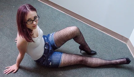
So I'm wondering what your thoughts may be on these two photos. Which one is better, technically? And then which one do you think I should use?

The first one I think has a much better pose, but one the second one I have her farther from the wall, and the walls create a sort of natural frame.. Appreciate your comments!

1. $Screen Shot 2014-08-20 at 1.50.04 PM.webp
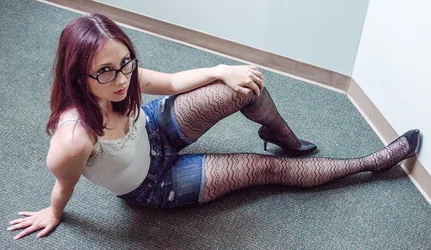
2. $Screen Shot 2014-08-20 at 1.49.54 PM.webp

Thanks!
 
Honestly, neither. I'd file them where they couldn't be held against me ever again.
 
I prefer her facial angle to the camera, and expression, in the first shot. I'm not really enthusiastic about either frame though...that upper arm needs some warping done on the left edge of it to correct for the too-close camera, and her giant head...well...that'll be tough to warp...
 
I prefer her facial angle to the camera, and expression, in the first shot. I'm not really enthusiastic about either frame though...that upper arm needs some warping done on the left edge of it to correct for the too-close camera, and her giant head...well...that'll be tough to warp...

Lol.. you mean her left* arm? I just realized how tiny it looks!

*edit: I meant right :P
 
Last edited:
I prefer her facial angle to the camera, and expression, in the first shot. I'm not really enthusiastic about either frame though...that upper arm needs some warping done on the left edge of it to correct for the too-close camera, and her giant head...well...that'll be tough to warp...

Lol.. you mean her left arm? I just realized how tiny it looks!

No, her right arm, tricep. It is what makes the other arm look small.
 
The light direction, quality is less than flattering to her, but is flattering to the floor and the walls.

IMO, having her in the corner and the dutch tilt don't work.
I would suggest that the angled lines of the brown baseboards would tend to keep the viewers eye away from her.
Diagonal lines convey a sense of movement that in these photos is inconsistent with the pose of subject.
 
Last edited:
Honestly, neither. I'd file them where they couldn't be held against me ever again.
You're cruel! I could learn something from you :)
 
Honestly, neither. I'd file them where they couldn't be held against me ever again.
You're cruel! I could learn something from you :)

Being cruel wasn't my intent, being honest about what I would do was. Spending time trying to "fix" a photo that's going to be okay, at best, isn't productive. One lesson that I learned in my first year was to be VERY Selective about the photos you want to edit. It seems now that I spend as much time culling my photos down to the selects as I do on the edits of those photos.
 
I prefer her facial angle to the camera, and expression, in the first shot. I'm not really enthusiastic about either frame though...that upper arm needs some warping done on the left edge of it to correct for the too-close camera, and her giant head...well...that'll be tough to warp...

Lol.. you mean her left arm? I just realized how tiny it looks!

No, her right arm, tricep. It is what makes the other arm look small.

Lol, whoops. That was a typo - I did mean to refer to the right arm. You are right.

And thanks for the advice, y'all. Now that you've pointed it out, I can see these probably aren't worth keeping.

For future reference if I want to do any pinup/boudoir type stuff one day, anyone with experience want to share some advice, or reading links?

Thanks!
 
So I'm wondering what your thoughts may be on these two photos. Which one is better, technically? And then which one do you think I should use?

The first one I think has a much better pose, but one the second one I have her farther from the wall, and the walls create a sort of natural frame.. Appreciate your comments!

1. View attachment 82490
2. View attachment 82489

Thanks!

On #1, I don't like gigantic right tricep--it's distracting and unflattering.
On #2, I don't like the fingers growing out of her shoulder.
 
Neither are good technically. You wanna shoot from lower down and leave more space for background or crop more severely.
 
Before you even worry about what your model is doing, worry about the background. I don't even pull the camera up to my face to take a portrait unless I'm okay with what the background will look like.
 

Create an account or login to comment

You must be a member in order to leave a comment

Create account

Create an account on our community. It's easy!

Log in

Already have an account? Log in here.

Back
Top Bottom