Spread your soul... (Does the crop work?)

Jasii

No longer a newbie, moving up!
Joined
Jun 17, 2015
Messages
470
Reaction score
171
Location
Dharamsala, Himachal Pradesh, India.
Can others edit my Photos
Photos OK to edit
Some more fields...... Do tell me when you've had enough.:02.47-tranquillity:
Another one from the Bhatiyat valley in Himachal Pradesh India. Tell me what you think? Does the unusual crop work?
Yeah! I know the frame is back but forgive my fetish for frames please. :D

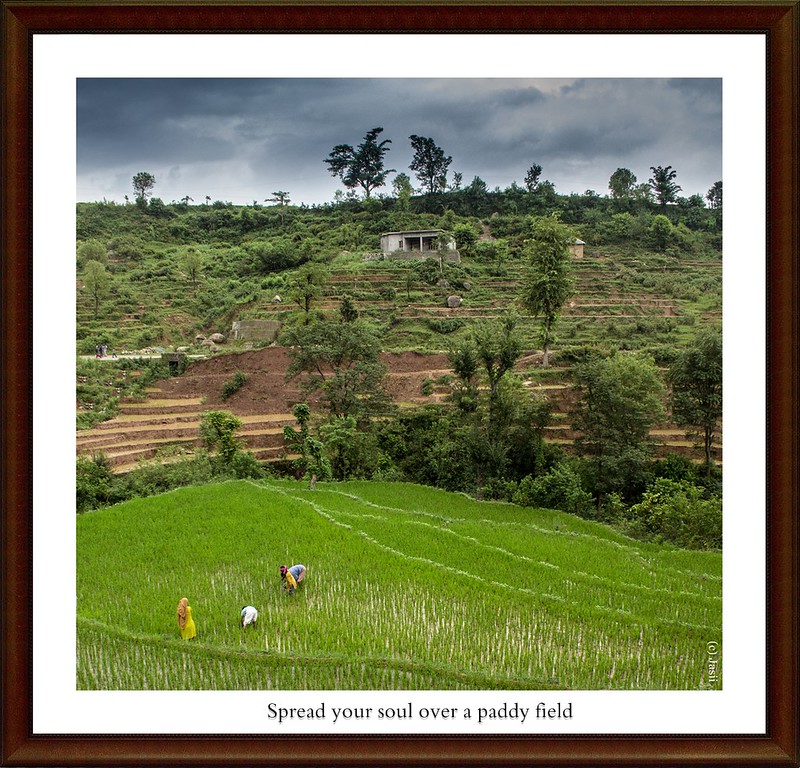
Spread your soul.... by jasiiboss, on Flickr
The unedited original image is being attached.
 

Attachments

  • IMG_0645 crop.jpg
    IMG_0645 crop.jpg
    158.2 KB · Views: 142
Last edited:
I must confess to a bit of ignorance here because usually when the question of whether or not something works, it is in comparison to something else, so my question back to you is Does the crop work in comparison to what? - another crop? - no crop? - square versus rectangular crop? - etc. Why is the crop unusual, again in comparison to what? Perhaps some additional information might be useful.

WesternGuy
LOL You got me there ! :D
Since this was an unusual crop and did not adhere to any crop ratio, hence the Q popped. I guess I have my answer now.
Rgds,
 
The crop is good. It might also work as a vertical because the way a viewer is likely to "read" this is from bottom (the people) to top (house and trees on horizon) - if you cropped about a third of the image on the right that would also work. To me, those trees are essential because they give you a place to go at the top of the image and the dark sky frames them well.
 
I think it's a pretty strong crop as is personally. I don't mind the quote so much.
 
I must confess to a bit of ignorance here because usually when the question of whether or not something works, it is in comparison to something else, so my question back to you is Does the crop work in comparison to what? - another crop? - no crop? - square versus rectangular crop? - etc. Why is the crop unusual, again in comparison to what? Perhaps some additional information might be useful.

WesternGuy
LOL You got me there ! :D
Since this was an unusual crop and did not adhere to any crop ratio, hence the Q popped. I guess I have my answer now.
Rgds,
So my next question is - Who says you have to crop to a "ratio"? I suspect a lot of us do for one reason or another, but, if the crop works for you, then that is all that matters.

For me, this is a nice picture, regardless of how it has been cropped. I think that:

1. there is just enough sky to tell the viewer what the weather was like and it provides a nice balance to all the green in the rest of the image. I would not crop it out.
2. the people in the lower left thirds position (more or less and talk about "rules") provide a nice sense of scale and they balance off the building in the upper part of the image.
3. there is a lot of "green" in the image, but it is not overwhelming.
4. there are converging lines in the image that take the viewers eye towards the top part of the image.

Anyway, I could probably go on, but you get the idea. The goal in photography (photographic art) should be to present to the world a picture that has some emotion and tells a story. For me, there is some emotion generated by the mere size of the "fields", which is why the people are good to have for scale. It tells the story of people "administering" (what ever that implies) their paddy fields. In my mind, this is a successful image.

I always try to ask myself - "Why would anyone be interested in this photo and what elements can be included or excluded to make it truly great?" - I am not always successful, nor do I always remember to ask myself that question, sometimes I am just experimenting and no one will ever see the result, but I always try to remember the words of Ansel Adams - You don't take a photograph, you make it. - For me, my goal is to produce "art" and what I do to the image and how I present it, is my choice and no one else's. What counts, for me, is whether or not I like the result and if others like it, then that is a bonus. Some folks might think that perspective is a little conceited, so be it. Do you think any of the great masters really cared what others thought about their work - I doubt it very much. Anyway, enough personal philosophy for now. You can agree, or disagree - your choice.

WesternGuy


P.S. Now that we have beaten this one to death :biggrin-93:, it would be nice to see the original image.
 
Put me on the crop the sky out bandwagon. There is a unity in the colours of the field/hillside and the sky is such a contrast and the brightest part of the image, light advances dark recedes so it towers over the image for me, it draws me up and out of the heart of the image and traps my eye there. I totally "ignore" the people in the field which should be a significant part of the image. Crop the sky and the image is comfortable to look around in and the people don't get lost.
 
My issue with the sky is the darkening of the trees, which looks like heavy-handed post-processing burning in, right in the center of the sky area, and on the two largest trees, so to me that looks like poor manipulation of the image. The light line below the dark clouds also makes me think "burned in sky".

I dunno...does it work? In a way, yes, I guess it's okay. But at the same time, there feels like too much hillside above the paddy.

Honestly, after seeing a number of your images over the past month, and sensing the same general pattern of questions, I think it's time to say that you need to focus a lot less on "the crop" and post-shoot alteration, and more time on figuring out where to point the camera. Not cropping images later, but actually making/taking more exposures in the field, with different aiming points for the lens, as a way to create entirely different compositions.

You've been working a lot on landscapes, and frankly, a lot of them are less impressive than they might have been because they were shot with very short focal length lenses, so the backgrounds are small, and far-away-looking. This shot has a strong, light-toned paddy in the front area, but then diverges off into land expansive yet mostly detail-free background. I would burn down the color values going up the hill on the left; the close-spaced terracing at the left edge of the frame leads the eye right out of the foreground and would look better darkened. More than half of this images is terraced hillside, with almost nothing to "see", no visual reward on the hillside; the biggest visual payoff are the trees at the top, and they look like they've been hastily burned in--yet still, they are the most visually rewarding, strong, simple, silhouetted things in the entire upper 3/4 of the frame. So, you have huge visual pull at the top, then the people and the pretty greens at the bottom of the frame, competing for attention. That is why you have people calling for cropping out the trees and sky at the top...it hurts as much as helps.

I think I would have cut this literally in half, cropping wayyyy down low. The idea of cropping off the entire right hand third of the frame is a good idea too. One could also cut this just above the road, and play the size of the people on the road against the size of the paddy workers.
 
The crop is good. It might also work as a vertical because the way a viewer is likely to "read" this is from bottom (the people) to top (house and trees on horizon) - if you cropped about a third of the image on the right that would also work. To me, those trees are essential because they give you a place to go at the top of the image and the dark sky frames them well.
Thanks Ken. Will give that right crop a go and see how it turns out.
Cheers.


I think it's a pretty strong crop as is personally. I don't mind the quote so much.
Thanks for concurring mate.


Put me on the crop the sky out bandwagon. There is a unity in the colours of the field/hillside and the sky is such a contrast and the brightest part of the image, light advances dark recedes so it towers over the image for me, it draws me up and out of the heart of the image and traps my eye there. I totally "ignore" the people in the field which should be a significant part of the image. Crop the sky and the image is comfortable to look around in and the people don't get lost.
It is always nice to get opinions representing opposing views that is what sponsors a healthy debate. The sky indeed was very bright nearly 3 stops . I note your observations regarding people in the image and the way the sky kind of constricts that.
Thank you.
 
I must confess to a bit of ignorance here because usually when the question of whether or not something works, it is in comparison to something else, so my question back to you is Does the crop work in comparison to what? - another crop? - no crop? - square versus rectangular crop? - etc. Why is the crop unusual, again in comparison to what? Perhaps some additional information might be useful.

WesternGuy
LOL You got me there ! :D
Since this was an unusual crop and did not adhere to any crop ratio, hence the Q popped. I guess I have my answer now.
Rgds,
So my next question is - Who says you have to crop to a "ratio"? I suspect a lot of us do for one reason or another, but, if the crop works for you, then that is all that matters.

For me, this is a nice picture, regardless of how it has been cropped. I think that:

1. there is just enough sky to tell the viewer what the weather was like and it provides a nice balance to all the green in the rest of the image. I would not crop it out.
2. the people in the lower left thirds position (more or less and talk about "rules") provide a nice sense of scale and they balance off the building in the upper part of the image.
3. there is a lot of "green" in the image, but it is not overwhelming.
4. there are converging lines in the image that take the viewers eye towards the top part of the image.

Anyway, I could probably go on, but you get the idea. The goal in photography (photographic art) should be to present to the world a picture that has some emotion and tells a story. For me, there is some emotion generated by the mere size of the "fields", which is why the people are good to have for scale. It tells the story of people "administering" (what ever that implies) their paddy fields. In my mind, this is a successful image.

I always try to ask myself - "Why would anyone be interested in this photo and what elements can be included or excluded to make it truly great?" - I am not always successful, nor do I always remember to ask myself that question, sometimes I am just experimenting and no one will ever see the result, but I always try to remember the words of Ansel Adams - You don't take a photograph, you make it. - For me, my goal is to produce "art" and what I do to the image and how I present it, is my choice and no one else's. What counts, for me, is whether or not I like the result and if others like it, then that is a bonus. Some folks might think that perspective is a little conceited, so be it. Do you think any of the great masters really cared what others thought about their work - I doubt it very much. Anyway, enough personal philosophy for now. You can agree, or disagree - your choice.

WesternGuy


P.S. Now that we have beaten this one to death :biggrin-93:, it would be nice to see the original image.

Phew!!!! that was some dissection......... :boxing:
Thank you, will read it a dozen more times so that the essence sinks in.
I have uploaded the original image.
Thank you once again and indebted......
Jasii
 

Most reactions

Back
Top