What's new

St. John's

Trever1t

Been spending a lot of time on here!
Joined
Dec 30, 2010
Messages
9,331
Reaction score
2,724
Location
San Jose, CA
Can others edit my Photos
Photos NOT OK to edit
St. John's Episcopal Church, established 1760 was the first Anglican church in the Danish West Indies.

I am not very happy with this conversion HDR. I couldn't get rid of the Halos 100% no matter how many things I tried. Tone-mapped in color this was then imported into CS and converted with NIK.
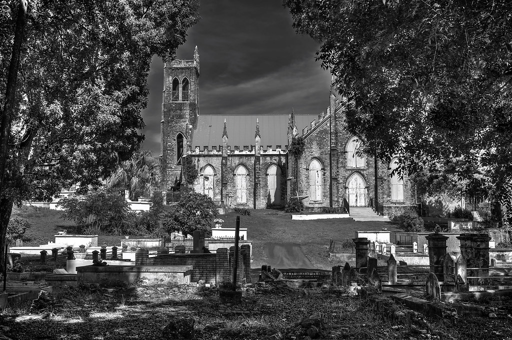

St. John's by WSG Photography, on Flickr

Tone-mapped before NIK conversion
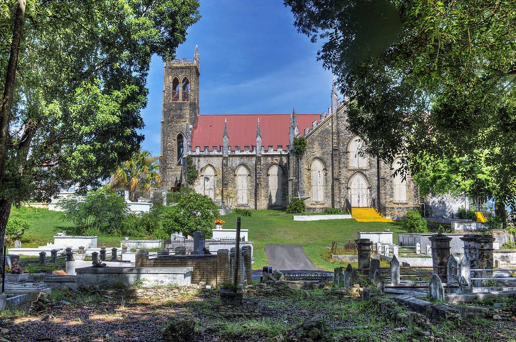

St. Johns by WSG Photography, on Flickr
 
Last edited:
Yeah, I can see this would be a struggle in processing. You're going from direct, harsh sunlit church walls, to what appears to be very dark shadows/sky. Seems like this was shot in harsh island sunlight (yeah?), so no relief from blazing sun to dark shadows.

The dynamic range difference from the leaves in the foreground to the sunlit walls is enormous. The black and white exaggerates the huge luminosity differences and doesn't quite "read" correctly, even for HDR.

The composition feels a bit cluttered in the foreground. I understand using the trees to frame the church, but I'm guessing there might have been a better angle/area to shoot this from.

I'd be interested to see this in color, but I'm inclined to say this this a throwaway: It might be a learning exercise, if nothing else, and many of your HDR's have been much better in the past.
 
Very interesting subject and quite beautiful church. I would love to see the original, color photograph as like for me this b&w rendition doesn't work too well. The picture is very busy with tons of detail in the fore plan and the building itself does not draw dominant amount of attention as it should. In color it may better stand out.
( Ehh.. I type slowly. :D )
 
I would play around with different "B&W filter effects"...maybe try a simulated Green Filter. The way I see it, the sky's tonal value is far too similar to that of the two trees that flank the image, and so, the "sky" just sort of melds into everything else, and the roof line also melds with the sky...the tonal values are just...not quite optimal for this particular scene. It just looks heavy-handed. Too "bold", too "dark" for this scene.
 
Yeah, too much contrast, perhaps this one is only for the memories. I couldn't really make my vacation around the perfect times...added a color tone mapped version up top. Perhaps I can do better from a single frame.
 
Yeah, too much contrast, perhaps this one is only for the memories. I couldn't really make my vacation around the perfect times...added a color tone mapped version up top. Perhaps I can do better from a single frame.

Yes! I've ran into this MANY times myself. With the huge amount of DR accessible in the highlights/shadow slider of LR 4, you may be able to work up something here. I don't think this is a contrast problem so much as it's a "too much detail in the shadows" problem. Everything melts together, and actually becomes a bit flat as a result.
 
I'm sure it's a nice setting, but there is no depth perception, especially with the b&w version. The little path in the center melts into the landscape. It's simply to busy for b&w.

I'd either concentrate on the church or the bone yard. :D
 

Create an account or login to comment

You must be a member in order to leave a comment

Create account

Create an account on our community. It's easy!

Log in

Already have an account? Log in here.

New Topics

Back
Top Bottom