What's new

STL Art Museum - Critique please!

Shu

TPF Noob!
Joined
Jun 30, 2012
Messages
11
Reaction score
0
Location
St. Louis
Can others edit my Photos
Photos OK to edit
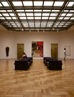
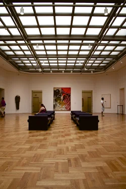
I had a little walk around the art museum today, and this was one of my favorite shots of the bunch. A couple questions:

1) To crop or not to crop? I feel like cropping the photo eliminates some of the distracting elements, but it also loses some of the depth.

2) What can I do to improve this photo?
$IMG_0066.webp $IMG_0066 - Version 2.webp
 
I prefer the cropped image. In the original, all of the 'action' in the photo is off in the distance, and all you've got up close is a lot of empty space. That might work in other circumstances (like maybe you were trying to convey a sense of loneliness, for example), but I don't think it works here.
 
What you can do to improve the photograph is to work out what it is that you're trying to convey, and then think about how to convey that better!

The long shot suggests that you're trying to convey that sense of airy space that one gets in a museum, the bigness and open spaces between the art. If that's it, I would suggest shooting landscape to get more width, get lower down to enhance the sense of height, and either get further back or use a wider lens to encompass more of the space in the frame. Select an angle that minimizes the extra stuff, you want art, clean wall and floor space, nothing extra. The chairs might count as art. In this case the two doorways in the background are extraneous and bring us a little abruptly back to earth. A sort of "ahhhh, the openness, the sense of space, I can almost hear the silence of the museu.. oh, there's the bathroom" sensation.
 
Thanks very much for the criticism! Unfortunately, my back was against the wall in this instance. It's somewhat disconcerting that I took about 70 photos today, but almost all of them were pretty boring to look at upon second glance. I guess I just need to think about what I'm shooting and what I'm trying to get across, like you said, and go from there. I've learned some of the technical aspects of shooting (exposure triangle, rule of thirds, etc.) but I've been struggling with getting an interesting composition. Anyways, thanks again.
 
Simple, not overly exciting, but kind of neat with some of the elements of balance and the pattern of both the ceiling and the floor. I think you could have gotten a bit edgier, but the second crop with the balance between the person standing on the right and the body thing hanging on the left is neat.

You might try a b/w.
 
I also prefer the crop. I'll second Manaheim's B&W suggestion as worth pursuing.

Some technical issues to consider:

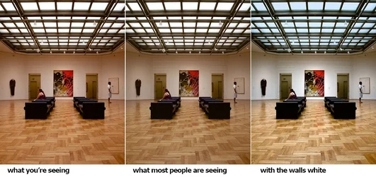
1. Your photos are tagged with the Adobe RGB colorspace. The only people on the internet who are going to see the photos as you see them are folks using Safari or Firefox as web browsers. The majority use IE and/or Chrome which do not support color management. IE and Chrome will ignore the Adobe RGB profile and display the photo incorrectly. When you place photos on the internet you need to make sure they are tagged sRGB.

2. Your photo's white balance and tone response are off a bit. The museum walls are painted white -- in your photo they have a red tint. So I adjusted the white balance to set the wall white. At the same time I adjusted Levels and contrast in the photo. The ceiling windows influence the tone balance of the entire photo. Their brightness pushes everything else down. The photo contains only neutral and warm colors so I couldn't resist the opportunity to add in a complement and I put some blue in the ceiling windows.

Joe

$stl_art.webp
 
I like the edit...it takes away the third unwanted person from the frame Ceiling provides enough leading lines :D
 
What's nice about something like this is that you can go back and shoot again.

I'm developing some ideas about how to productively shoot, and re-shoot, but the basic concept is this:

- take some pictures
- look at them, and see if there's some idea or sense or feeling you think you could communicate with one (or more) of them, some sort of germ of an idea. In this case something like "Hmm, this picture is sort of reaching for that sense of silent open space that museums have" might occur to you (or something quite different!)
- hypothesize about how you could improve that and communicate it better, maybe develop several competing ideas on how you could do it
- go back and re-shoot, testing these ideas out
- look at the results, what worked? what didn't? do you get a NEW and better idea?
- return to the second step, above
 
Amolitor, I'll definitely be heading back, trying to think through my shots a lot more than I did that day. As you said, I'm going to try the landscape idea instead of shooting portrait. Ysarex, could you provide any clarification as to how you edited the photo? I couldn't seem to get the walls white without casting a blue shadow around everything else in the photo. It might just be some basic editing that I haven't gotten the hang of yet. I really liked the black and white too. Thanks for the help, guys!
 
Amolitor, I'll definitely be heading back, trying to think through my shots a lot more than I did that day. As you said, I'm going to try the landscape idea instead of shooting portrait. Ysarex, could you provide any clarification as to how you edited the photo? I couldn't seem to get the walls white without casting a blue shadow around everything else in the photo. It might just be some basic editing that I haven't gotten the hang of yet. I really liked the black and white too. Thanks for the help, guys!

I used Photoshop.

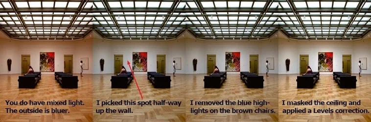
I started with the Color Picker and checked a spot on the wall (see illustration). NOTE: Right click with the eye dropper and set an 11x11 average. The spot was R = 185, G = 166, B = 151. Add those three numbers together and divide by 3 and you get 168. The image is a tad dark anyway so I just rounded up to 175. I opened Curves and holding down Ctrl/Shift I clicked on that same spot. Still in Curves switch to the Red channel and you'll see a node on the line. Find the Input/Output values and change the Output value to 175. Repeat for the Green and Blue channels and that spot on the wall will be neutral. At the same time the white balance for the entire photo is altered.

I then did a rough selection around the brown leather chairs and used Selective Color to pull down the blue highlights coming from the skylight.

Next I masked the skylight windows and applied a Levels adjustment to the rest of the image. I pulled the highlight end slider left to a value around 210 and the midpoint slider to the right -- value about .87.

Putting the blue in the windows was a little trickier, I used the same mask I had just created in the step above when I made the Levels adjustment.

If you like maybe someday I'll meet you over there and show you.

Joe

$edit_process.webp
 
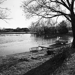
I think the people are far too interesting to lose them in the composition by including boring architecture:

I would crop like this:

i-tsp4Cvb-X2.jpg
 

Create an account or login to comment

You must be a member in order to leave a comment

Create account

Create an account on our community. It's easy!

Log in

Already have an account? Log in here.

Back
Top Bottom