What's new

Street/Urban in B/W - C & C Welcome

Lazy Photographer

TPF Noob!
Joined
Jul 4, 2009
Messages
648
Reaction score
5
Location
Toronto, Canada
Can others edit my Photos
Photos OK to edit
1.
PortraitDay-0312-EDITED-2.jpg


2.
PortraitDay-0343-EDITED.jpg


3.
PortraitDay-0220-EDITED-2.jpg


4.
KewbeachCraftsSale-454-EDITED.jpg


5.
PortraitDay-0345-EDITED-3.jpg


6.
PortraitDay-0373-EDITED.jpg


7.
JanuaryDowntwn-503-EDITED.jpg


8.
JanuaryDowntwn-028-EDITED.jpg
 
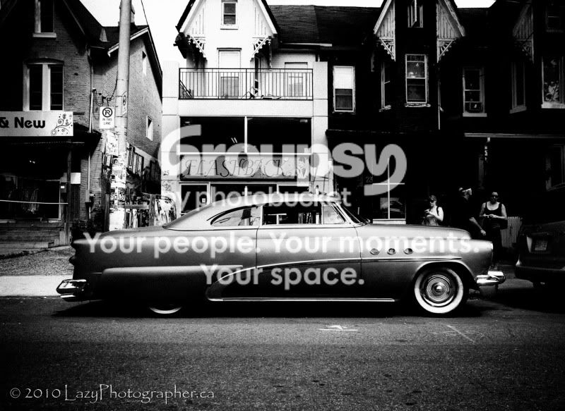
Love #1, maaaaaybe a bit overdone on the vignetting. But I would leave that you user preference. Also, I would have waited until the two people had move out of frame. Maybe try and clone them out, shouldn't be too impossible.

the rest... eh. I saw #1 and was ready for a mega cool set and they kinda let me down.


p!nK
 
#1 is very interesting, I like the banner FLASHBACK that is over the old car kinda makes the picture come together.
 
Too contrasty. Shadow and highlight details are obliterated.
 
Thanks everyone.
Yeah, I wasn't sure about the vignetting on #1 either. I wanted something really gritty.
I sort of like that contrasty look but I realize it's not for everyone. It's certainly more about the style than about making sure all the highlights and shadows are correctly exposed. To my eye, the originals are rather bland without a lot of contrast. To each his own, though.
Thanks again.
 
Interesing and nicely done. I'd ignore the comments about being overly contrasty. I think you have a style and it's a good one. Stick with it.
 
Some are too contrasty for my taste as well, but as manaheim says, it could be a style that works. If you do a series and they're all processed that way, it could work.

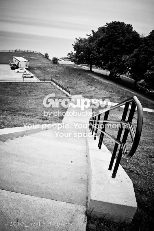
#4 is interesting and I think #6 is a scream. I love the way the shape of his back matches the shape of the statue. Cropping a little on the sides and darkening that bright vertical strip between them might accentuate that.
 
Too contrasty. Shadow and highlight details are obliterated.

Agreed. With 1 and 2. Losing way too much in the shadow areas in 1 and too much blown out in 2. In 2 you are dealing with a kid with dark skin and harsh daylight and that is not easy. You need to do some burning and dodging when processing such shots. Reminds me of shooting nepalese sherpas against a snow background, lol. Fill flash can also be a way to shoot this.
 
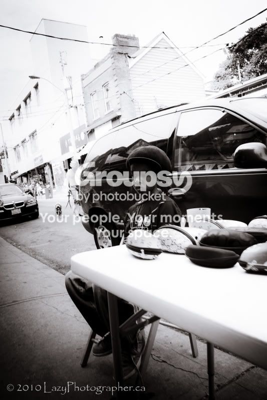
Okay, well it sounds like most agree on the contrast being a bit much. As for #2, I purposely processed it this way. The background in the original is fine and not blown but I was going for a "look." Obviously, it's not working as well as I'd hoped. But that's okay. That's why I post them here, to learn from the feedback. Thanks everyone, very much appreciated. Oh, one more thing: I'm really coming around to the notion that I dialled up too much vignetting in #1. I'm going to revisit this and see what I get.
 
Okay, well it sounds like most agree on the contrast being a bit much. As for #2, I purposely processed it this way. The background in the original is fine and not blown but I was going for a "look." Obviously, it's not working as well as I'd hoped. But that's okay. That's why I post them here, to learn from the feedback. Thanks everyone, very much appreciated. Oh, one more thing: I'm really coming around to the notion that I dialled up too much vignetting in #1. I'm going to revisit this and see what I get.

And here you have it. THE example of why internet forums are a detriment to the artistic process.

This guy was going for "a look". He had a sort of a vision of some kind. What did the bulk of this community do? Poo-poo it. Why? Because "it's not the best way to get 'this kind of shot'".

First... How do any of you really know what "kind of shot" he was trying to take?

Second... why in the heck does consensus determine whether or not a process was the right one?

As someone providing critique... Sharing how a piece of art did or didn't work for you personally and what it made you feel personally is fine. Discrediting the work because it didn't match your personal specifications is downright ridiculous.

As someone accepting critique... listening honestly and openly to all feedback is perfect. Changing your style because others didn't like what you did is potentially criminal.

I've said it before... there was a time when Van Gogh was laughed at, and if I didn't know how valuable they were, I wouldn't take a Picaso if it was handed to me for free... but obviously these artists mean something to somebody.

 
After your first few postings on here you start to realize EVERYONE is a beginner haha! Feedback is helpful, and fun to get, but take it for what it's worth on this forum where most people think it has to be pure photography or it's crap.

I like artistic license regardless of the genre! Listen to the technical stuff, cause there's a lot of good info to be gained here, but DON'T pay attention to personal opinions, cause only yours count on that!
 
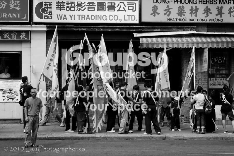
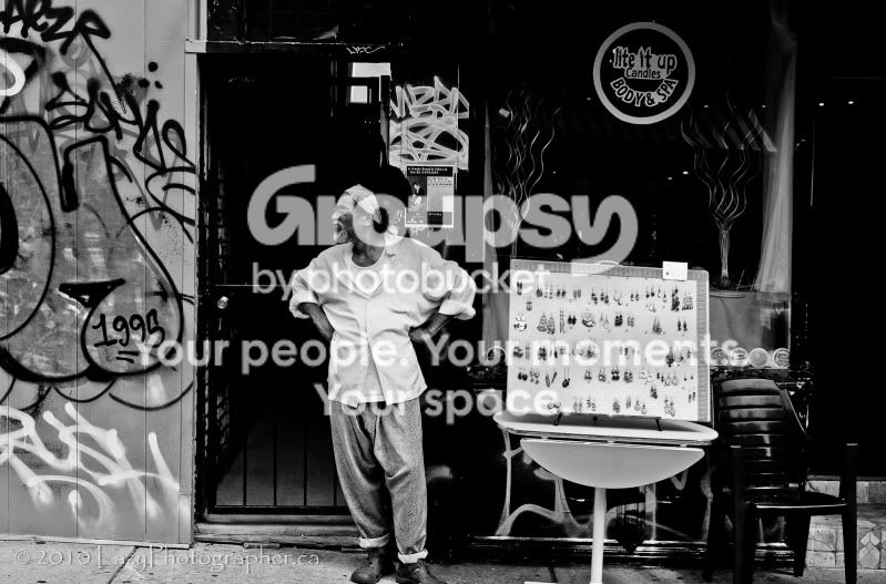
I like #3 because my eye immediately goes to the one man looking in the camera; like all this is going on behind him and he has no idea. It tells a story. I also like the depth in #4. I am trying to learn how to shoot these kind of scenes myself but unfortunately I hate everything I shoot in this regard.
 
Okay, well it sounds like most agree on the contrast being a bit much. As for #2, I purposely processed it this way. The background in the original is fine and not blown but I was going for a "look." Obviously, it's not working as well as I'd hoped. But that's okay. That's why I post them here, to learn from the feedback. Thanks everyone, very much appreciated. Oh, one more thing: I'm really coming around to the notion that I dialled up too much vignetting in #1. I'm going to revisit this and see what I get.

And here you have it. THE example of why internet forums are a detriment to the artistic process.

This guy was going for "a look". He had a sort of a vision of some kind. What did the bulk of this community do? Poo-poo it. Why? Because "it's not the best way to get 'this kind of shot'".

First... How do any of you really know what "kind of shot" he was trying to take?

Second... why in the heck does consensus determine whether or not a process was the right one?

As someone providing critique... Sharing how a piece of art did or didn't work for you personally and what it made you feel personally is fine. Discrediting the work because it didn't match your personal specifications is downright ridiculous.

As someone accepting critique... listening honestly and openly to all feedback is perfect. Changing your style because others didn't like what you did is potentially criminal.

I've said it before... there was a time when Van Gogh was laughed at, and if I didn't know how valuable they were, I wouldn't take a Picaso if it was handed to me for free... but obviously these artists mean something to somebody.
This is bullshit.

First of all, if you think high contrast street photography is a new style, or even interesting, you're dreaming. Everybody does it. Just like everybody shoots street in black & white.

He asked for C&C, and we all gave him opinions. No need to include a disclaimer. Most people get it.

So what if he revisits a few of these images and adjusts the contrast? When is getting a different perspective ever a bad thing?
 
Okay, well it sounds like most agree on the contrast being a bit much. As for #2, I purposely processed it this way. The background in the original is fine and not blown but I was going for a "look." Obviously, it's not working as well as I'd hoped. But that's okay. That's why I post them here, to learn from the feedback. Thanks everyone, very much appreciated. Oh, one more thing: I'm really coming around to the notion that I dialled up too much vignetting in #1. I'm going to revisit this and see what I get.

And here you have it. THE example of why internet forums are a detriment to the artistic process.

This guy was going for "a look". He had a sort of a vision of some kind. What did the bulk of this community do? Poo-poo it. Why? Because "it's not the best way to get 'this kind of shot'".

First... How do any of you really know what "kind of shot" he was trying to take?

Second... why in the heck does consensus determine whether or not a process was the right one?

As someone providing critique... Sharing how a piece of art did or didn't work for you personally and what it made you feel personally is fine. Discrediting the work because it didn't match your personal specifications is downright ridiculous.

As someone accepting critique... listening honestly and openly to all feedback is perfect. Changing your style because others didn't like what you did is potentially criminal.

I've said it before... there was a time when Van Gogh was laughed at, and if I didn't know how valuable they were, I wouldn't take a Picaso if it was handed to me for free... but obviously these artists mean something to somebody.
This is bullshit.

First of all, if you think high contrast street photography is a new style, or even interesting, you're dreaming. Everybody does it. Just like everybody shoots street in black & white.

He asked for C&C, and we all gave him opinions. No need to include a disclaimer. Most people get it.

So what if he revisits a few of these images and adjusts the contrast? When is getting a different perspective ever a bad thing?

I think you both make good points. When I review the comments and critiques I divide them into two categories, those who get it and those who don't. For instance, someone was critical of #2 because the background was blown, as if the camera settings were incorrect -- but consider what settings your camera would have to be at to get that shot to look as it does here. I couldn't begin to guess at what settings I'd have to use to get a shot that was that far from "textbook correct." In post processing my concern was to ensure the boy's face wasn't lost in the dark colours of the car behind him and I felt that letting the background "blow" was fine if it helped draw one's eye to the boy's face. I think it worked fine, but I also know that when compared to the textbook description of correct exposure it fails. To me, however, the photo works. I'm very pleased with the result. The original, when converted to b/w with proper exposure, doesn't have nearly the drama I wanted. But hey, the original might be far more boring but it's correctly exposed, right?

On the other hand, when a handful of people say the contrast is dialled up too much, I don't take that to mean it shouldn't be all contrasty and dramatic, just that in my effort to make it all contrasty and dramatic I might have overdone it a smidge. I assume those who made the "too contrasty" comments get that the shots are supposed to be high contrast. In their comments they've already taken that into consideration. Get me? Even then, if after revisiting the shots I decide I still like them as they are above, I'll leave them alone. If someone's paying me for them, then I'll happily adjust them until my customer is happy.

Anyway, I always apply my own sensibilities to the comments and criticisms I read. The only time I get bothered is if someone is being a dick about it. Fortunately for me that's happened very rarely. Mostly I'm very appreciative of the feedback I get, especially the critical ones, when constructive.

 
This is bullshit.

First of all, if you think high contrast street photography is a new style, or even interesting, you're dreaming. Everybody does it. Just like everybody shoots street in black & white.

He asked for C&C, and we all gave him opinions. No need to include a disclaimer. Most people get it.

So what if he revisits a few of these images and adjusts the contrast? When is getting a different perspective ever a bad thing?

It's bull****? Excellent retort. I stand diminshed. Bravo. :er:

Lazy Photographer said:
I think you both make good points. When I review the comments and critiques I divide them into two categories, those who get it and those who don't. For instance, someone was critical of #2 because the background was blown, as if the camera settings were incorrect -- but consider what settings your camera would have to be at to get that shot to look as it does here. I couldn't begin to guess at what settings I'd have to use to get a shot that was that far from "textbook correct." In post processing my concern was to ensure the boy's face wasn't lost in the dark colours of the car behind him and I felt that letting the background "blow" was fine if it helped draw one's eye to the boy's face. I think it worked fine, but I also know that when compared to the textbook description of correct exposure it fails. To me, however, the photo works. I'm very pleased with the result. The original, when converted to b/w with proper exposure, doesn't have nearly the drama I wanted. But hey, the original might be far more boring but it's correctly exposed, right?

On the other hand, when a handful of people say the contrast is dialled up too much, I don't take that to mean it shouldn't be all contrasty and dramatic, just that in my effort to make it all contrasty and dramatic I might have overdone it a smidge. I assume those who made the "too contrasty" comments get that the shots are supposed to be high contrast. In their comments they've already taken that into consideration. Get me? Even then, if after revisiting the shots I decide I still like them as they are above, I'll leave them alone. If someone's paying me for them, then I'll happily adjust them until my customer is happy.

Anyway, I always apply my own sensibilities to the comments and criticisms I read. The only time I get bothered is if someone is being a dick about it. Fortunately for me that's happened very rarely. Mostly I'm very appreciative of the feedback I get, especially the critical ones, when constructive.

Well, in that case, I'd say a more genuine bravo to you because so few people on here receiving critique are doing what you are describing.

The only thing I might suggest is I think you're giving the masses on the internet waaaaaaay too much credit. I applaud you for your positive outlook, but... I wouldn't hold onto it too strongly. :)
 

Create an account or login to comment

You must be a member in order to leave a comment

Create account

Create an account on our community. It's easy!

Log in

Already have an account? Log in here.

New Topics

Back
Top Bottom