What's new

Structure lines.

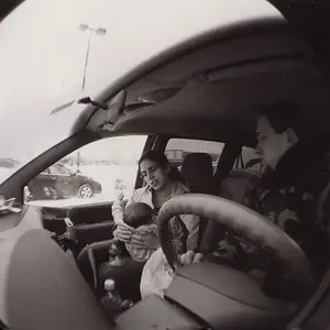
I'm not a big fan of the upper right corner. I'd consider doing a burn to darken it and make it less noticeable. Otherwise this is a pretty striking image. The lines and tonality are very pleasing to the eye.
 
I agree with the above. My first instinct was to crop it, but this may be a better option.
 
Thanks for the suggestion. I will try that.
 
I like it as is. if it were lightened, it would be boring and not have depth to the frame.
 
I like it as is. if it were lightened, it would be boring and not have depth to the frame.

I just mean the little area in the top right with the windows or whatever they are..
 
@W.Y.Photo, I understand what you are saying, just that building windows in the background. I think you are correct to use the brush to that area and not add a vignetting to the whole thing.

@Braineack thanks.
 
I like it as is. if it were lightened, it would be boring and not have depth to the frame.
I think the same. The windows behind contestualize it and makes me understand this is part of something in front of a building.
Without it...uhm...I think they're a nice texture, but not strong enough.
 
I'm gonna go with losing the upper right corner. Love the lines, very nice.
 
I like the burn the corner. It's still there to give the information but is dark to not draw your attention.

Changes are reflected on the original post.
 

Create an account or login to comment

You must be a member in order to leave a comment

Create account

Create an account on our community. It's easy!

Log in

Already have an account? Log in here.

New Topics

Back
Top Bottom