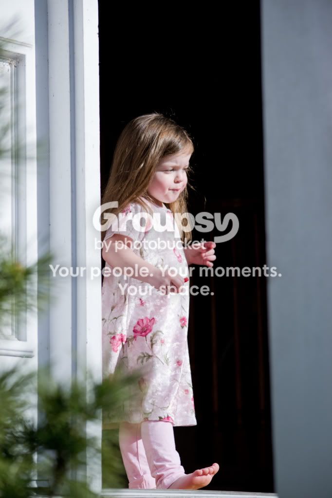
I love #3 and #6, but the bottom right (our right not hers) foot really does stand out too much once you notice it, and #6 would be great but as on of the above posters mentioned there is a little too much purple in it. Keep working on what you did with these two I really can't stand photographs that look like a billion others it's too stock for my tastes, but while they are in similar poses to a lot of child shots, there is something eerily beautiful about them. If you are using an auto white balance try using costume, you don't need a grey card if you don't have one (you can always try printing one out at 18% grey) but you will spend a little more time getting the white balance right (which I don't think is a big deal).
Improvement wise there is HUGE difference and it's far from hard to notice it, nearly everything looks better.
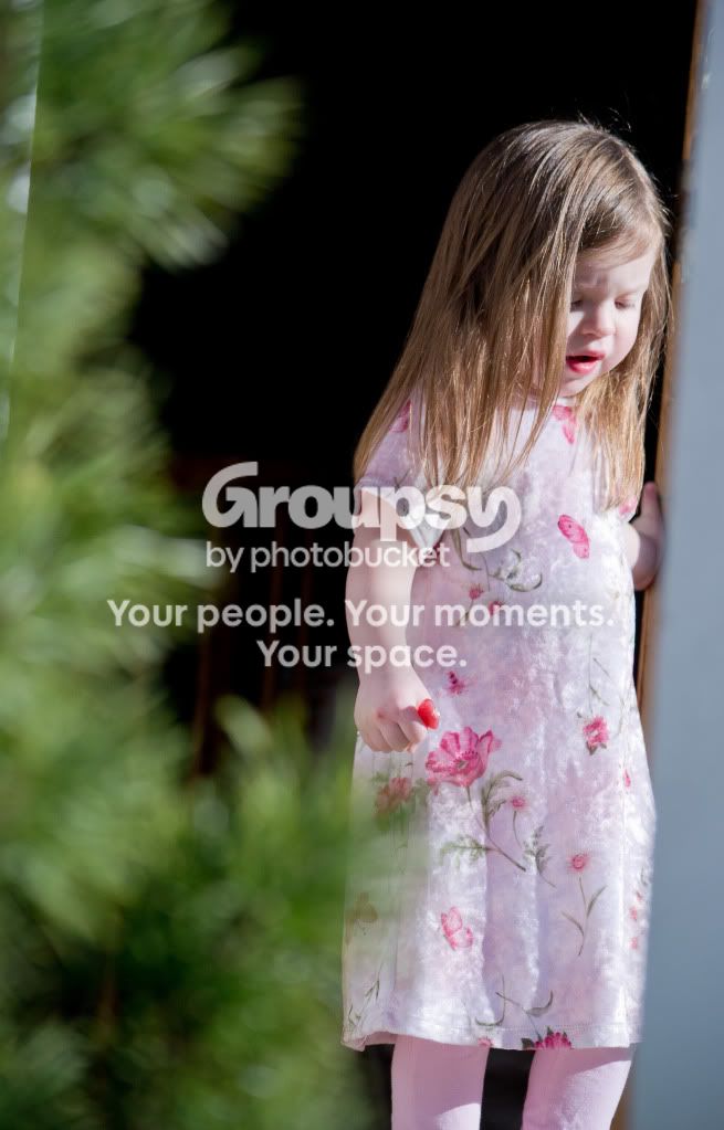
I do want to mention a couple things though, I feel like there is a little too much bloom on her on four and five, and the tree in too much of an obstruction. Get rid of those two all together OR continue to see if you can improve that area. I think you are on the right track, there is defiantly something different about these pictures and that is a good thing. Stock photographs are boring in my opinion, even if they are taken by an "extraordinary photographer".
I don't imagine children are easy to shoot (with a camera that is hahah I kid, sorry).
Also I would suggest different clothing, she has very light skin so see what happens with darker clothing, if you have any medium purple dresses for her then take her out to a really green area and see what happens. But only take that sort of advice as you want it, remember this is YOUR art and what looks good to someone looks like crap to someone else (I think your average wedding photo sucks, I don't care how perfect the shot is, I've seen it a million times and even the faces look the same now).
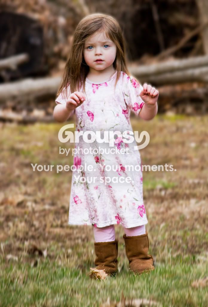
One more thing, in photos like three and six try and keep her less in the center, move around a little try different heights and angles to help composition. Something I learned from drawing is to always keep your focal point out of the center, why that is I dunno, the human mind is all messed up.













![[No title]](/data/xfmg/thumbnail/39/39189-22b7e8d8eadc9cc3d7b341bfb336079e.jpg?1734173064)