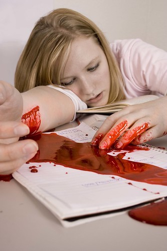
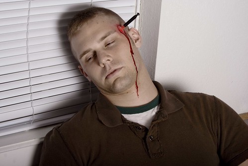
In the first two, I would perhaps (if possible with the makeup) show the person in the act of cutting herself, eraser style. That a way your message is a bit more clearer. Cause truthfully, without understanding what you were trying to do, I wouldn't have made the connection with 1, 2, and 4.
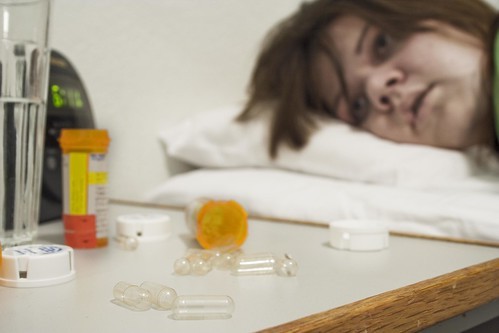
#5 is amazing. I don't find it comical though, at all... As a former drug user I get a lot of symbolism from this, as the pills we usually take when we're feeling down make us feel better, but the content feeling is fake. So in a way, the pills are full of empty hope... I doubt many will see it that way, but for me, this totally clicked, and was amazing.
Someone told me art sometimes is about knowing the limits between what is okay and what is taboo, and then INTENTIONALLY stepping over them. I agree with this, and find your work both edgy and good.
Btw, as a noob, I strongly suggest you think about lowering the saturation, especially on the ones where the people are already dead. I'm not saying you should, but when I downloaded one of the photos and set the saturation to -50, it REALLY made the feel of death pop out. With such strong colors the emphasis is more on the gore, whereas with muted colors it has a more morbid feel to it (making it possibly seem more satirical). Or perhaps lower the saturation, and only saturate the object of death and/or blood. I don't think there's anything wrong with them as is, but I just am trying to be creative.


![[No title]](/data/xfmg/thumbnail/38/38734-a0c4ec46a440db881aca3700b0c62879.jpg?1734172600)


![[No title]](/data/xfmg/thumbnail/35/35952-55c8d42ec1c6ff0e13b45356cbf9c068.jpg?1734167758)
