What's new

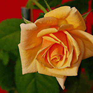
Sunburst Orchid

jcdeboever

Been spending a lot of time on here!
Joined
Sep 5, 2015
Messages
19,860
Reaction score
16,082
Location
Michigan
Can others edit my Photos
Photos OK to edit
Canon SX60HS, hand held. f/4, 1/80s, ISO 320, Program Auto, Spot metering.

Sunburst Orchid.webp
 
Nice. Remember the eye is attracted to 'light'. A small bit of dodging to anther cap (?) would give those hairs a bit more contrast and promote the eye to focus on the central elements.
 
Nice. Remember the eye is attracted to 'light'. A small bit of dodging to anther cap (?) would give those hairs a bit more contrast and promote the eye to focus on the central elements.

It did do that but apparently not enough so I did a little more with slightly more flow to it.
IMG_1059e2.webp


2. Here is another angle of it, with dodging of the hairs.
IMG_1063e.webp
 
I'm not a fan of the composition/cropping in any of these with the petals cut off where they are. Also they seem a bit dark to me. Maybe it's just the color palette...
 
SquarePeg said:
I'm not a fan of the composition/cropping in any of these with the petals cut off where they are. Also they seem a bit dark to me. Maybe it's just the color palette...

I like the original shot the most, the others a bit less so. Maybe it's the amount of OOF on #2 that I do not like, or maybe the larger display size...and the 21.5 inch or whatever iMac I am seeing these on. For me, the third shot shows good detiails when seen ful-sized, but that means I need to scroll around a bit; when seen at regular size, #3 looks a bit fuzzy on the finest details...seems like the re-sizing algorithm being used (somewhere) is not making #3 look optimal. This is an issue on the web: on my 30 inch monitor, shot #3 would likely look good, seen whole, full-frame-area, but on this iMac, the display area is a bit too large, so I tend to look at it sized-down a bit, and at full-size, I have to scroll a bit, so I canon see the picture as a "whole".

Back to Squarepeg's comment "Also they seem a bit dark to me." Yeah...a lil bit. And I think they need some delicate contrast curve tweaking...I think these aere a bit dark, but think they could be adjusted for a bit more separation of the tonal values: dark is fine, but the low values all need more separation from one another. Just a bit more "oomph", because these are rather low in key, we need something to draw the eye a bit more, to appreciate the subtle differences that are there. Maybe a bit of creative licensed trickery, like enhancing the oranges in luminosity, and saturation, and then adjsting the curves a bit.

 
SquarePeg said:
I'm not a fan of the composition/cropping in any of these with the petals cut off where they are. Also they seem a bit dark to me. Maybe it's just the color palette...

I like the original shot the most, the others a bit less so. Maybe it's the amount of OOF on #2 that I do not like, or maybe the larger display size...and the 21.5 inch or whatever iMac I am seeing these on. For me, the third shot shows good detiails when seen ful-sized, but that means I need to scroll around a bit; when seen at regular size, #3 looks a bit fuzzy on the finest details...seems like the re-sizing algorithm being used (somewhere) is not making #3 look optimal. This is an issue on the web: on my 30 inch monitor, shot #3 would likely look good, seen whole, full-frame-area, but on this iMac, the display area is a bit too large, so I tend to look at it sized-down a bit, and at full-size, I have to scroll a bit, so I canon see the picture as a "whole".

Back to Squarepeg's comment "Also they seem a bit dark to me." Yeah...a lil bit. And I think they need some delicate contrast curve tweaking...I think these aere a bit dark, but think they could be adjusted for a bit more separation of the tonal values: dark is fine, but the low values all need more separation from one another. Just a bit more "oomph", because these are rather low in key, we need something to draw the eye a bit more, to appreciate the subtle differences that are there. Maybe a bit of creative licensed trickery, like enhancing the oranges in luminosity, and saturation, and then adjsting the curves a bit.

OK, I revisited for a third time. I do tend to edit on the darker side and not very good at editing either. I try to get it as close as I can in camera. I agree that second one is not tack sharp but I focus more on the image which is probably a little short sighted on my part. So I bumped the levels a little more, what do you think Derrel? I also scaled them down more.

As far as the crop, I am experimenting a lot lately with it to try and get a different image look. Personal taste I suppose. I would preferably like to push it even more dramatic and abstract but not there yet.

1.
IMG_1059e3.webp


2.
IMG_1063e2.webp
 
These have a lot more "oomph", for sure.I would consider these to be close to maximally saturated--any more and they might look garish.

I like the 1,020 pixel tall size measurement on the first shot; the second shot, the 804x 603 horizontal image looks a tiny bit small on this iMac. But I think these sizes are close to optimal for most of the web. The issue is always, "What are people viewing on?" Computer monitors can handle very w i d e images, but not super-tall ones. On smart phones, tells look GREAT! But not so much the wides.

It's kind of surprising to me how much mileage you are getting out of this small Canon point & shoot camera. I don't really know what to say about floral shots at times; we've got this new multi-shot focus-stacked way of shooting; we've got abstracted and blurred florals; we've got all kinds of florals these days. I think every kind of shot has at least something going for it. I'm not especially moved by this orchid. It may be called sunburst, but it looks more like human anatomy to me. I do like the strong orange, in light, and the dark green background, but for me at least, the payoff in the small, sharply in-focus area is being diluted a bit by the larger area that is slightly OOF. I think Squarepeg said it well when she stated, "'I'm not a fan of the composition/cropping in any of these with the petals cut off where they are".

I don't want to hurt your feelings, and I know you've spent time on these, but they're not really grabbing me. I think more DOF would have helped. I dunno...I think the focus-stacking crowd's output over the last six,seven years has colored my perception of how floral shots should look. Maybe your idea is right--to go for more abstraction?
 
These have a lot more "oomph", for sure.I would consider these to be close to maximally saturated--any more and they might look garish.

I like the 1,020 pixel tall size measurement on the first shot; the second shot, the 804x 603 horizontal image looks a tiny bit small on this iMac. But I think these sizes are close to optimal for most of the web. The issue is always, "What are people viewing on?" Computer monitors can handle very w i d e images, but not super-tall ones. On smart phones, tells look GREAT! But not so much the wides.

It's kind of surprising to me how much mileage you are getting out of this small Canon point & shoot camera. I don't really know what to say about floral shots at times; we've got this new multi-shot focus-stacked way of shooting; we've got abstracted and blurred florals; we've got all kinds of florals these days. I think every kind of shot has at least something going for it. I'm not especially moved by this orchid. It may be called sunburst, but it looks more like human anatomy to me. I do like the strong orange, in light, and the dark green background, but for me at least, the payoff in the small, sharply in-focus area is being diluted a bit by the larger area that is slightly OOF. I think Squarepeg said it well when she stated, "'I'm not a fan of the composition/cropping in any of these with the petals cut off where they are".

I don't want to hurt your feelings, and I know you've spent time on these, but they're not really grabbing me. I think more DOF would have helped. I dunno...I think the focus-stacking crowd's output over the last six,seven years has colored my perception of how floral shots should look. Maybe your idea is right--to go for more abstraction?
I'm not offended by either of the comments because they have input as to why. I'm am learning and experimenting and have a natural connection to orchids as my grandma use to grow them, drew them a lot as a boy. I don't see these as anything great either, just learning from the comments in order to bring the instructions fruitfully into future images. Thanks again for your helpful critique, and Sharon's as well.
 
I love orchids and think they are just beautiful flowers. One of my top 5 flowers to look at but not to photograph! I have not seen many photos of orchids that can do them justice. Paintings yes but photos, no. I've attempted them myself a bunch of times, but have gotten poor results, whether it was single bloom, group, backlit, abstract, macro etc. Check on Flickr, put in a search for orchid and the results are just meh, IMO.
 
I love orchids and think they are just beautiful flowers. One of my top 5 flowers to look at but not to photograph! I have not seen many photos of orchids that can do them justice. Paintings yes but photos, no. I've attempted them myself a bunch of times, but have gotten poor results, whether it was single bloom, group, backlit, abstract, macro etc. Check on Flickr, put in a search for orchid and the results are just meh, IMO.

I 100% agree.
 

Create an account or login to comment

You must be a member in order to leave a comment

Create account

Create an account on our community. It's easy!

Log in

Already have an account? Log in here.

New Topics

Back
Top Bottom