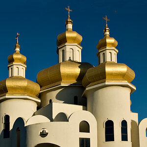
Ok, bit of a long post here so get comfortable...

Before I start I would like to make it plain that I'm making no real interpretation of the image only editing for colour.
The main problem you are facing is clear when you open the image in Camera RAW:
If you look at the histogram you see two main areas of image data, the sky is most of the peak to the right and the foreground mostly the peak to the left. So whatever global changes you make to one area will not be optimum to the other.
Now I'm guessing here but if I follow the common path and explain what is happening perhaps some of it will resonate. In introducing a warmer colour balance you do two things, you enhance the look and feel you want in the foreground, but a warmer, more orange, colour balance has a detrimental effect on the blue. Being it's complementary what it does is to de-saturate the sky, turning it more grey. If you then tone-map to bring the two areas of exposure closer together the effect on the colour is to push it towards grey. Your already greyer sky is pushed further towards grey and begins to lose the dominant hues of blue/cyan and a yellowish tint awards the lower left.
There are some ways of getting around this in camera RAW. I'm using CS6 which will have some tools that don't exist in Elements, but you can do work arounds. It's the principles that I'm working to that may provide the difference:
With CS6 you can work with Smart Objects, which means that you can keep going back and adjusting the raw file at anytime through the process. This allows and interesting option, that you can change the raw file, copy it, then rasterise it, (then the changes are permenant). You can then layer these changes and blend them together in the final image. I use a combination of different masks.
So to start I've made an edit for the sky only deepening the blue/cyan and exposure and using the tone controls to increase contrast. I've copied and rasterised the layer then gone back into the original and put it back to normal. Making my copy layer invisible I can then see and work on the foreground. What I did here is to create two separate colour balances, one warm and one cool, again copying and rasterising each change, returning the base layer to original. By using the colour channels as masks I can blend these different colour balances together. This allows me to bring up the warmer foreground without unduly affecting the sky, the sky will be kept cooler because of the bluer colour balance. Because I've used the colour channels as masks the blue does not unduly affect the warmer tones and vice-versa, but it also means that the gradations between colours are faded and more natural. Unlike the saturation slider that tends to remove these gradations and make the transitions more abrupt.
This is the result, the darker edit for the sky is still invisible:
Now if I then add the darker sky which I masked by using a modified copy of the blue channel, (copied, then apple a levels adjustment to the mask and faded the "inconsistencies" in with a brush):
What you have now is a start...
This does not represent any finished image, it only represents a better starting point with more colour and if you look at the histogram you'll see that the big gap is now almost gone. You will not need to process this as much and so will retain more of the colour, and find it easier to achieve the result you desire.
You can of course go nuts and end up with a layers panel like this representing layer upon layer of small adjustments all blended:
Which is not a definitive edit but just to show how far you can go without touching the saturation slider and only having one curves adjustment to lift the whites of the clouds. It's probably not exactly how I'd do it when working with the raw data, and you can see that with the jpeg some posterisation is creeping into the sky:
Compared to the original:
Hope the above helps and gives you a few more options/directions to try.






![[No title]](/data/xfmg/thumbnail/34/34592-a6ba64e21d4257d5df6832c1bc9691f1.jpg?1734165588)
![[No title]](/data/xfmg/thumbnail/34/34593-f9e16dc135ec1fcde87624f30e703802.jpg?1734165595)