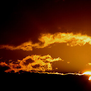
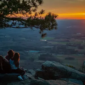
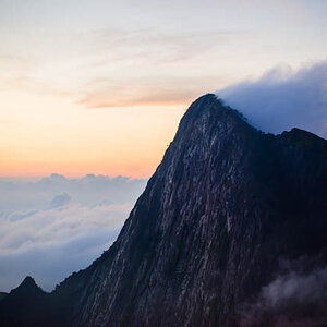
There seems to be way too much empty space in this.
What were your reasons for choosing a portrait format? This could look good as a silhoette shot in landscape.:thumbup:
Also it would be better to size your photo so that the longest edge is 600 pixels (800 max) so viewers don't have to scroll the page to see the whole frame.
My thoughts, exactly.
The photo is too large for internet presentation.
And the sky is not that interesting where it becomes blue to fill all that space.
Crop it in half. Make it a horizontal photo.
Then test out for yourself if not you, too, will find it more interesting.
The way it is it is leaning towards "boring", I'm afraid... sorry about that.




![[No title]](/data/xfmg/thumbnail/41/41765-153b10bab62ae8adbcc4d984fd08ed74.jpg?1734176069)