invisible
Been spending a lot of time on here!
- Joined
- Mar 10, 2007
- Messages
- 5,213
- Reaction score
- 983
- Location
- Canada
- Website
- www.federicobuchbinder.com
- Can others edit my Photos
- Photos NOT OK to edit
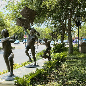
More sleepy stuff ")
Shot handheld, available light only.
Thanks for looking...
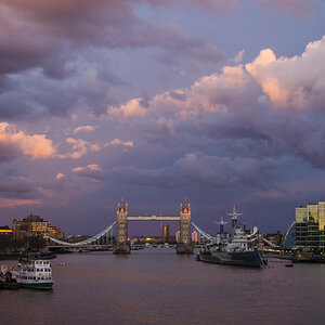
Shot handheld, available light only.
Thanks for looking...
Last edited:


![[No title]](/data/xfmg/thumbnail/36/36393-86ce601930c671b92b6df002b7fcbd0b.jpg?1619737548)