I like #1, nice colours, good composition.
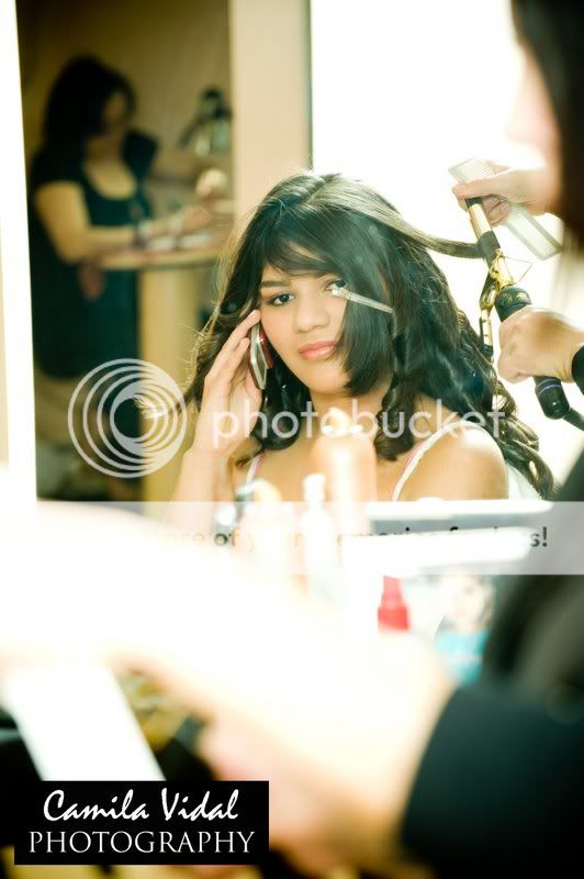
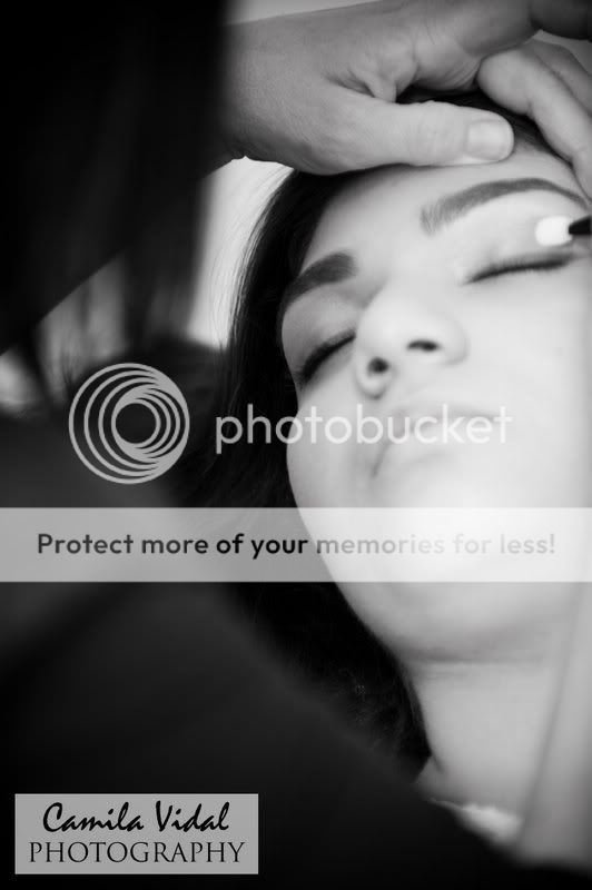
#2 is a good idea, but that thing in front of her left eye is distracting. Maybe moving in a bit closer to remove some of the clutter in front of her (some, not all) and the dead space over her.
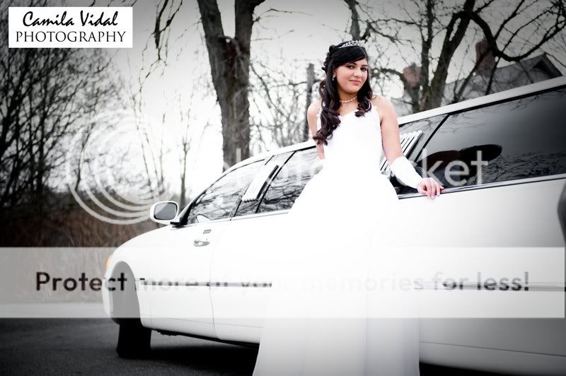
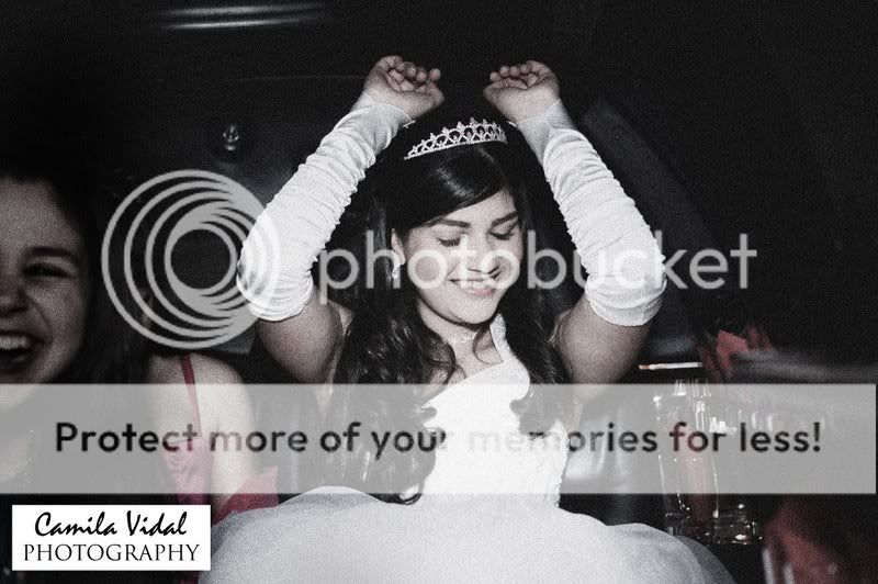
#3 is a fun pose, but on my monitor, it looks like the white of her dress is blown out
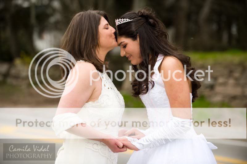
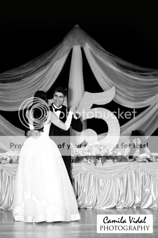
#5 is a great shot, probably my fave of the set
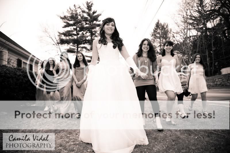
#6 is a fun pic as well, but you cut off some feet and some of the person in the blue on the right
#7 great shot again. I would of liked to have her whole dress in the picture and again, the whites on my monitor in her dress seem blown out


![[No title]](/data/xfmg/thumbnail/38/38735-2245cc1b04db3f96fa74095ae14558a6.jpg?1734172601)


