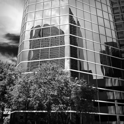
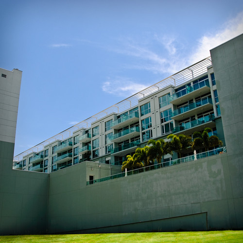
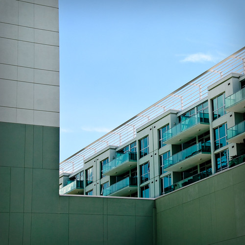
Lovely... I like 2.. 3 doesn't look as flat as 4, but I love 4..... Linear me. 3 looks great with the court cut out even though it blends with the trees.
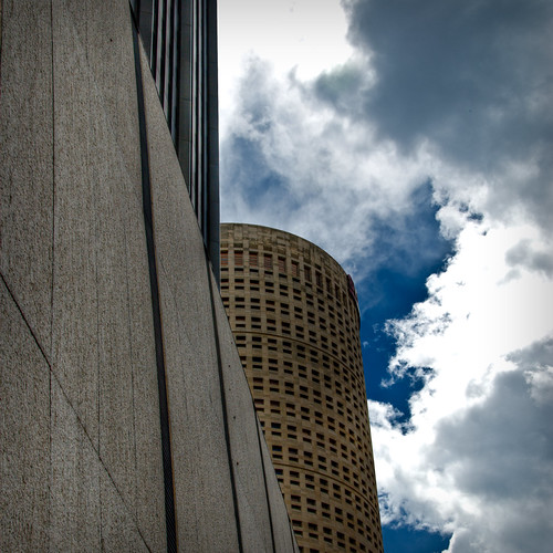
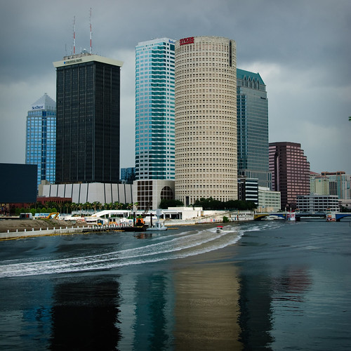
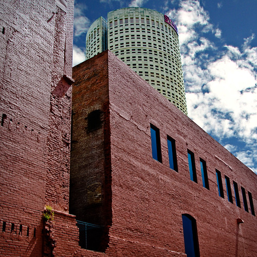
There's something about 7 the brown building and the sky work for me, I like it. The shaded corner of the brick wall. If that white building just wasn't in the way. But I guess the cylindrical shape works.
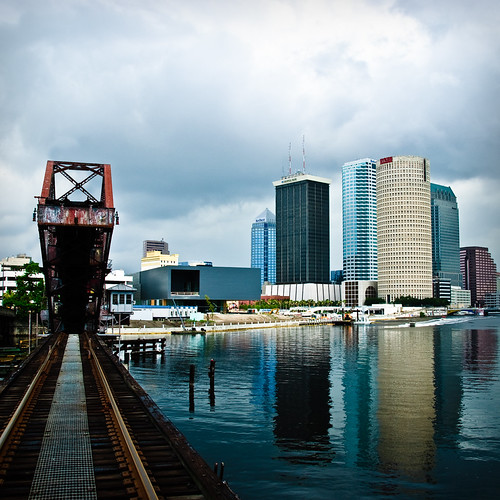
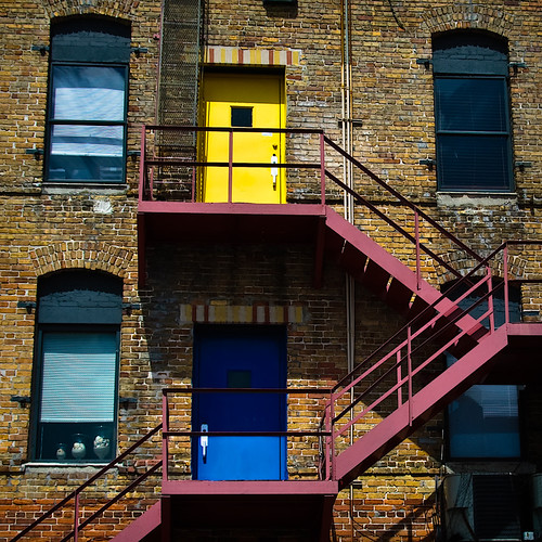
Love the pop of colors in 8.
Your images are very crisp... as they say. Great exposure.




![[No title]](/data/xfmg/thumbnail/37/37535-0e9dcff8bc21e85b84fa89af160ac8d5.jpg?1734170691)