What's new

Teenage Photography CC and Advice for me? (Numbuh 2)

Sluchy523

TPF Noob!
Joined
Aug 8, 2012
Messages
9
Reaction score
1
Location
United States
Can others edit my Photos
Photos OK to edit
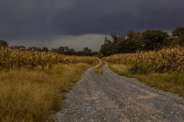
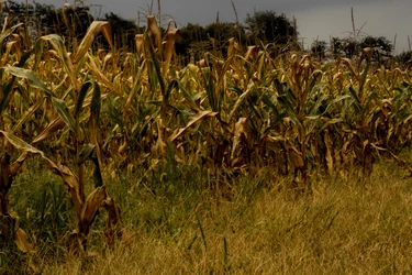
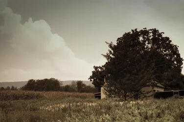
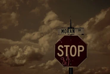
Um, continuation of my last forum. Exported the images at a lower quality so you can see them directly. CC please :)

$Hill and Wheat Field (5).webp$Hill and Wheat Field (6).webp$Hill and Wheat Field (10).webp$IMG_6839.webp$IMG_7882.webp
 
I like the last one! Works well for me and suits B&W..

For me the Graffiti on the STOP sign is a distraction..

The others dont float my boat..

Regards
 
five is more than I am willing to do serious C&C on.. no more than two or three at the most is the accepted norm here....

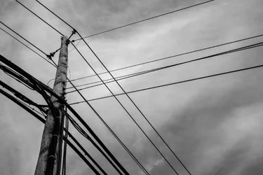
All appear to be underexposed, they lack obvious or meaningful subjects, have OOF or DOF problems, and appear to have some odd color shifts. The B&W one is the only one that looks like a decent, sharp reasonable exposure... and unfortunately, I see nothing in it that is interesting. Just a pole and lines (done to death)!

The desaturation in #3 and #4 is not helping the photos at all... they just render already meaningless photos even less attractive. Selective color is way overdone also.. and usually does not add to a photo either.

I corrected exposure on the first shot... just to give you an idea of correct exposure (since I am sure you are not on a calibrated monitor, based on your images).

$xxxxx.webp

Maybe you should explain to us what you saw or see in each of the images... that you consider worthwhile? (Oh.. and are you sure that is a WHEAT field?) :)
 
I have no idea, it was just some random field I saw while I was biking :)
 
I have no idea, it was just some random field I saw while I was biking :)

I know the above sounds harsh... I do come across that way at times. Just try to "see" what you are shooting.. and try to pick subjects that are interesting to others, or MAKE them interesting to others in the way you shoot them. Watch your exposures, and learn about DOF and how aperture affects it.. this may help Online Depth of Field Calculator. You may also want to google "Composition" and do some reading on that also....

keep on shooting! :)
 
Those are SERIOUSLY UNDEREXPOSED. Your monitor is set up for internet and gaming and that will make you think your images are nice and bright-they're not. They are really really dark.
 
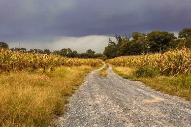
I am new to, the corn field is a nice idea but i think you should have gotten lower to chop the distracting trees in the background and the photos look underexposed. The stop sign is a personal favourite but its a bit too dark and the graffiti is a bit distracting.
 
The first two have a really interesting look, to my eye. Underexposed? I'm not seeing it. I am seeing some really interesting light and color on the leaves of the drying corn stalks. I like the sense of approaching storm, both in the light, the tones, and in the actual subject (clouds etc), all of these play well together here. Compositionally they're both a bit of a muddle, #2 especially.

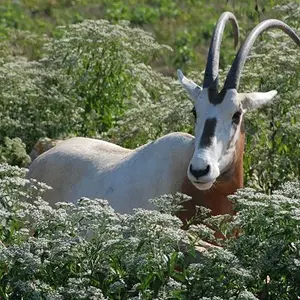
#3 is a strong composition, nice repetition of shapes with the cloud versus the tree. It looks soft, which might be the heavy compression. Whatever. screw Group f/64, long live pictorialism, I say.

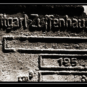
#4 feels like it's some sort of social comment, but it's not speaking to me. Strong-ish composition, I guess, but the elements aren't really cohering for me.

#5 is one of those bloody things everyone does. We just cannot leave the telephone poles and wires alone. It's a pretty good photograph, but it's been made infinitely many times, and it's never really said much, it's always just a kind of interesting looking graphic about nothing. I have a bunch of similar ones lying around, I can't leave it alone either, but I have no idea even what I'm looking for with these.

 
The first two have a really interesting look, to my eye. Underexposed? I'm not seeing it. I am seeing some really interesting light and color on the leaves of the drying corn stalks. I like the sense of approaching storm, both in the light, the tones, and in the actual subject (clouds etc), all of these play well together here. Compositionally they're both a bit of a muddle, #2 especially.

I strongly agree. After reading everyone's responses to #1 and #2 as underexposed yesterday, I was a bit surprised. I think the OP captures the mood of an impending storm especially in #1. I think it's perfectly exposed.
 
And I think you both need to calibrate your monitors... :)

(Next thing will be a bunch of gushing about how "artistically" the OP captured these images, and how they are so poignant they make you weep, right?) lol!
 
Tip: put a model in some of those awesome scenes
bigthumb.gif

And make sure she's HOT...and, put her on a motorcycle....or a scooter...or a moped... lol....just kinda' kidding ol 2Wheel...

I'd say, "Keep shooting. Just keep on shooting. Every day. Keep exposing the film...err...the memory cards..."
 
Sorry, but I tried to recreate the lighting as best as I could for pics 1 and 2. My default monitor brightness is 35%, and I have no idea how to calibrate it without buying one of those fancy $200 programs to do so. I'll make a print tomorrow to see how it looks and I'll post process the exposure if it doesn't portray the light that I'm seeing currently on my monitor and what I saw when I captured it.

P.S I'm 14, the only models I can get to be in my pictures are middle schoolers :|
 

Create an account or login to comment

You must be a member in order to leave a comment

Create account

Create an account on our community. It's easy!

Log in

Already have an account? Log in here.

Back
Top Bottom