Texas sunrise with CHROME

Lacoma

TPF Noob!
Joined
Apr 22, 2013
Messages
24
Reaction score
1
Location
Richmond Hill Ga
Can others edit my Photos
Photos OK to edit
$Texas sunrise with CHROME2.jpgC&C please.
 
I like this better than the previous one, Lacoma. I'd recommend cloning out those wires and either framing a bit higher or simulating a top for that antenna. It leads my eye right out of the frame. That container and trailer is still a bit of an eyesore. Maybe unhook them for the shot? Good HDR treatment, but still considerable halos.
 
I say leave the wires in. The wires echo the diagonal lines on the implied box on the trailer. Nice sunset, nice clouds in the sky. I have to disagree that the box on the truck is an eyesore...it's a truck AND TRAILER rig! A "tractor/trailer" rig. yeah, there's some haloing...but I think these days a lot of people expect haloing, and don't care if it's there unless it is really,really,really objectionable. This being maybe the 3,457th HDR shot I've seen in this style, I'm beginning to get a lot looser in my appreciation of this style.
 
Derrel, I can almost agree with you, but . . .

. . . if the wires were a deliberate design element, I'd agree to leave them in, but they're extraneous to the inherent dynamic of the shot and, in my opinion anyway, should be banished. The problem I have with the container and trailer is that, being somewhat dark and detailed, it draws attention to the fact that the image is somewhat imbalanced toward the right. I'd love to see a close-coupled smooth-sided trailer for comparison, or none at all.

Finally, the halos. I guess I mean white lines around the perimeter rather than glowing halos. To me, they scream 'processing flaw,' not artistic treatment.

I guess it's a matter of perfection being so close at hand, but not being realized. Lacoma has come close to a magazine quality shot with this one, but it's being hurt by detail issues. Being the perfectionist that I am, I always tend to notice stuff like this. And once noticed, I can never seem to 'unsee' them.
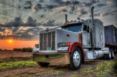
 
Wow!! Thank's for the compliments. I am still very new to everything here. I am trying to learn a much as possible to have better quality images. I have never used Photoshop only ran my stuff through Photomatix. The container is off the trailer now not sure if I can ever give you the smooth edge look I pull flatbed trailers so something new on it just about everyday. But I really like the C&C. I will keep working on them. I have another picture from same spot just different look will post it
 

Attachments

  • $Texas223.jpg
    $Texas223.jpg
    960.6 KB · Views: 264
I disagree about the wires...they give size clues and depth clues. Leave them in. In the second shot, the three utility poles behind the trailer give a perfectly rational reason to LEAVE THE WIRES IN. It is not 1886...there are freakin' wires in many places...Photoshopping them out is disingenuous.

The second shot is a better composition...but now the clouds have horrible ghost-edges...looking at the full-sized image of the second shot at largest size was a disappointment (but only in the cloud parts) with the way the edges of the brighter clouds have ghost-edging....bummer. I like the rendering of the truck, and the trailer, much better in the second shot--different perspective on the truck's hood, and the closer exhaust stack overlapping that one small cloud is a really nice 3-D detail. And again, the utility poles placed right there at the edge--those poles MAKE THE WIRES have a reason for being in the shot.

Again...wires show modernity...they show REALITY. Cloning wires out to fulfill some sort of stripped-down fictionalize ideal of perfection seems distasteful to me. I favor the realism and authenticity of showing the modern landscape the way it actually is. Not as it was in the 1880's. If there ARE wires in the scene, they damned well ought to be in the shot.
 
I agree with you about the wires in the second shot. I just feel that in the first, they're a random element. The second image has a lot more context. The hood merges a lot better with the cab in the first shot. It's a Peterbilt thing, I think; but it's classic. There were no trucks in 1886, so the era is obvious. Your points about the formal elements hit the mark. Now the trailer and container actually fit; and the wires now have a reason to exist.

My history is in fine art and advertising photography, not photojournalism, so I really couldn't give a rat's ass about REALITY. But I understand your point, Derrel. We come at photography from different angles, that's all. I also believe that Lacoma would benefit from learning some post-processing techniques, so he can handle the small things where the camera and Photomatix lead his images astray. I'm sure that will come in time.
 
Last edited:
I prefer the composition of the second. but i still think the HDR is overdone and obvious (like the clouds).


what is up with the soft spots below all of the tires on the first?
 
I prefer #1, with or without the wires wouldn't matter to me. I see Derrel's point, but they are so unobtrusive that if they were cloned out, I wouldn't miss them.

I like the perspective in #1 better. The angle from down lower makes the truck appear a little more imposing, which I would expect from an 18-wheeler.

What would I change? - frame a little more to the right and get the whole trailer in the shot, or stand a little to the left and get a look more along the length (but that may push the sun out of the shot).

The processing - I don't think it's really over cooked, but there is definitely something going in the processing. The soft spots under the tires...I've seen that in Photomatix on some sets of exposures I've played with. It seems to happen with thin, contrasty elements (the grass stems in this case)...they're like "dark" halos. Also, there seems to be darker shadow areas that just don't fit and some dark halos next to the exhaust stacks. I haven't been able to find any settings that eliminate it, it just seems to happen with certain exposure sets for some reason.

Would you mind posting up the exposure set and let us play with it?
 
If I were doing it, I'd simply combine the sky of 1 and blend in the foreground of 4.
 
Thanks for the compliment. But I can post the RAW because I somehow deleted them today. All I have left is the Jpegs that I posted you are welcome to use those.
 
Given the files to work with I decided to go for two styles; realistic and overcooked. Below is my overcooked (it's late, I'll try realistic tomorrow).

I noticed when playing with it there are a fair amount of sun rays that will come out when moving the sliders in Photomatix to extremes. Definitely not going to be to everyone's taste, but..

$tonemapped.jpg
 
I noticed the rays in the original post and wished they were a bit more prominent. Nice job for slightly overcooked. I'm a little bugged by the dark foliage at the lower right, though. Too much of an eye-catcher.
 

Most reactions

New Topics

Back
Top