What's new

The color of my pictures are dull

redgreenblue

TPF Noob!
Joined
Jan 12, 2010
Messages
4
Reaction score
0
Location
Florida
Can others edit my Photos
Photos OK to edit
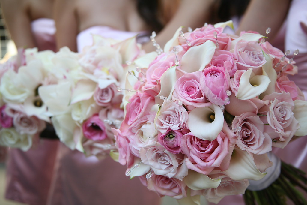
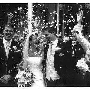
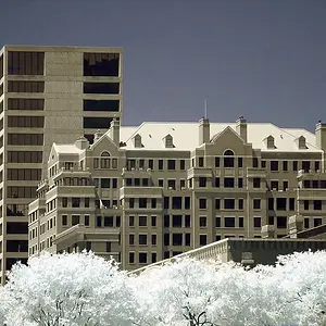
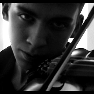
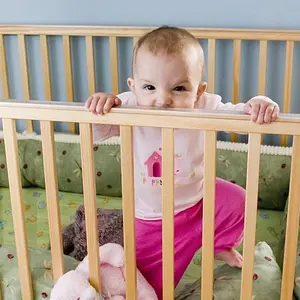
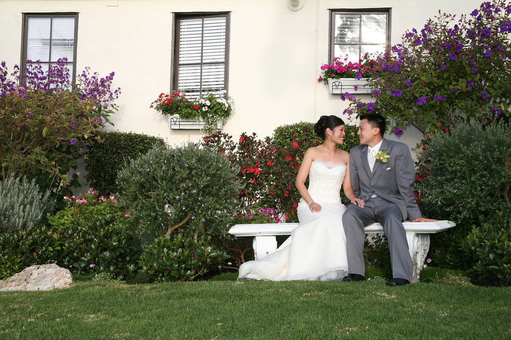
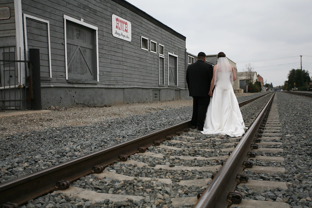
I am just starting out in photography. These shots are taken by me from friends weddings I've attended.

I've noticed that my pictures look so dull in color and it lacks any life or vibrance. What advice do you have to make my picture color stand out a bit more? I don't want to heavily rely on photoshop but am willing to use it to add just a little zest.

Feel free to play around with the picture.
If you can be very detailed with what you did to make the picture better I would appreciate it.
4291484363_aef009da7f_b.jpg


4292230312_d2999dc047_b.jpg


4291477799_8aeba69453_b.jpg
 
What camera and lenses are you using ?
Was this shot RAW ?
Have you done any post-processing ?
 
Well, in the second one - the colors are dull. Pretty much everything there is gray.

In the other two I would maybe just give the saturation or vibrance a little bump.

The vibrance slider works pretty good for adding vibrance. ;)
(Not sure if the software you're using has that...Lightroom does.)

edit
Also... Maybe it's your monitor? Is it calibrated?

They don't really look bad to me...
 
The colour in your pictures aren't dull. The lighting is. If you shoot a grey wall you'll get a grey picture. If your subjects are lit with a cloudy sky and cast no shadows you'll get a flat picture.

With our local photo club we were out one day and saw an interesting fence. One guy bent down to take a snap looked at the image, exclaimed "dull" and walked away. Another guy (strobist reader surprisingly enough), pulled out his off camera flash, put an orange gel on it and set it up lighting the fence from an extreme angle. White balancing for the gel the fence with it's now dramatic lighting stood out very well against a dark blue background, and he exclaimed "cool"!

So while I still like the first image, the second one could be done exactly the same except walking into a sunset and be awesome. (edit: Actually looking at it again, there's no separation between the subject and the background. There's a building growing out of them. A slightly lower angle and having them slightly closer to the camera would help them stick out much more from the background) The third one (if it was staged and not snapped during the ceremony) could benefit in my view from a flash directed exclusively at the front most bouquet to make it pop and stand out.

What camera and lenses are you using ?
Was this shot RAW ?
Have you done any post-processing ?
-Irrelevant.
-and not needed to make an exciting and popped image.

Though post processing is always a good question to ask when someone complains about a dull image :)
 
Last edited:
I don't know if I'd call these images dull. To me a camera's job is to try to reproduce the image as accurately as it can. I think you'll find most people do a lot of post production work to get their images to "pop" out a little more. Now if you're saying the physical setting was much more vibrant than the photos show... that's another story.

Overall I'd call it personal preference. Do some post production work if you're not happy with the results but overall I'd say the color balance is pretty good.
 
I'm with Garbz. The light is flat. A little off camera flash could help give some depth, separate the subject from the back ground/illuminate them a bit more.

Hope this helps.
 
Well, in the second one - the colors are dull. Pretty much everything there is gray.

In the other two I would maybe just give the saturation or vibrance a little bump.

The vibrance slider works pretty good for adding vibrance. ;)
(Not sure if the software you're using has that...Lightroom does.)

edit
Also... Maybe it's your monitor? Is it calibrated?

They don't really look bad to me...

100/% agree
I check the calibration of your monitor if you do not have a calibrator Datacolor has a couple options with a reasonable price

Beside that I think is more your camera settings that are on neutral
 
Well, I actually find the less saturated colors work well in the bouquet shot look rather nice. The only thing is the contrast could be bumped up a bit in that one. The other pictures, however, they do look a bit flat and everything that I could say has already been said, so, :grumpy:
 

Create an account or login to comment

You must be a member in order to leave a comment

Create account

Create an account on our community. It's easy!

Log in

Already have an account? Log in here.

Back
Top Bottom