Remi M.
TPF Noob!
- Joined
- Jun 25, 2006
- Messages
- 279
- Reaction score
- 0
- Location
- Vancouver, Canada
- Can others edit my Photos
- Photos OK to edit
Lately I have found my self to really like taking pictures in the fog. The only bad part about it is that you have to wake up early to get the shots. These shots were taken over two different days. All in or around Vancouver.
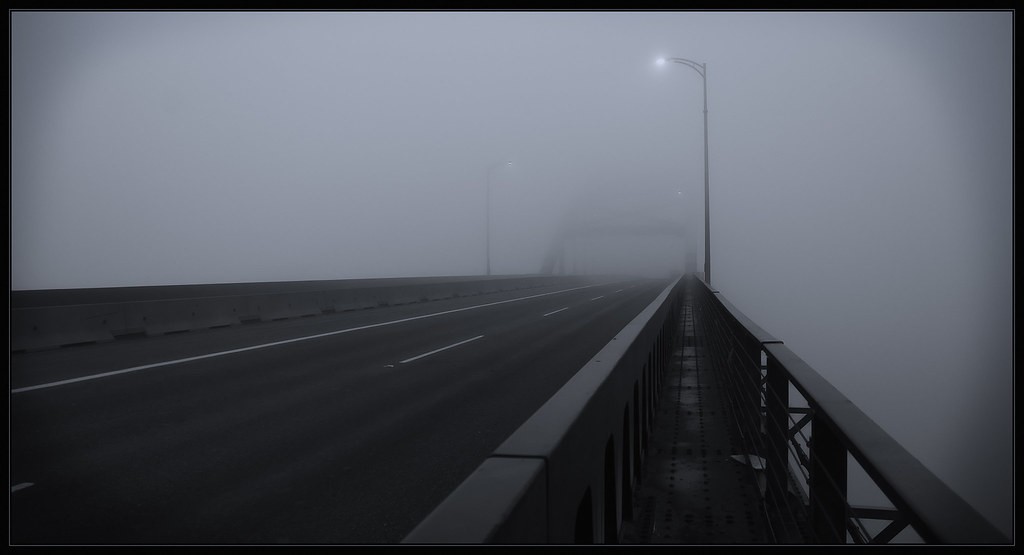
1. Port Mann Bridge (this shot is a bit of pchop trickery, the bridge was never this empty)
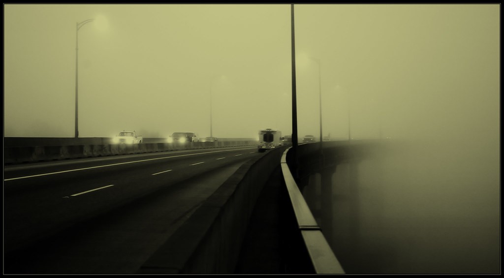
2. Port Mann Bridge
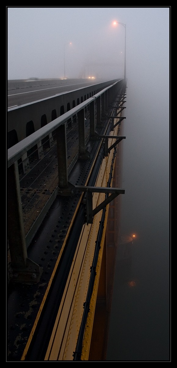
3. Port Mann Bridge (shortly after taking this shot, I was asked to leave the bridge, seems I missed the sign saying no pedestrian traffic") )
)
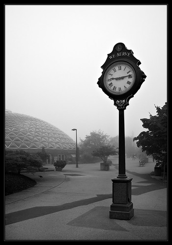
4. Queen Elizabeth Park. The dome shaped building is the Bloedel Conservatory (botanical).
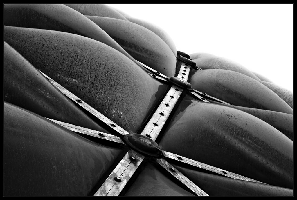
5. Bloedel Conservatory up close
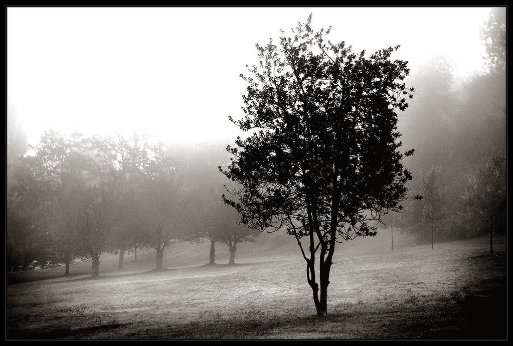
6. Queen Elizabeth park
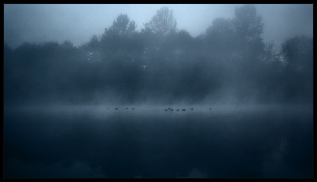
7. Surrey Lake
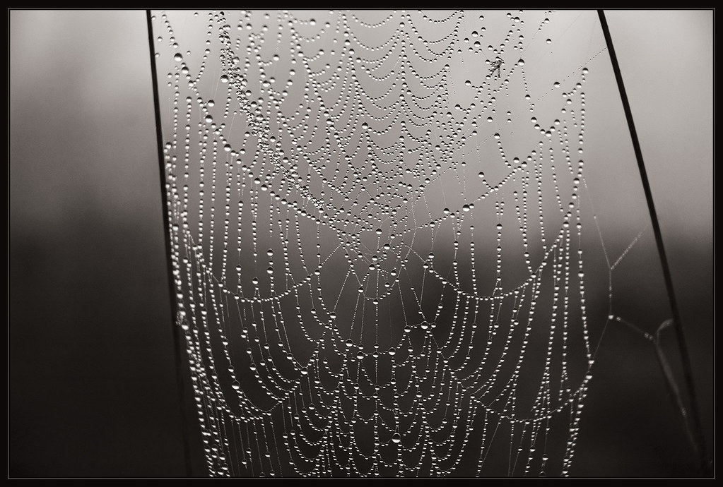
8. Surrey lake park
1. Port Mann Bridge (this shot is a bit of pchop trickery, the bridge was never this empty)
2. Port Mann Bridge
3. Port Mann Bridge (shortly after taking this shot, I was asked to leave the bridge, seems I missed the sign saying no pedestrian traffic
)
4. Queen Elizabeth Park. The dome shaped building is the Bloedel Conservatory (botanical).
5. Bloedel Conservatory up close
6. Queen Elizabeth park
7. Surrey Lake
8. Surrey lake park


