C&C per req:
As nyfoto said, resizing would be appreciated, as would limiting the number of images in one post. Good, constructive critique takes time, sometimes a couple of minutes or more per image by the time it's all done, and with posts of more than five or so pictures, you're asking for a lot of someone's time. That aside...
1. Potentially a nice sunset here, however the tree blocked what I would guess is the nicest part of the scene. Was this deliberate, and if so, what was your aim? The treeline, as dark as it is is rather distracting. I think the use of Grad NDs or an HDR would have made this a more powerful image, as well as the cropping of the house(?) to the right.
2. I don't get much from this one. Some interesting cloud formations, but the bulk of the image is either grey sky, or under-exposed commercial buildings.
3. This one is very nice. I would consider cropping it to eliminate the sire-tower on the right, and playing with the levels/curves a little more to lighten up the ground area. Again, Grad NDs would have really made this image.
4. A nice macro attempt, but the large, unfocused area in the left/middle foreground is very distracting. As well, watch your highlights. The blown or nearly blown area upper right is discordant. With this type of image, careful lighting, and the use of reflectors, diffusers, and ring lights is often required.
5. Nice, but I would consider cropping out a large part of the flat, grey cloud area, as well as some of the ground. Concentrate just on the sunlit region with a little of the cloud/ground around as a frame.
6. Nice well captured (Those are some big-@$$ condensers!)
7. Nice B&W, a little dark in the foreground, but nice tonal range. I would consider cropping a bit off of each side though; it's rather long and low to little effect.
8. Another nice conversion; I would suggest some levels/curves work to darken the sky and lighten the foreground, as well as a re-crop to off-centre the goat (the subject I assuem). Consider the rule of thirds, the ridge line, the goat, and the small bush to his (her?) right. As well, clone/crop the pole on the LH edge of the image.
9. Almost really nice but not quite. Ideal, textbook composition with the path leading into the centre of the image, however the area is too dark for the eye to easily pick up detail.
10. Again, I don't get much from this one. There's potential in here, but I don't think you've captured it.
11. Nice, but again a little dark in the ground areas, and I think too much sky. I would look to crop it just above the second small cloud layer. Not sure if the wires help or hinder the image. I think I'd prefer it without.
12. Overall too dark. You've got a taste for sunsets. You NEED graduated ND filters!
13. Nice effect; I would have preferred it without the antennae, but they're not a big deal
14. Another case of "too extreme". Blown highlights and black foreground as well as the object slanting off to the right.
15. Nice, but I would prefer to see the point of focus more near to the "I" and "T" rather than the "3".
16. Again, too dark below the cloud-line.
17. Well captured. Good composition, nice saturation, and good exposure.
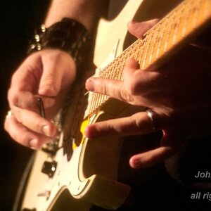
18. A classic image, however the fingers need to be in focus for this one to work. Again, watch your edges. In this case you have a hard, black line angled down on the LH side.
Just my $00.02 worth - your milage may vary.
~John
Just my $00.02 worth - your milage may vary.
~John
Ps - 21 minutes... not too bad.




![[No title]](/data/xfmg/thumbnail/30/30882-ce388519574371448d7493784524607a.jpg?1734158883)