What's new

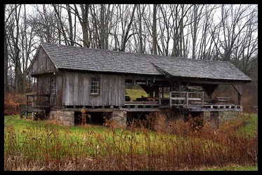
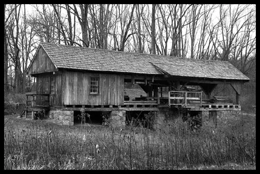
The Mill

A little flat for my liking. I would suggest tweaking the curves to bring out some of the wood textures.
 
$Mill2.webp

$Mill1.webp
 
Any better? I'm fairly new to digital and I keep hearing references to "curves". I "play" with the curves, but it doesn't seem to do more then change the overall contrast of the image. This is the result of just playing with the brightness and contrast. I'd be curious to see the result of the original with "curve" adjustment.
Thanks. I'm learning and can use every "magic wand" there is.
View attachment 28304
 
Thanks. I see your input and mine looks rather flat in comparison. I looked at it in B&W, but the sky just turned me off. I guess gray looks better in color :lmao:. I need to play with this one some more to see how these "curves" work. Like I said, I never see more then a contrast change no matter where I pull, push or slide:meh:
 
Last edited:
Rick - in curves one useful thing you can do is to look at something you want to accentuate, say the darker areas in the wood. Look at the RGB values for the darker and lighter areas in the wood, let's say they average around 100 for the dark areas and 180 for the lighter ones. You fix a point on the curve at about 140, then pull the curve down at about 100. It should pop up a little above 140 on its own, but if that isn't enough, then help it along. The result is that you've darkened the darker areas and lightened the lighter ones and given the wood more contrast. If this change is not good for some other part of the image, which is pretty likely, then you have to use the layer mask on the curves adjustment layer to limit the effect to the areas where the wood is.

On the framing of the image, how well it works depends on what you're trying to depict. If it's the way the building looks, its textures, shape, etc., then moving closer and eliminating most of the trees and grass would be better. If it's the way the building looks in its environment, then this works pretty well. I might prefer less of the trees and more ground, but maybe that's just me.

 
I looks better corrected .... I do not use curves for most photos ..... look at levels, here you can change highlight, mid tone and shadow area all separately..... mess with it and see. Levels is quick and easy and will not change color ( may open color on a deep image)
 
Thanks guys.
Ken, that helps. I just moved things around to see what effect it had on the picture. I'll have to look at it again now that I have an idea HOW to do it.
Mully, yeah, I've found levels and actually use them a lot. It does appear to be a "quick and easy" operation.
Thanks again to both.

Oh yeah, framing. I moved to the opposite side of the foreground ditch and scoped out different frames on all 4 sides. At the same time filling the frame and backing off. I settled on this one. I liked the way the mill was sandwiched between the foreground ditch and the trees behind. I thought it gave a good representation of the surrounding environment.
 

Create an account or login to comment

You must be a member in order to leave a comment

Create account

Create an account on our community. It's easy!

Log in

Already have an account? Log in here.

Back
Top Bottom