The tree that didnt Burn!

Stormchase

No longer a newbie, moving up!
Joined
Oct 6, 2009
Messages
1,191
Reaction score
108
Location
Phoenix Arizona
Can others edit my Photos
Photos OK to edit
So I drove up north of phoenix last week to try and capture a fire that was burning in Yarnall, Az ... again. When I got up to ground zero for the firefighters they were telling me there was basically no good roads to get close. They didn't mind a photographer getting as close as I could but I realized that they were being flown into the drop zone. In short it was un-accessible. There is a town I have driven through many times (Peoples Valley, Az) in the area that has these amazing trees. I have always thought about stopping but never seem to have my gear with me. Well today I did. The fire was burning on the east side of the road, The west had a strange beauty about it this day.

Let me know what you think. How would you approach this different? I will let you know what I like about the shots. I took more of coarse but pulled my favorites to post. I think it was interesting how different each focal length makes the tree look. They are all the same angle.

I used 2 lenses, close and far. I was able to have the light work with me starting from far at 200mm and working closer and ending at 10mm. Only a little trespassing involved ;) I don't think the cows minded much. The 200mm shots were great as well but I just couldn't get the a balance to not blow out one or the other. Even HDR didnt seem to make me happy.

1)
This was at 10mm
This was a few steps back. I like the prospective on this as well.
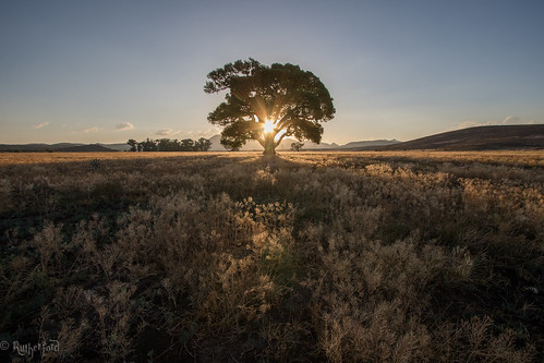
1QS9A3008 by Stormchase73,
2)
This one was shot HDR at 22mm and a little closer.
I like the sun coming through and was my choice.
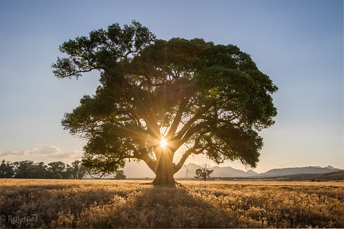
1QS9A2989-HDR by Stormchase73,

3)
This is at 200mm. I really wanted this to work but it didnt. I tried a black and white here and still not completly happy. Quick edit but I do love the compression at 200. I think the mountains add a bit to it.
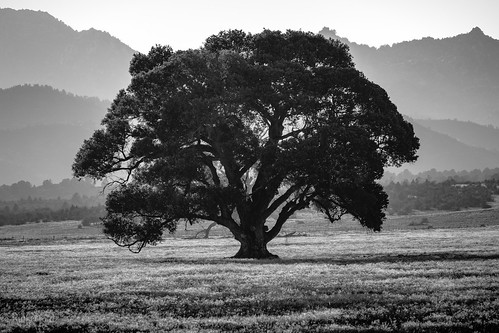
1QS9A2963 by Stormchase73, on Flickr

4)
This is 10mm Up and in your face!
What I like about this one is that the sun was behind the trunk. It lit up the leaves nicely from underneath. I would have hoped for a little more light on the underside but still nice I think. Its a bit strong on the saturation now that I look at it again. I edit on a 52" TV (im still working on that issue)
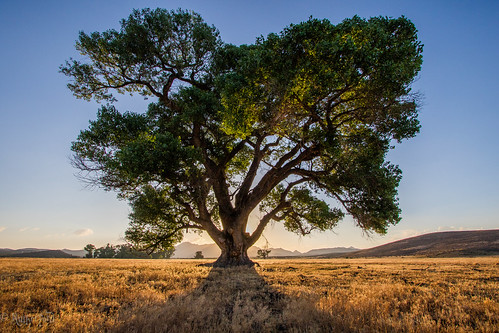
1QS9A3006 by Stormchase73, on Flickr
 
I like these, especially the 2nd one. I can see why you dead centered the main subject in the first 2 but I think a different composition would have worked better in the last 2 shots.
 
2 and 4 I love. Not that I hate the others, but I love the light on 4.
 
Nice. It looks like a fake tree from your adventure.
 
#4 would be my pick.
 
There is a real danger of concentrating on one aspect of a picture and the technical solutions that you tend to loose sight of the image as a whole.

Here we have the sun shining through a tree. The following is just presented as alternative ideas and thoughts, nothing else. Why include the sun, what does it actually add to the image and what does it take away? The inherent problem of shooting into the sun is that you're always shooting into the shadows and the lack of colour and contrast you find in shadows. Even HDR will not fix this, only give you the stripped back saturated dominant hues. Your last image starts to explore other options that give more light and colour to the subject.

But having chosen the subject and the light the limitations can dictate the the outcome. With the tree in shadow and lacking colour and contrast, placing it so it's scale fills most of the image also fills most of the image with that lack of colour and contrast. I also feel that in positioning the sun you've lost the separation between the tree and the background. If your camera was a little lower there would be space under the lower branches.

So back to the first image, which I think could be the best, but I see as having a couple of problems. It reduces the scale of the tree within the image and thus reduces the dominant lack of colour and contrast and also introduces the backlit foreground, both good. The problem with the composition is that the left and right edges add nothing to the image that's not already in the centre. All they do is further diminish the scale of the tree within the frame (smaller percentage of the overall picture), and introduce a lot of flat tones.
The other problem is that the general methods of processing such a large DR usually flatten the tones and colour within an image to some extent. In this instance I would use layers with luminosity masks and modified masks to introduce variations in colour such as orton effects, and I often blend two slightly different colour balances. I would also tweak some more seperation (contrast) in the tones in the foreground than the background as this adds a sense of depth.

I would keep with the symmetrical composition balancing the three main points of light on the central vertical. Offered only as an alternative:

mod-1.jpg
 
Wow love the colored ones, the black and white one I dont think is very interesting
 
I like these, especially the 2nd one. I can see why you dead centered the main subject in the first 2 but I think a different composition would have worked better in the last 2 shots.
Thanks, I wanted it to be all about the tree, and the sun. I like how it came together when I was there.
2 and 4 I love. Not that I hate the others, but I love the light on 4.
Thanks, me too :)

Nice. It looks like a fake tree from your adventure.
I have thought about bringing a prop with me sometime and shoot it at different places.Its all real tho.

#4 would be my pick.
Thanks. I like the light on it too.
There is a real danger of concentrating on one aspect of a picture and the technical solutions that you tend to loose sight of the image as a whole.

Here we have the sun shining through a tree. The following is just presented as alternative ideas and thoughts, nothing else. Why include the sun, what does it actually add to the image and what does it take away? The inherent problem of shooting into the sun is that you're always shooting into the shadows and the lack of colour and contrast you find in shadows. Even HDR will not fix this, only give you the stripped back saturated dominant hues. Your last image starts to explore other options that give more light and colour to the subject.

But having chosen the subject and the light the limitations can dictate the the outcome. With the tree in shadow and lacking colour and contrast, placing it so it's scale fills most of the image also fills most of the image with that lack of colour and contrast. I also feel that in positioning the sun you've lost the separation between the tree and the background. If your camera was a little lower there would be space under the lower branches.

So back to the first image, which I think could be the best, but I see as having a couple of problems. It reduces the scale of the tree within the image and thus reduces the dominant lack of colour and contrast and also introduces the backlit foreground, both good. The problem with the composition is that the left and right edges add nothing to the image that's not already in the centre. All they do is further diminish the scale of the tree within the frame (smaller percentage of the overall picture), and introduce a lot of flat tones.
The other problem is that the general methods of processing such a large DR usually flatten the tones and colour within an image to some extent. In this instance I would use layers with luminosity masks and modified masks to introduce variations in colour such as orton effects, and I often blend two slightly different colour balances. I would also tweak some more seperation (contrast) in the tones in the foreground than the background as this adds a sense of depth.

I would keep with the symmetrical composition balancing the three main points of light on the central vertical. Offered only as an alternative:

View attachment 123585
Thank you for the detailed response.
I agree now that you point it out about the background. I did a 3 exposure HDR on #2 and it still has a lot of detail lost. It really blends it all together in a bad way. I wasn't thinking about that when I moved into position. I was originally thinking about being lower too, just in general. I was a little worried with a police cars rolling by every couple minutes because of the fire. Even tho they were busy, I was still illegal. Moving quick.

What I was going for in the first image was the loneliness of that tree in the large field. Thats what caught my eye on this one when I was driving by. I like to stick with the the first thing that catches my eye about a subject, then enlighten it. That's what I tried to do with the 1st. Show some of the open area. I have seen some very simple shots with 1 small to medium sized subjects like this that I liked. Kinda going in that direction.
I do like the edit you did tho. It looks good in that crop. With photoshop, well, im still learning. Well im trying to learn some of the basics. I haven't done layers or masking. Seen a couple videos on it but haven't executed anything like that yet. I mostly use it for cloning and repairing. The rest is done in lightroom. Mostly the basic tab. one day :)


Wow love the colored ones, the black and white one I dont think is very interesting
It isnt really haha. It seemed to be the best of ruined shots. I know you cant make a good shot out of a bad one and it get worse with processing. sometimes B&W can improve it a little.
 

Most reactions

Back
Top