batmura
No longer a newbie, moving up!
- Joined
- Sep 19, 2012
- Messages
- 649
- Reaction score
- 240
- Location
- Istanbul, Turkey
- Can others edit my Photos
- Photos OK to edit
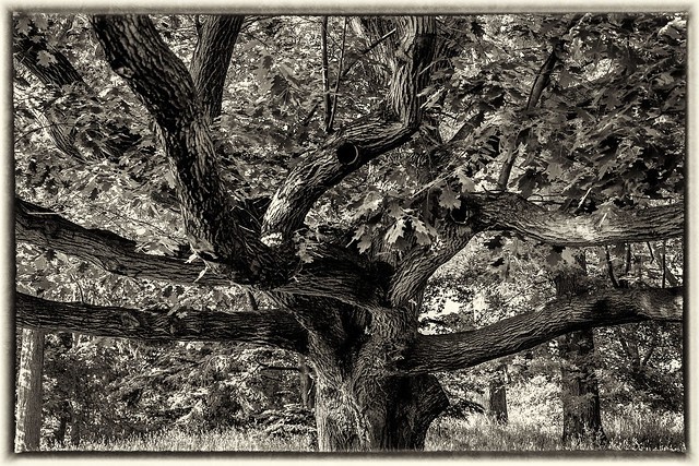
Which one do you like better? Any feedback is always welcome.
#1

brooklynbotanicgarden by batmura, on Flickr
#2
brooklynbotanicgarden (2) by batmura, on Flickr
#1
brooklynbotanicgarden by batmura, on Flickr
#2
brooklynbotanicgarden (2) by batmura, on Flickr


![[No title]](/data/xfmg/thumbnail/42/42351-b976e32171d0405397bf5237bc4b902e.jpg?1734176880)

